Good Color Combinations for Bedrooms: Beginner’s Guide
Why Good Color Combinations for Bedrooms Matter More Than You Think
Finding good color combinations for bedrooms can feel overwhelming — but the right palette makes a real difference in how you sleep, relax, and feel every morning.
Here are the most effective bedroom color combinations to consider:
| Color Combination | Mood Created | Best For |
|---|---|---|
| Soft blue + warm white | Calm, airy | Better sleep, small rooms |
| Sage green + warm ivory | Grounded, natural | Master bedrooms |
| Warm white + natural oak | Timeless, cozy | Any bedroom style |
| Dusty blue + natural linen | Relaxed, coastal | Guest rooms |
| Warm terracotta + cream | Earthy, inviting | North-facing rooms |
| Deep navy + warm gold | Rich, dramatic | Large bedrooms |
| Blush pink + warm grey | Soft, romantic | Master or guest rooms |
| Charcoal + crisp white | Modern, clean | Contemporary spaces |
Research backs this up: approximately 90% of a person’s first impression of a room is based on color alone. And 88% of people report better sleep in rooms with cool, muted tones. Your color choice isn’t just aesthetic — it’s functional.
I’m Jean Hauser, owner of The Color House and a Benjamin Moore paint specialist with over two decades of experience helping Rhode Island homeowners discover good color combinations for bedrooms that are both beautiful and livable. In this guide, I’ll walk you through everything you need to choose a palette with confidence.

The Science of Good Color Combinations for Bedrooms
Choosing the right bedroom colors is more than just picking your favorite shades. It is deeply rooted in color theory and human psychology. In interior design, colors are generally divided into two main categories: active and passive.
- Active Colors: Vibrant hues like bright reds, oranges, and sunny yellows have long wavelengths that stimulate the brain. While they work beautifully in creative spaces or dining rooms, they can keep your adrenaline pumping when you are trying to wind down.
- Passive Colors: Cool tones like soft blues, botanical greens, and gentle purples have shorter wavelengths that are physically easier on the eyes. They promote tranquility, lower heart rates, and prepare the mind for restorative sleep.
Because 73% of a room’s perceived quality is attributed to its color palette before any furniture is even noticed, starting with a cohesive color system is essential. Professional designers do not just select a wall color in isolation; they design a complete system where walls, flooring, textiles, and accents work together. To see how the experts build these balanced systems, check out these 12 Stunning Bedroom Color Palettes That Interior Designers Actually Use for direct inspiration.
Applying the 60-30-10 Rule to Bedroom Design
To prevent a bedroom from looking chaotic or, conversely, completely flat, interior designers rely on a classic formula: the 60-30-10 rule. This simple guideline ensures visual balance by distributing your palette across three distinct layers:
- 60% Dominant Color: This is the foundation of your room. It typically covers your walls, large rugs, or largest furniture pieces. In a bedroom, this should almost always be a calming, restful hue.
- 30% Secondary Color: This tone supports the dominant color and provides essential contrast. You will usually apply this to your bedding, custom window draperies, or mid-sized furniture.
- 10% Accent Color: This is your playground for personality. Use it in small doses on throw pillows, artwork, bedside lamps, or hardware finishes (like brushed brass or matte black).
One of the most common mistakes we see homeowners make is reversing this ratio—such as letting a vibrant accent color take over 60% of the wall space. For a deeper dive into balancing bold and neutral tones across your entire home, explore our guide on Mix and Match Magic: Creative Room Color Combos for Your Home.
How Lighting Affects Good Color Combinations for Bedrooms

A paint color that looks like a dream in a brightly lit showroom can look completely different on your bedroom walls. Natural light shifts constantly throughout the day, and the direction your windows face plays a massive role in how paint colors behave:
- North-Facing Rooms: These spaces receive cool, slightly bluish light all day, which can make cool grays and stark whites feel chilly or clinical. To balance this, choose warm-toned neutrals, soft terracottas, or creamy whites with warm undertones.
- South-Facing Rooms: Blessed with warm, golden light from morning to night, these rooms make almost any color look gorgeous. Cool, desaturated tones work exceptionally well here, as the warm light prevents them from feeling too cold.
- East-Facing Rooms: You will experience bright, warm light in the morning and cool shadows in the afternoon. If you use your bedroom primarily as an evening retreat, choose colors that look great under cool, indirect light.
- West-Facing Rooms: These rooms enjoy cool morning light followed by intense, warm, and golden afternoon sun. Rich, earthy tones handle this dramatic shift beautifully.
Because lighting is so unpredictable, never skip testing. To avoid costly mistakes, read our expert tips in The Smart Way to Sample: Get Your Room Colors Right Every Time.
Calming and Serene Palettes for Better Sleep
If your primary goal is to transform your bedroom into a peaceful sanctuary, prioritizing sleep hygiene is key. The colors surrounding you before you close your eyes directly impact your cortisol (stress hormone) levels and melatonin production.
| Calming Color | Psychological Impact | Why It Works for Sleep |
|---|---|---|
| Soft Sage Green | Grounding, earthy, refreshing | Lowers stress by connecting the mind to nature. |
| Muted Dusty Blue | Peaceful, serene, cooling | Scientifically proven to reduce heart rate and blood pressure. |
| Warm Greige | Enveloping, cozy, stable | Provides a soft, quiet backdrop without the starkness of white. |
| Pale Blush Pink | Nurturing, warm, gentle | Creates a flattering, comforting cocoon effect. |
For a look at the top calming paint colors trending for 2026, read Calming Bedroom Paint Colors for 2026 — Tara Nelson Designs. To build lasting design habits that ensure your paint choices always translate to a restful environment, check out our guide on 10 Easy Habits for Success with Bedroom Paint Colors.
Coordinating Walls with Indoor Window Treatments and Textiles

A beautiful wall color only works if the rest of the room speaks the same language. Your bedding, rugs, and indoor window treatments should act as the secondary (30%) and accent (10%) elements that pull the space together. Focusing on high-quality indoor window treatments, such as custom blinds and elegant draperies, allows you to control natural light while enhancing your bedroom’s overall color palette.
When coordinating indoor window treatments, consider both light control and aesthetic harmony:
- Indoor Blinds: Wooden or textured blinds add warmth, organic structure, and privacy. For a seamless look, pair natural wood blinds with soft, earthy wall colors.
- Custom Draperies: Elegant draperies in linen, cotton, or velvet can either match your wall color for a soothing, monochromatic look, or provide a subtle contrast in a coordinating mid-tone. Layering draperies over indoor blinds creates a rich, cozy aesthetic.
To help you find the perfect match, our North Kingstown and Cranston stores are our only showrooms for window treatments, featuring a gorgeous selection of indoor blinds, custom draperies, and hardware. Visit us at these locations to explore how custom window treatments can elevate your design, and learn more about our professional decorating services to bring your entire vision to life.
6 Timeless and Trending Bedroom Color Combinations for 2026
As we look forward to the design trends of 2026, bedroom aesthetics are moving away from sterile, stark minimalism and embracing rich, emotionally resonant spaces. Here are six curated color combinations that perfectly balance timeless appeal with modern style, as highlighted in The Bedroom Color Trends That Create a Calm, Cozy Feel:
- Sage Green & Warm Ivory: A gorgeous, botanical combination that brings the grounding peace of the outdoors inside.
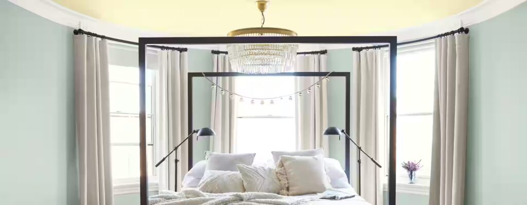
- Dusty Blue & Natural Linen: The ultimate coastal-inspired retreat. It feels breezy, light, and effortlessly relaxed.
- Warm Terracotta & Cream: Perfect for north-facing rooms, this palette absorbs and reflects light to create a cozy, sun-warmed hug.
- Deep Navy & Warm Gold: For those who love a bit of drama, deep navy walls paired with brushed gold accents create a luxurious, cocoon-like atmosphere.
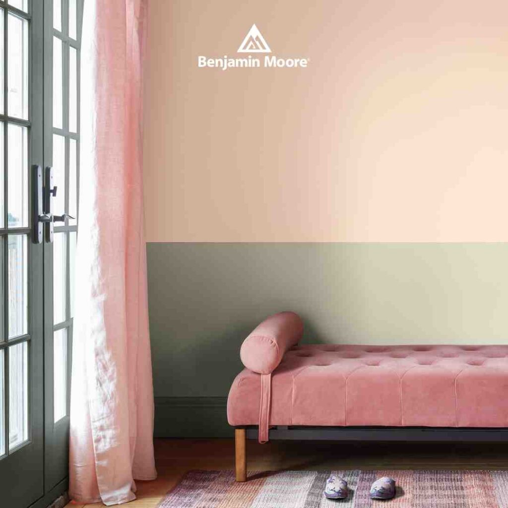
- Blush Pink & Warm Grey: A sophisticated, adult take on pink that feels romantic, soft, and incredibly flattering under warm evening light.
- Charcoal & Crisp White: A high-contrast, modern classic. When layered with plenty of texture, it feels clean, tailored, and calm.
Classic Neutrals and Warm Woods
If you prefer a bedroom that can easily adapt to changing decor over the years, you cannot go wrong with classic neutrals paired with natural wood finishes.
Warm whites and soft cream paints act as a luminous backdrop that reflects light beautifully without feeling sterile. When you pair these soft backdrops with the organic textures of natural oak, pine, or walnut furniture, you create a rich, multi-dimensional space that feels high-end yet incredibly inviting.
To find the perfect neutral base for your project, read The Definitive Guide to Cream Color Paint and browse our curated collection of Neutral Interior Paint Colors.
Designing with Good Color Combinations for Bedrooms
At The Color House, we know that choosing the right bedroom colors is a deeply personal journey. As a proud, women-owned local business with locations in North Kingstown, Cranston, Wakefield, Middletown, and Smithfield, we are dedicated to helping Rhode Island homeowners create spaces they love.
Whether you are looking for premium Benjamin Moore paints, need expert design advice, or want to schedule a personalized color consultation, our team is here to guide you every step of the way. Stop by one of our showrooms today, grab some Sample Bedroom Paint Colors, and let’s start creating your dream bedroom retreat!