
Why Cream Color Paint Is the Smartest Neutral for Your Home
Cream color paint is a warm, off-white shade that sits between pure white and beige — and it’s one of the most popular neutral choices for home interiors.
Quick answer: What is cream color paint?
| Feature | Details |
|---|---|
| Color family | Warm neutral, between white and beige |
| Common undertones | Yellow, peach, vanilla, soft orange |
| Typical LRV range | 71–82 (high light reflectance) |
| Best used in | Living rooms, kitchens, dining rooms, trim |
| Pairs well with | Sage green, soft pink, moody tones, warm neutrals |
| Top brands | Benjamin Moore |
Cream is warm without being yellow. It’s neutral without feeling cold or stark. That balance is why designers and homeowners keep coming back to it.
It works in almost any room, under almost any light. And with dozens of shades available — from pale vanilla to rich custard — there’s a cream for every space.
I’m Jean Hauser, owner of The Color House and a design professional with over two decades of experience helping Rhode Island homeowners find the perfect cream color paint for their walls, trim, and beyond. In this guide, I’ll walk you through everything you need to know to choose the right shade with confidence.

Understanding the Versatility of cream color paint
When we think of a “neutral” home, many of us default to white. But pure white can often feel clinical or cold, especially in the unique coastal light we get here in Rhode Island. This is where cream color paint shines. It offers the brightness of white but with an added layer of “soul” and comfort.
One of the most important technical aspects we discuss with our clients at The Color House is Light Reflectance Value (LRV). LRV is a scale from 0 to 100 that measures how much light a color reflects. A value of 0 is absolute black, and 100 is pure white. Most popular cream paints sit in the 70 to 82 range. This means they are highly reflective, making them excellent for brightening up a dim hallway or a north-facing living room, while still retaining enough pigment to feel like a “color” on the wall.
Another benefit of choosing a high-quality cream color paint is what we call “one-coat hide.” Premium lines, like those we carry from Benjamin Moore, are engineered with dense pigments that cover the previous color more effectively. While a true one-coat finish often depends on the surface condition and the specific product used, creams generally offer much better coverage than stark whites or deep jewel tones.

To help you visualize the technical differences, let’s look at how a few top-tier cream shades compare:
| Paint Color | LRV | Primary Undertone | Best Use |
|---|---|---|---|
| Benjamin Moore Cream 2159-60 | 81.46 | Yellow/Orange | Bright, airy kitchens |
| Benjamin Moore Windham Cream HC-6 | 79.04 | Peach | Sunlit bedrooms |
| Benjamin Moore Swans Mill Cream 260 | 79.11 | Pale Yellow | Elegant living rooms |
| Benjamin Moore Rich Cream 2153-60 | 76.61 | Beige/Peach | Cozy dining spaces |
| Benjamin Moore Navajo White OC-95 | 78.26 | Yellow/Tan | Classic trim and walls |
Whether you are looking for Cream Color Paint Samples to test in your own light or you’re specifically searching for The Best Cream Brick Paints You Can Buy Right Now, understanding these values is the first step toward a successful project.
Defining Cream vs. White and Beige
It is a common mistake to use the terms “off-white,” “cream,” and “beige” interchangeably. However, in professional design, they serve very different purposes.
- White and Off-White: These are the brightest options. Off-whites have a tiny hint of gray, blue, or yellow to take the edge off the brightness. They are “clean” but can sometimes feel a bit sharp.
- Cream color paint: Cream is significantly warmer. It is defined by its yellow, peach, or vanilla undertones. It’s meant to evoke a sense of harmony and calm. Think of it like a scoop of handmade vanilla ice cream—it’s luscious, inviting, and soft.
- Beige: Beige moves further away from white and into brown and tan. It has more “weight” and saturation. While cream feels like a sunlit room, beige feels like a sandy beach.
Choosing cream is about finding balance. It’s the “Goldilocks” of neutrals—not too cold, not too heavy. It creates an environment that sets the stage for relaxation and connection. For those exploring the Benjamin Moore Off-White Collection, you’ll find that cream shades are often the most flattering against skin tones, making them a favorite for bathrooms and dressing areas.
Top Benjamin Moore cream color paint Picks
At The Color House, we are proud to be a premier Benjamin Moore retailer. Their cream collection is extensive, featuring over 57 unique shades. Here are the “all-stars” we frequently recommend to our Rhode Island neighbors:
- Ancient Ivory OC-133: This is a staple for a reason. It is a sophisticated, versatile off-white that leans into the cream category without being “too yellow.” It’s perfect for open-concept homes where you want a consistent, peaceful flow.
- Windham Cream HC-6: Part of the Historical Collection, this is a sunlit, luscious cream with a whisper of peach. It’s a “happy” color that works beautifully in rooms that don’t get a lot of natural light, as it mimics the glow of the sun.
- Rich Cream 2153-60: If you want something that feels a bit more “decadent,” this is it. It’s a soft beige sweetened with peach, reminiscent of a crème custard. It’s an interior-only favorite that adds immediate coziness.
- Swans Mill Cream 260: A pale, creamy yellow that softly illuminates a space. It’s a classic choice for traditional homes, providing a sense of timeless elegance.
All of these colors benefit from Benjamin Moore’s proprietary Gennex Color Technology. This isn’t just a marketing term; it’s a specialized pigment system that makes the paint more durable and ensures the color stays vibrant for years. Most conventional tints weaken the paint film, but Gennex actually strengthens it.
If you’re in the area, stop by our Benjamin Moore Paint Store – NORTH SMITHFIELD, RI 02896-7609 to see these large-format swatches in person.
Choosing the Right Sheen for Your Space
Once you’ve picked your perfect cream color paint, the next hurdle is the sheen. The sheen (or finish) changes how the color looks and how well it stands up to your lifestyle.
- Flat/Matte: These have no shine. They are excellent at hiding imperfections in your drywall. We often recommend Matte for adult bedrooms or formal living rooms where you want a velvety, high-end look.
- Eggshell: This is the “standard” for most walls. It has a very low-level gloss—like the surface of a real egg—and is easy to wipe down. It’s the workhorse of the cream world.
- Satin: Satin has a bit more glow. It’s highly durable and moisture-resistant, making it our top pick for kitchens, bathrooms, and laundry rooms.
- Semi-Gloss: This is typically reserved for trim, doors, and crown molding. Painting your trim in a cream semi-gloss against a flatter cream wall creates a beautiful, subtle monochromatic contrast.
The higher the sheen, the more light reflects off the surface. A high-sheen cream will look brighter and “yellower” than a flat version of the same color.
Designing Your Home with Cream Accents and Indoor Window Treatments
One of the reasons we love cream color paint at The Color House is that it provides the perfect foundation for your indoor window treatments, blinds, and draperies to take center stage. Cream offers a warmth that complements fabric textures and wood tones far better than a stark white.
If you’re going for a monochromatic look—which is very “in” right now—you can layer different shades of cream. Use a slightly darker cream on the walls, a lighter cream on the trim, and then bring in cream-colored rugs and sofas. This creates a “quiet luxury” aesthetic that feels incredibly expensive and calming.
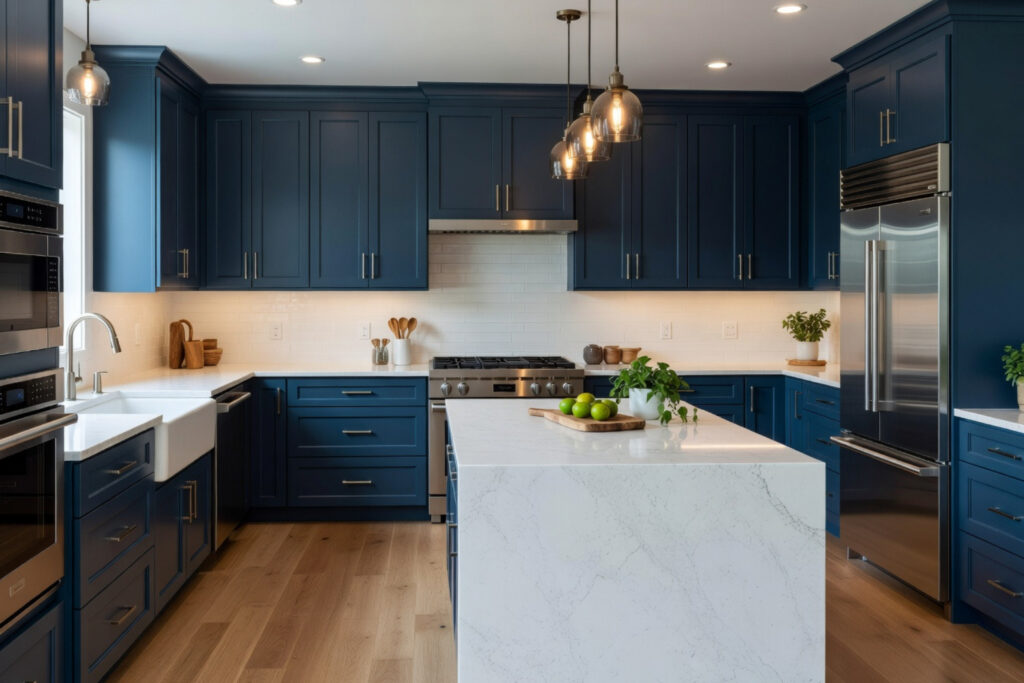
If you prefer contrast, cream is the perfect partner for “moody” colors. Try painting your kitchen cabinets in a deep navy or forest green and pairing them with cream color paint on the walls. The cream keeps the room from feeling like a cave, while the dark cabinets provide the drama.
For more personalized ideas on how to pull these elements together, you can Explore our decorating services.
Pairing Cream Color Paint with Indoor Blinds and Draperies
This is where many homeowners get stuck. You’ve painted the room a beautiful cream, but what do you do with the windows? At The Color House, we specialize in indoor window treatments, and we’ve seen how the right choice can transform a room.
Indoor Blinds: For a clean, modern look, consider wood or faux-wood blinds in a “Cloud” or “White Sand” finish. These provide privacy and light control while blending seamlessly with your cream walls. Avoid stark white blinds, as they can make your cream walls look “dirty” by comparison.
Draperies: This is where you can add texture. A heavy linen drapery in a natural oatmeal or cream color adds a layer of softness to the room. If your walls are a “peach-leaning” cream like Windham Cream, look for drapes with a bit of a warm beige thread to pull the look together.
Roman Shades: If you want a more tailored look, Roman shades in a textured fabric are excellent. They act like a piece of art for your window. Light-filtering fabrics are particularly beautiful with cream walls because they allow a soft, diffused glow to enter the room, which enhances the warmth of the paint.
For help selecting the right style, check out More info about window treatments.
Lighting and Room-Specific Applications
We can’t talk about cream color paint without talking about light. Light is the “secret ingredient” that changes everything.
- Natural Light (North-Facing): Rooms that face north get a cool, bluish light. This can make cool whites look gray or even blue. A warm cream is essential here to “cheat” some warmth into the space.
- Natural Light (South-Facing): These rooms are flooded with warm, golden light. A very yellow cream might look too intense here. In south-facing rooms, we often recommend “paler” creams like Ancient Ivory.
- Artificial Light: LED bulbs come in different “temperatures.” A “Warm White” bulb (2700K) will make your cream look even richer. A “Daylight” bulb (5000K) will make it look much whiter and cooler.
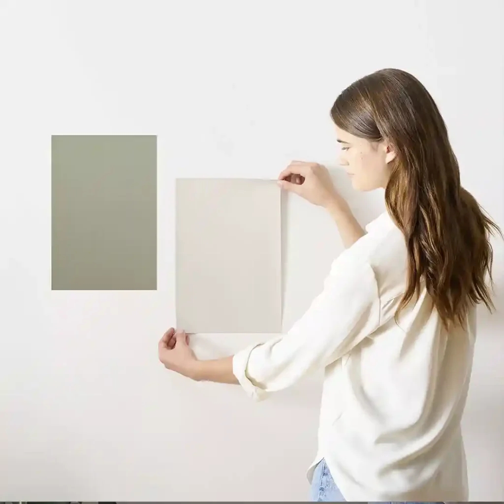
Before you commit to a full gallon, we always say: “Test, don’t guess!” You can read more in our guide, Dont get whipped your guide to cream paint testers and swatches.
Professional Guidance for Your Next Project
Choosing the right cream color paint and matching indoor blinds is a big decision. It’s the backdrop of your life—the place where you gather for holiday meals, relax after a long day, and wake up every morning. At The Color House, we don’t think you should have to make that choice alone.
As a women-owned business with deep roots in Rhode Island, we pride ourselves on offering a personalized alternative to the big-box stores. Whether you are in North Kingstown, Cranston, Wakefield, Middletown, or Smithfield, our team is ready to provide the expert advice and premium inventory you need to get the job done right.
From selecting the perfect Benjamin Moore shade to finding the indoor blinds that pull the whole room together, we are here to help. If you’re feeling overwhelmed by the 2,499 different beige and cream results you might find online, let us narrow it down for you based on your specific home and lighting.
Ready to start your transformation? Book a professional color consultation with us today, and let’s find your perfect cream together.