Master the Science of Selecting Bedroom Paint Colors
Choosing the right bedroom paint colors is about more than just aesthetics; it is a specialized science that balances biology with design. When we step into a room, our brains immediately begin processing the wavelengths of light reflecting off the walls. This isn’t just a “feeling”—it is a physiological response supported by over 128 years of psychological theory and research.
Research has shown that certain colors can actually influence our heart rate and stress levels. For example, looking at intense, vibrant reds can increase your heart rate and stimulate the adrenal glands, which is the last thing you want when trying to wind down after a long day in Cranston or Smithfield. Conversely, soft blues and greens are known to lower blood pressure and calm the nervous system.
Beyond just mood, the colors surrounding you can impact your cognitive performance. If your bedroom also serves as a home office, a color that is too distracting might hinder your focus, while a color that is too dreary might dampen your productivity.
Furthermore, we must consider the air we breathe. At The Color House, we strongly advocate for low-VOC (Volatile Organic Compounds) paints, especially for bedrooms. Since you spend roughly eight hours a night in this space, using paints with minimal emissions is a vital health consideration for your respiratory system and overall stress levels.

Prioritize Sleep-Inducing Bedroom Paint Colors
If your primary goal is a better night’s rest, science points toward certain hues for sleep that cue the brain to produce melatonin. Blue is widely considered the most relaxing color because the ganglion cells in our retinas—the same ones that manage our circadian rhythms—are most sensitive to blue.
At our Rhode Island showrooms, we often point customers toward Benjamin Moore favorites that achieve this timeless serenity:
- Glass Slipper: A barely-there, sophisticated blue that feels like a breath of fresh air without looking like a nursery.
- Palace Pearl: A cool, misty blue-green that brings an immediate sense of calm and intentionality to a master suite.
- White Dove: A designer-favorite neutral that offers soft warmth, preventing the room from feeling clinical or stark.
- Swiss Coffee: A versatile, creamy white that glows beautifully in the morning light.
Sage greens are another fantastic option, acting as an “earthy neutral” that connects the indoors with the natural beauty of the Rhode Island coast. These colors don’t just look good; they provide a stable environment for the mind to “unplug.” For those who prefer a more understated look, you can find more info about neutral interior paint colors to help guide your selection.
Evaluate Light and Room Orientation
One of the most common mistakes we see is choosing a color based on a tiny swatch under the fluorescent lights of a big-box store. Light is the most important variable in how bedroom paint colors actually appear on your walls.
- North-Facing Rooms: These rooms receive cool, bluish light. To prevent the space from feeling chilly, we recommend warmer neutrals or colors with a hint of yellow or pink undertone.
- South-Facing Rooms: These are flooded with warm, intense sunlight. This is the perfect place for “cool” colors like blues and grays, which will look balanced rather than icy.
- East/West-Facing Rooms: The light will shift dramatically from morning to evening. A color that looks like a beautiful peach in the morning might turn into a muddy orange by sunset.
You also need to understand Light Reflectance Value (LRV). This is a scale from 0 to 100 that tells you how much light a color reflects. In a small, dark bedroom in a historic North Kingstown home, a high LRV (lighter color) can help the space feel less claustrophobic. If you are struggling to visualize how light will affect your space, you can get more info about color consultation from our local experts.

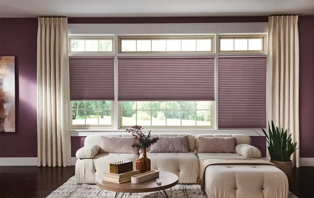
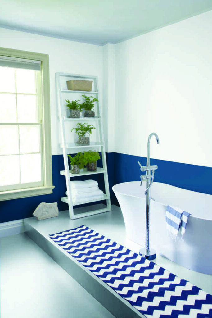
Coordinate with Window Treatments and Textiles
Your walls do not exist in a vacuum. To achieve a professional, cohesive design, your bedroom paint colors must play nice with your window treatments and bedding.
We often see homeowners choose a wall color and then struggle to find blinds or drapes that match. We recommend considering your window treatments early in the process. For instance, if you love the look of natural walnut wood tones in your furniture, a cool blue like Glass Slipper provides a stunning, high-contrast backdrop.
If you are using heavy custom draperies to block out light for better sleep, ensure the fabric texture complements the wall finish. A matte wall paired with linen duvets and soft cotton window treatments creates a “layered” look that feels expensive and cozy. If your room is small, matching your blinds or shutters to the wall color can create a seamless, unbroken line that makes the room feel much larger.
Expert Strategies for Applying Bedroom Paint Colors
Once you have narrowed down your hue, you must choose the right finish. The “sheen” of the paint affects both the color’s appearance and the room’s durability.
| Finish | Best Use | Why? |
|---|---|---|
| Matte | Adult Bedrooms | Hides imperfections; non-reflective for a soft, velvety look. |
| Eggshell | Guest Rooms | A hint of shine; easier to wipe down than matte but still soft. |
| Satin | Kids’ Bedrooms | Highly durable and easy to clean (fingerprints, scuffs). |
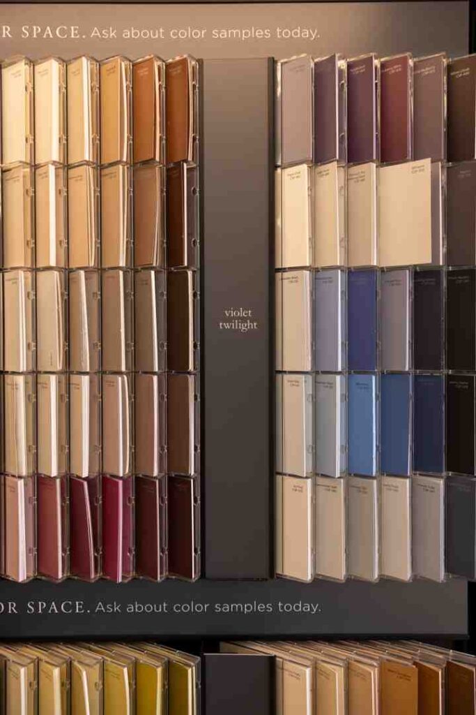
While classic neutrals are always in style, we are seeing exciting new trends for 2025 and 2026. Designers are moving away from “cool grays” and toward “grounded elegance.” This includes earthy clay tones, deep plums, and warm browns (think “Mocha Mousse”). These colors create a “cocooning” effect, making the bedroom feel like a true sanctuary. If you are new to DIY painting, we have more info about the best interior paint colors for beginners to ensure your first project is a success.
Test Your Bedroom Paint Colors Virtually and Physically
Never commit to a gallon of paint without testing it in your actual room. We always suggest a two-step testing process. First, use virtual visualizers (like the Benjamin Moore app) to see if a color family even works with your furniture.
Second, and most importantly, use physical samples. At The Color House, we offer sample bedroom paint colors and bedroom paint samples that allow you to see the real pigment on your walls.
A popular modern alternative to messy sample pots is the use of peel and stick samples. These are large swatches of real paint that you can move from wall to wall. This is crucial for checking “undertones”—that sneaky bit of green or purple that only shows up at 4:00 PM. For more tips on how to use these effectively, check out our peel and stick paint samples buying guide.
Avoid Common Application Mistakes
Even the most beautiful bedroom paint colors can look “off” if they aren’t applied correctly. Here are a few habits to ensure success:
- Don’t Skip the Prep: Clean your walls with a damp cloth and patch any holes. Paint won’t hide cracks; it will often highlight them.
- The Two-Coat Rule: Even if the can says “one-coat coverage,” two coats provide a much deeper, more accurate color and better durability.
- Consider the Ceiling: Most people default to “Stark White” for the ceiling, but this can create a harsh contrast. Try a “soft white” like Cloud White, or for a cozy, designer look, “color drench” the room by painting the ceiling the same color as the walls (or a 50% lighter version).
- Mind the Trim: Your trim and doors should coordinate. If you have chosen a warm gray wall, ensure your white trim has a similar warm undertone. You can find more help in choosing your perfect gray on our blog.
For more professional secrets on getting the perfect finish, read our beyond the swatch expert tips.
Conclusion: Creating Your Personal Sanctuary
Choosing bedroom paint colors is a personal journey, but you don’t have to walk it alone. Whether you are looking for a deep, moody plum for a romantic retreat or a crisp, sleep-inducing blue, the team at The Color House is here to help.
As a women-owned business with deep roots in Rhode Island—from Middletown to Smithfield—we pride ourselves on offering the individualized service and expert advice that big-box stores simply can’t match. We carry the full line of premium Benjamin Moore paints, ensuring your bedroom looks stunning for years to come.
Ready to transform your space? Visit us at any of our Rhode Island locations in North Kingstown, Cranston, Wakefield, Middletown, or Smithfield. Beyond just paint, we offer comprehensive decorating services to help you choose the perfect window treatments and finishes to complete your sanctuary. Let’s find your perfect color today.