Why Amber Interiors Paint Colors Are Taking Over Home Design
Amber interiors paint colors are the neutrals, warm whites, and moody darks made famous by Los Angeles-based designer Amber Lewis — and they’re everywhere right now. Achieving this look requires a careful balance of paint and indoor window treatments like blinds and draperies.
Here’s a quick look at her most-used paint colors across projects:
| Color | Brand | Best Use |
|---|---|---|
| White Heat | Dunn-Edwards | Walls |
| Wevet | Farrow & Ball | Contemporary spaces |
| Manor House Gray | Farrow & Ball | Cabinetry, trim |
| Down Pipe | Farrow & Ball | Cabinetry, interior accents |
| Amherst Gray | Benjamin Moore | Walls |
| Figueroa | Portola Paints | Walls, cabinetry |
Amber Lewis has built a cult following of 1.5 million on Instagram by covering entire homes in layered, California-cool neutrals — from creamy whites to earthy greiges and deep, dramatic darks. Her palettes feel effortless, but there’s real strategy behind every color choice, including how light filters through indoor blinds.
The challenge? What looks perfect in a sun-drenched California home can look completely different in a Rhode Island living room with less natural light. Undertones shift. Rooms change. That’s where having the right guidance makes all the difference.
I’m Jean Hauser, owner of The Color House and a Benjamin Moore color expert with over two decades of experience helping Rhode Island homeowners find their perfect amber interiors paint colors — and translate designer inspiration into results that actually work in their specific spaces. Whether you’re drawn to Amber Lewis’s warm whites or her moody cabinetry darks, this guide will walk you through exactly what you need to know.

Key amber interiors paint colors vocabulary:
The Signature Amber Interiors Paint Colors Palette
To understand the amber interiors paint colors aesthetic, we have to look at how Amber Lewis defines a neutral. In her world, a neutral isn’t just “beige.” It’s any color that lacks heavy saturation. This philosophy extends beyond the walls to your indoor window treatments, which act as a secondary layer of color and texture.
Whether it’s a light ivory or a dark, “creamy” forest green, the key is that the color feels organic and lived-in rather than rich and intense. This philosophy is why her style has such a massive following; 214 people searched for “Amber interiors paint colors” on Pinterest in just the last day alone! People are hungry for that Belgian farmhouse vibe that feels both high-end and incredibly comfortable.
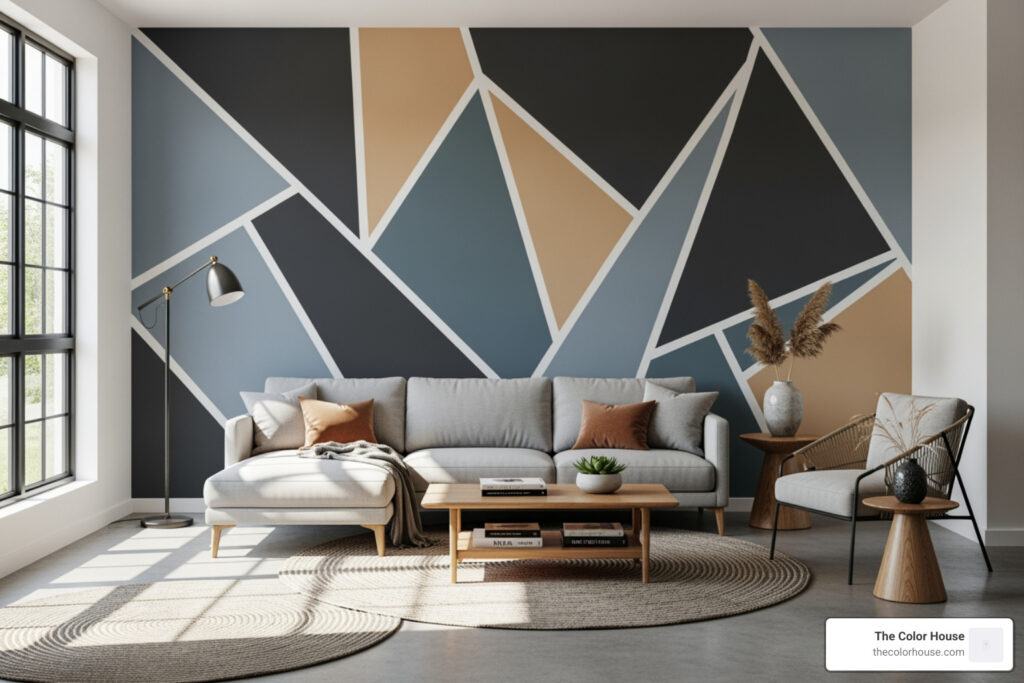
We often see these palettes categorized into three groups: the perfect whites, the moody darks, and the “in-between” greiges. By sticking to these Neutral Interior Paint Colors, you create a home that feels cohesive from the entryway to the primary bedroom. You can explore more visual inspiration for these combinations on the Amber Interiors Paint Colors Pinterest board.
Best White Amber Interiors Paint Colors for Bright Spaces
Finding the perfect white is notoriously difficult. As we often tell our clients in Cranston and Smithfield, white paint is a chameleon. Its appearance changes based on your wall texture, the environment outside your windows, and the specific lighting in your room.
Amber Lewis famously narrows down the infinite world of whites into a few “simple selects.” She often uses different whites in the same home — perhaps a crisp neutral white in the entryway to feel welcoming, and a warmer, creamier white in the family room to up the cozy factor.
If you are looking for that classic look, consider these top recommendations from Amber’s Favorite White Paint Colors:
- Wevet (Farrow & Ball): Amber calls this the “prettiest, warmest white.” It has a translucent quality (its name actually comes from an old Dorset word for spiderweb) that makes it perfect for contemporary spaces that still want to feel inviting.
- White Heat (Dunn-Edwards): A go-to for many of her iconic projects, providing a clean, bright backdrop that isn’t clinical.
- Swiss Coffee: A classic warm white that we frequently recommend at The Color House for those wanting a traditional, “home sweet home” feel.
When choosing between these, it helps to look at Cream Color Paint Samples to see how the yellow or brown undertones react to your specific space.
| Feature | White Dove (BM) | Wevet (F&B) | White Heat (DE) |
|---|---|---|---|
| Undertone | Soft, Gray-Yellow | Translucent, Warm | Clean, Neutral |
| Vibe | Classic & Versatile | Contemporary & Airy | Bright & Modern |
| Best Room | Living Rooms | Kitchens | Entryways |
Moody Darks and Earthy Amber Interiors Paint Colors
While the whites get a lot of the spotlight, the true “Amber Interiors” look relies on high-contrast, moody darks used on cabinetry, trim, and accent walls. These aren’t just “black” or “gray” — they are complex, desaturated colors that add depth.
One of her most frequently asked-about colors is Down Pipe. It is a deep lead gray that is incredibly hard to get wrong. Whether you use it on kitchen cabinetry or a focal wall in a den, it provides a dramatic anchor for the room. Another favorite is Manor House Gray, which she describes as a “dramatic, true gray” that holds its hue regardless of the lighting conditions — a rare feat for a gray!
For those who want a bit of color while staying within the neutral family, look toward earthy greens. An Olive Green Color Sample can show you how a dark forest green (like Midnight Spruce) can transform a kitchen island or a bathroom vanity into a sophisticated statement piece.
If you’re feeling stuck on which dark to choose, our guide on Choosing Your Perfect Gray breaks down the most popular options we see in Rhode Island homes. You can also see how these colors are applied in real-world settings by checking out the Most Frequently Asked: Paint Colors list from Amber’s own blog.
Layering Neutrals with Indoor Window Treatments
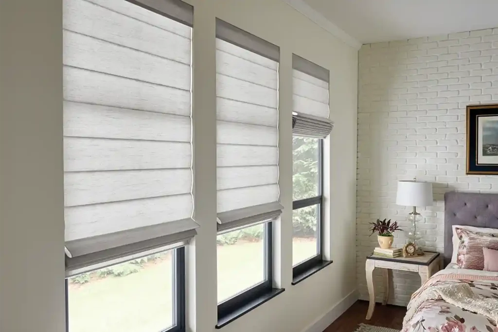
The secret to the “California Cool” aesthetic isn’t just the paint on the walls; it’s how that paint interacts with the rest of the room, specifically through indoor window treatments. Amber Lewis is a master of layering, and we always remind our customers that your Window Treatments are a massive part of your color palette.
To achieve this look, you must pair your amber interiors paint colors with organic textures. For an Amber-inspired room, we suggest focusing on these indoor elements:
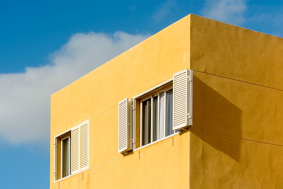
- Indoor Blinds: Opt for natural wood tones or woven grasses. These indoor blinds add a rhythmic texture that breaks up the flat surface of a painted wall and filters light in a way that enhances warm paint undertones.
- Draperies: Stick to heavy linens in oatmeal, sand, or soft greige. When draperies are hung high and wide, they soften the edges of the room and complement warm white walls perfectly, creating that signature layered look.
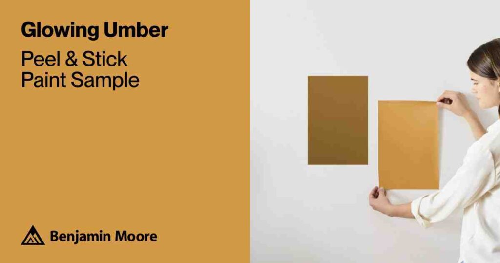
Don’t forget the wood tones in your furniture and flooring. A popular way to bring warmth into a space is through the wood itself. For example, learning Everything You Need To Know About The Armstrong Clark Amber Color can help you understand how to treat interior wood to match that golden, sun-drenched amber glow that Lewis loves.
Expert Tips for Applying Amber Lewis-Inspired Palettes

Applying these colors requires more than just a brush and a bucket. In our Rhode Island locations, from Middletown to Smithfield, we see how our local light — which can be quite blue and cool during our long winters — affects these warm California palettes.
One of Amber’s best tips is to “start small” with textured paints. She often uses Roman Clay or plaster finishes in powder rooms or bedrooms to add an organic, stone-like appeal. This mimics the look of limewash and gives the walls a soul that flat paint simply can’t match.
Amber’s Top 3 Cabinetry Colors:
- Midnight Spruce: A dark, moody green that feels timeless.
- Black Lead: Used for high-contrast Spanish-style or modern farmhouse kitchens.
- Revere Pewter: A classic “greige” that works beautifully on cabinetry when paired with darker hardware.
If you’re feeling overwhelmed, a Color Consultation can help you map out these transitions so your home feels like a curated gallery rather than a collection of random rooms.
Testing and Sampling Your Palette
We cannot stress this enough: Never commit to a color without sampling it in your own home.
Because amber interiors paint colors rely on subtle undertones, they are highly sensitive to natural light. A warm white that looks “creamy” in a South-facing Los Angeles living room might look “muddy” or “yellow” in a North-facing bedroom in Cranston. This is also why we recommend testing your samples alongside your chosen indoor blinds or draperies, as the way light filters through these window treatments will significantly impact the final look.
When looking at Bedroom Paint Samples, observe them at three different times of day:
- Morning: When the light is cool and crisp.
- Afternoon: When the sun is at its peak.
- Evening: Under your artificial indoor lighting.
You can also use virtual visualizers to get a general idea, but physical Sample Bedroom Paint Colors are the only way to see how the paint reacts to your specific wall texture. Amber Lewis herself recommends testing whites in the actual room light before committing, as even one drop of a different hue can shift the entire mood.
Choosing the Right Finish for Every Room
The “sheen” or finish of your paint is just as important as the color. For a true Amber Interiors look, you generally want to avoid high-gloss finishes on walls, as they feel too modern and “plastic.”
- Matte: Best for traditional spaces and walls with imperfections. It provides that soft, velvety look Amber is known for.
- Eggshell: The “goldilocks” of finishes. It has a slight hint of shine for durability and washability, making it perfect for hallways and living rooms.
- Satin/Semi-Gloss: Reserve these for your trim and cabinetry to provide a subtle contrast against matte walls.
For more details on which finish to choose, check out The Ultimate Guide To Best Indoor Paint Colors For Walls or our primer for The Best Interior Paint Colors For Beginners.
Finalizing Your Design with The Color House
At The Color House, we are proud to be Rhode Island’s premier destination for Benjamin Moore paints, which offer the depth and quality needed to achieve these high-end designer looks. Whether you are in North Kingstown or Wakefield, our team is ready to help you navigate the nuances of the amber interiors paint colors palette.
Choosing the right color is a journey. If you want to skip the guesswork, talking to a Color Specialist can save you time and money. We can help you find the Benjamin Moore equivalents to Amber’s favorite shades, ensuring you get the exact “California Cool” vibe with the durability required for New England living.
Ready to transform your space? Check out Everything You Need To Know About Hiring A Paint Color Consultant and let us help you bring the Amber Lewis aesthetic to your Rhode Island home!