The Best Benjamin Moore Kitchen Cabinet Colours at a Glance
Benjamin Moore kitchen cabinet colours offer one of the widest selections available, with over 3,500 colours compatible with their Advance® Interior paint — a formula specifically designed for cabinetry.
Here are the most popular picks by category:
| Category | Top Colours |
|---|---|
| Classic Whites | Chantilly Lace OC-65, Simply White OC-117, White Dove OC-17 |
| Off-Whites | Cloud Cover OC-25, Silver Satin OC-26, Swiss Coffee OC-45 |
| Blues & Teals | Hale Navy HC-154, Aegean Teal 2136-40, Polo Blue 2062-10 |
| Greens | October Mist 1495, Secret Path CSP-800 |
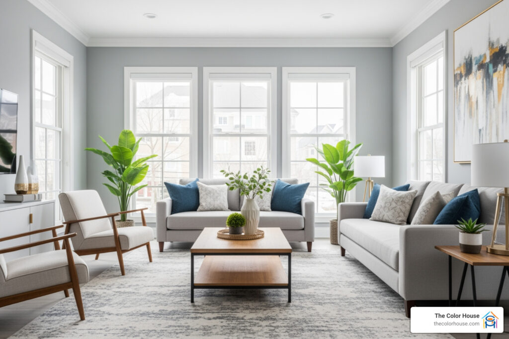
| Grays | Oxford Gray 2128-40, Revere Pewter HC-172 |
| Bold & Dark | Wrought Iron 2124-10, Lush AF-475 |
Whites and off-whites are the most popular choice by far. But blues, greens, and deep neutrals are close behind — and growing fast.
If you want a quick answer: Chantilly Lace OC-65, Simply White OC-117, and Hale Navy HC-154 are consistently the top three cabinet colours chosen by homeowners and designers alike.
I’m Jean Hauser, owner of The Color House — Rhode Island’s premier Benjamin Moore retailer — and I’ve spent over two decades helping homeowners navigate benjamin moore kitchen cabinet colours to find the perfect fit for their space. In the sections below, I’ll walk you through every major colour category, finish option, and coordination tips for indoor window treatments like blinds and draperies to make a confident, lasting choice.

Top Benjamin Moore Kitchen Cabinet Colours for Every Style
Choosing the right paint for your kitchen is about more than just picking a shade you like; it’s about setting the mood for the heart of your home. Whether you are aiming for a crisp, modern look or a cozy, farmhouse vibe, the benjamin moore kitchen cabinet colours you choose will dictate the energy of the room. At our Rhode Island showrooms, we see a massive variety of styles, but certain heavy hitters consistently rise to the top.
The Power of Pure Whites: Chantilly Lace and Simply White
If you want a kitchen that feels brand new and clinical in the best way possible, Chantilly Lace OC-65 is your best friend. Designers often call it the “classic little black dress” of paint because it has almost no undertones. It’s a pure, crisp white that looks stunning on perimeter cabinets.
For something with a tiny bit more “glow,” Simply White OC-117 is a perennial favorite. It has a slight yellow undertone that keeps it from feeling sterile, making it a go-to for kitchens with lots of natural light.
Warm Neutrals and Designer Picks
If pure white feels a bit too sharp, we often recommend Opaline OC-33. Interior designer Lauren Robbins notes that it is a favorite for creating a welcoming atmosphere, though she sometimes suggests cutting it by 50% to lean away from the yellow.
For those looking to make a statement without going “bright,” Polo Blue 2062-10 is an absolute showstopper. Designer Cynthia Ferguson loves this shade because it reads as a deep, regal blue in the daylight but can look almost black in the evening, providing a sophisticated, ever-changing look.
Comparison of Popular Cabinet Hues
To help you narrow it down, we’ve put together this comparison of our most-requested benjamin moore kitchen cabinet colours.
| Colour Name | Code | Mood | Best For |
|---|---|---|---|
| Chantilly Lace | OC-65 | Crisp & Clean | Modern Minimalism |
| Cloud Cover | OC-25 | Soft & Airy | Small Kitchens |
| Hale Navy | HC-154 | Classic & Bold | Kitchen Islands |
| Silver Satin | OC-26 | Subtle & Chic | Transitional Spaces |
| Simply White | OC-117 | Warm & Bright | Traditional Homes |
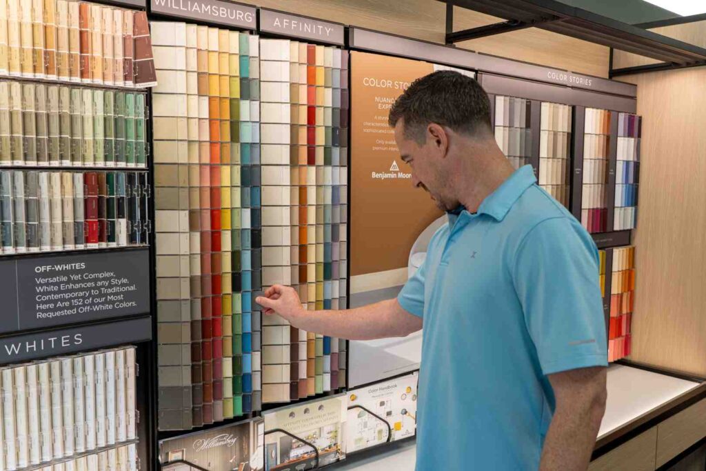
Still feeling overwhelmed? We offer professional color consultation services at our locations in Cranston, North Kingstown, and beyond to help you see these swatches in your own lighting.
Timeless and Low-Maintenance Benjamin Moore Kitchen Cabinet Colours
Let’s be honest: the kitchen is a high-traffic zone. Between spaghetti sauce splatters and sticky fingers, maintenance is a real concern. If you want a kitchen that looks great years from now without requiring a daily deep clean, you need to consider both the colour and the durability of the paint.
The “Hides Everything” Palette
Darker benjamin moore kitchen cabinet colours are the unsung heroes of low-maintenance living. Shades like forest green, charcoal gray, and deep navy are excellent at concealing minor scuffs and dust.
- Wrought Iron 2124-10: A moody, dark gray that feels incredibly luxe.
- Lush AF-475: A deep, forest green that brings the outdoors in while hiding kitchen grime.
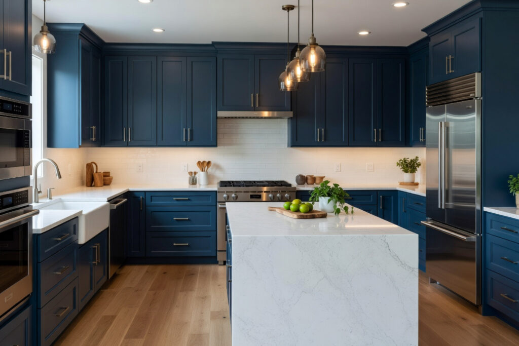
- Hale Navy HC-154: Perhaps the most famous navy in the world, it’s a “safe” bold choice that anchors a room.
Timeless Warmth: White Dove and Swiss Coffee
If you prefer a lighter look but want to avoid the “stark” feeling of pure white, White Dove OC-17 is the gold standard. It is a soft, creamy white that has been a bestseller for decades. It works beautifully with marble countertops and brass hardware.
Similarly, Swiss Coffee OC-45 is a designer favorite for a reason. It is the perfect neutral white that doesn’t feel too yellow or too beige. When you Transform Your Home with Benjamin Moore Paint, choosing a timeless shade like this ensures you won’t be repainting in three years when the latest trend fades.

Choosing the Best Benjamin Moore Kitchen Cabinet Colours to Maximize Space
Not everyone is blessed with a massive, open-concept kitchen. For our neighbors in places like Wakefield or Smithfield who might be working with cozy, historic galley kitchens, the right benjamin moore kitchen cabinet colours can perform a bit of “architectural magic.”
Light Reflection and Openness
To make a small kitchen look bigger, you want colours with high light reflectance values (LRV). Light neutrals and off-whites reflect natural and artificial light back into the room, pushing the walls “out” visually.
- Silver Satin OC-26: This is a very light gray that often looks like a “shadowed white.” It provides enough contrast against white walls to look intentional but keeps the space feeling airy.
- Paper White OC-55: A crisp, cool white with a hint of gray that feels fresh and expansive.
- Cloud Cover OC-25: A soft, misty off-white that creates a seamless, serene environment.
For a unique twist on a light neutral, check out our Detailed Guide to Benjamin Moore First Crush CSP-31. It’s a sophisticated, pale pinkish-beige that adds warmth without closing in the space.
Designer Favorites: From Bold Blues to Earthy Greens
In recent years, we’ve seen a shift away from the “all-white” kitchen toward more organic, earthy tones. Designers are increasingly reaching for greens and blues that feel grounded and calm.
The Rise of Green
Green is the new neutral. October Mist 1495, a former Color of the Year, is a gentle sage that looks stunning in rustic or modern kitchens alike. If you want something a bit deeper, Green Kitchen Cabinets are trending heavily in Rhode Island, especially in more coastal homes.
Designer Allison Garcy points to Secret Path CSP-800 as a top choice for cabinetry right now. It’s an earthy, muted green that feels sophisticated and anchors the lower cabinets perfectly when paired with a lighter upper.
Moody Blues and Teals
Aegean Teal 2136-40 remains one of the most popular benjamin moore kitchen cabinet colours for those who want a “pop” of colour that still feels timeless. It’s a blend of blue, green, and gray that works with almost any countertop material, from butcher block to quartz.
Achieving a Professional Finish and Coordinating Your Kitchen
You’ve picked the perfect colour — now how do you make it look like a professional did it? The secret isn’t just in the brushstroke; it’s in the product and the sheen. At The Color House, we recommend Benjamin Moore Advance® Interior for every cabinet project. It’s a waterborne alkyd paint that acts like an oil paint (leveling out beautifully with a hard finish) but cleans up with simple soap and water.
Choosing Your Sheen
The sheen you choose for your benjamin moore kitchen cabinet colours affects both the look and the durability:
- Pearl/Satin: This is the most popular choice for cabinets. It offers a soft glow that hides imperfections better than higher glosses but is still very easy to wipe down.
- Semi-Gloss: Excellent for high-moisture areas. It’s very durable and reflects more light, which can make colours appear more vibrant.
- High Gloss: If you want a “luxe” or “lacquered” look, this is it. It requires a perfectly smooth surface (lots of sanding!), but the result is incredibly high-end.
To learn more about matching your project to the right product, read our guide on how to Whip Up a New Look: Choosing the Perfect Paint for Your Kitchen.
Coordinating Cabinet Colours with Indoor Window Treatments, Blinds, and Draperies
A kitchen isn’t finished until the windows are dressed. When selecting your benjamin moore kitchen cabinet colours, you must consider how they will interact with your window treatments.
For a cohesive look, focus on how indoor blinds and draperies can enhance your cabinetry. If you have dark, moody cabinets like Hale Navy, consider light-coloured Roman shades or creamy white draperies to provide contrast. Conversely, if you have a monochromatic white kitchen, you can add texture and warmth with woven wood blinds or patterned fabric shades. The goal is to create a harmonious flow where the paint and the fabrics complement each other’s undertones, ensuring your blinds and draperies feel like an integral part of the room’s design.
How to Refinish Cabinets with Benjamin Moore Advance
Painting cabinets is a labor of love, but it’s the most cost-effective way to transform your kitchen. Here is the “Color House Way” to get a factory-like finish:
- Prep is King: Remove all doors, drawers, and hardware. Clean every surface with a degreaser. If there’s grease left on the wood, the paint won’t stick!
- Sanding: Lightly sand the surfaces to “scuff” the existing finish. Wipe away all dust with a tack cloth.
- Priming: Use Benjamin Moore Fresh Start High-Hiding All Purpose Primer. This ensures your new colour (especially if it’s light) covers the old wood perfectly.
- Painting: Apply two coats of Advance Interior. The most important rule? Wait. Advance needs 16–24 hours of dry time between coats. If you rush it, you’ll end up with a tacky mess.
- Reassemble: Wait at least 3-5 days before putting the hardware back on to ensure the paint has had time to begin its curing process.
For a deeper dive into the DIY process, check out our DIYer’s Guide to Cabinet Painting Success.
Expert Advice from The Color House
At The Color House, we are more than just a paint store. As a women-owned business serving the Rhode Island community for years, we pride ourselves on providing the kind of individualized service you just can’t find at big-box retailers. Whether you are visiting us in Middletown or Smithfield, our team is ready to help you navigate the thousands of benjamin moore kitchen cabinet colours to find the one that fits your life.
We understand the local light in New England—how a cool gray might look blue on a rainy day in Narragansett or how a warm white can glow during a Cranston sunset. We have the largest inventory in the state, meaning we have the Benjamin Moore products you need in stock and ready to go.
If you are ready to start your transformation, stop by one of our locations or check out our Benjamin Moore Cranston Complete Guide for more local inspiration. We can’t wait to help you cook up something beautiful!
FAQs About Benjamin Moore Kitchen Cabinet Colours
Which Benjamin Moore paint is best for kitchen cabinets? Without a doubt, Advance® Interior is the gold standard. It provides a furniture-quality finish that is incredibly hard and durable once cured, making it perfect for the “slams and bams” of a busy kitchen.
What is the most popular white for kitchen cabinets? While it’s a tight race, White Dove OC-17 and Chantilly Lace OC-65 are the top two. White Dove is preferred for its warmth, while Chantilly Lace is the choice for a “true” white.
How do I coordinate my cabinet colour with my window treatments? Think about contrast and undertones. If your cabinets are a warm white like White Dove, look for indoor blinds or draperies in natural wood tones or warm linens. For cooler cabinet colours, sleek roller blinds or grey-toned draperies work beautifully to maintain a modern, cohesive aesthetic.
Should my island be a different colour than my cabinets? We love a two-tone kitchen! A common designer trick is to use a light neutral like Simply White for the perimeter cabinets and a bold anchor like Hale Navy or Wrought Iron for the island. It adds depth and a focal point to the room.
Do I need to sand my cabinets before using Benjamin Moore paint? Yes. Even if you use a high-quality primer, a light sanding helps the paint “bite” into the surface, ensuring your beautiful new colour doesn’t peel off in a year.