Why an Agreeable Gray Bathroom Is a Timeless Design Choice
An agreeable gray bathroom uses this iconic warm greige — a versatile shade with subtle green undertones and an LRV of 60 — to create a calm, versatile space that works with almost any fixture, tile, or vanity style.
Here is a quick look at what makes it work:
| Element | Recommendation |
|---|---|
| Paint color | Agreeable Gray |
| Finish | Satin or semi-gloss for moisture resistance |
| Best lighting | Warm white LEDs, 2700K–3000K |
| Trim color | Crisp white (e.g., Benjamin Moore White Dove) |
| Vanity pairing | White cabinets, warm wood, or matte black accents |
| Works best in | Well-lit bathrooms with warm or neutral light sources |
| Avoid in | North-facing or very low-light bathrooms with no warm bulbs |
Agreeable Gray has held a top spot among the most popular neutral colors for years — and for good reason. It sits right in the sweet spot between warm and cool, so it feels fresh without feeling cold, and cozy without feeling dated. It is the kind of color that lets your tiles, fixtures, and accessories do the talking.
That said, it is not a magic bullet. How it looks in your bathroom depends heavily on your lighting, your existing finishes, and how you pair it. Get those things right, and the result is a space that feels like a boutique hotel. Get them wrong, and it can read dingy or flat.
I’m Jean Hauser, owner of The Color House and a paint and design expert with over two decades of experience helping Rhode Island homeowners get color decisions right — including dozens of agreeable gray bathroom projects where the difference came down to bulb temperature and trim choice. In this guide, I’ll walk you through everything you need to know to pull it off confidently.

Designing the Perfect Agreeable Gray Bathroom
When we talk about an agreeable gray bathroom, we are entering “greige.” If you have ever struggled to choose between a sterile gray and a dated beige, this color is your olive branch. It is a chameleon that adapts to its surroundings, which is exactly why it remains a foundational neutral in homes from North Kingstown to Smithfield.
Understanding LRV and Undertones
The technical side of color is where the magic happens. Agreeable Gray has a Light Reflectance Value (LRV) of 60. On a scale where 0 is absolute black and 100 is pure white, 60 is the “happy spot.” It is light enough to make a small powder room feel airy but has enough “body” to provide a soft contrast against white trim.
Its undertones are primarily warm green, which keeps it from looking like cold, blue-toned concrete. However, there is a tiny, barely-there splash of violet tucked inside. In a well-lit master suite, you will never see it. But in a dark, North-facing bathroom, that violet can sometimes make the walls look a bit “fleshy” or muddy. This is why we always emphasize that the best way to choose a color is to see it in your actual space. If you are feeling overwhelmed, our color consultations can help you navigate these tricky shifts.
Why It Works for Rhode Island Homes
In Rhode Island, our light changes dramatically with the seasons. We have those bright, crisp coastal summers and long, gray winters. Agreeable Gray is popular here because it provides a “warm hug” during those gloomy January days without feeling heavy when the July sun is streaming through the window.

For a deeper dive into how this shade stacks up against other neutrals, check out our guide on choosing-your-perfect-gray-popular-paint-colors-reviewed.
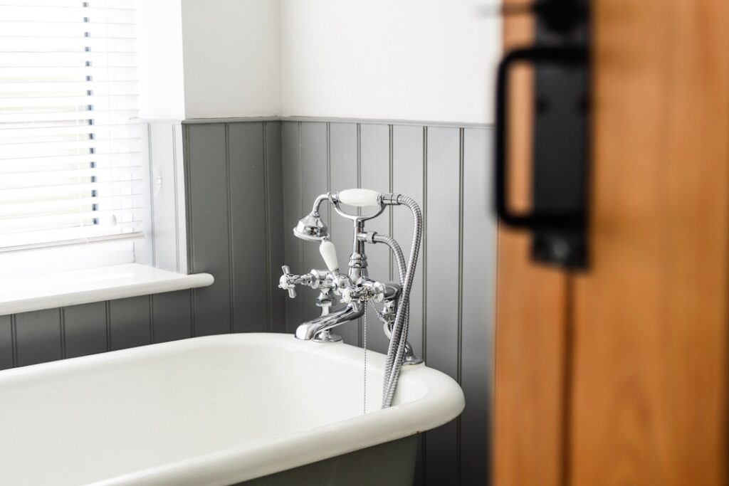
Lighting and Texture in an Agreeable Gray Bathroom
Lighting is the most important factor in whether your agreeable gray bathroom looks stunning or “blah.” Because this color is so reactive, it essentially takes on the personality of your light bulbs.
- Natural Light: If your bathroom has a large window, Agreeable Gray will look like a soft, glowing off-white. In South-facing rooms, it stays warm and inviting. In North-facing rooms, the cool blue light from outside can make it look a bit flatter and grayer.
- Artificial Light: Most bathrooms rely on artificial light for a large portion of the day. We recommend using warm white LED bulbs in the 2700K to 3000K range. This temperature enhances the warm beige side of the paint. Avoid “Daylight” bulbs (5000K+), which can make the color look blue-gray and a bit sterile.
- Texture: To keep a neutral bathroom from feeling boring, you need texture. Think about pairing your walls with a matte hexagon floor tile, a plush white rug, or even a small eucalyptus hanging in the shower. These elements give the eye something to do and make the gray feel like a sophisticated backdrop rather than just a plain wall.
For more inspiration on using neutrals effectively, explore our neutral-interior-paint-colors resources.
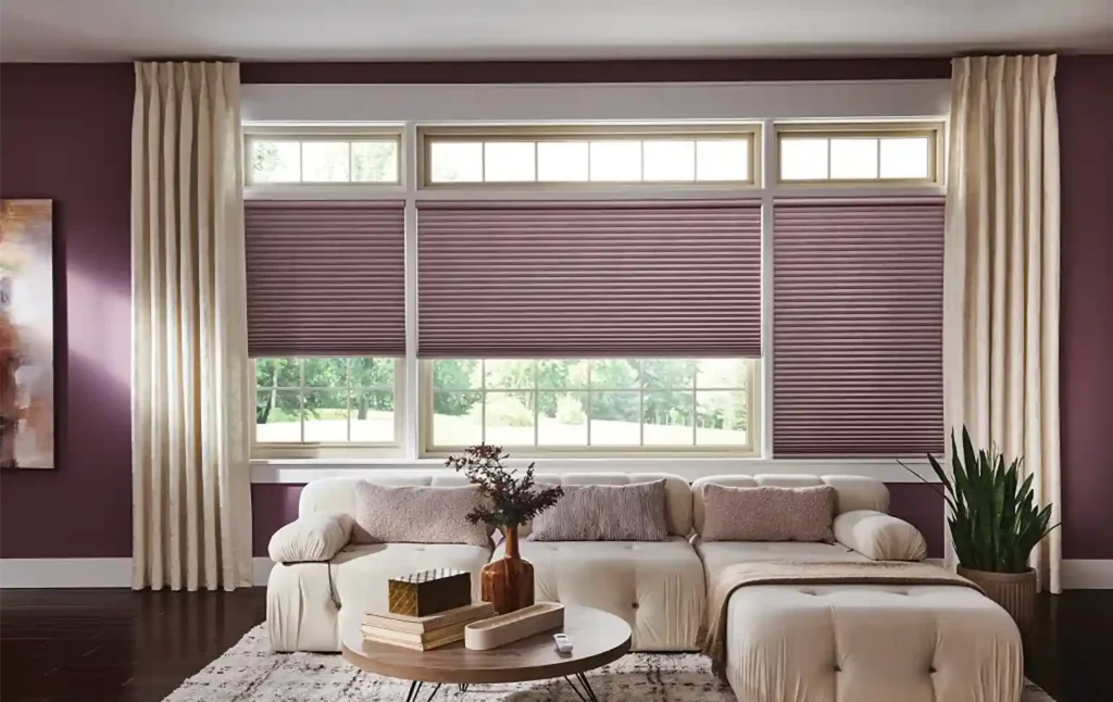
Coordinating Window Treatments for an Agreeable Gray Bathroom
A bathroom isn’t just about paint and tile; it’s about privacy and light control. When designing an agreeable gray bathroom, your window treatments should complement the softness of the walls.
- Moisture-Resistant Blinds: Bathrooms are high-humidity environments. We often recommend high-quality faux wood blinds. They provide the warmth of real wood but won’t warp or peel when the shower gets steamy. A crisp white blind against an Agreeable Gray wall creates a clean, classic look.
- Roman Shades: If you want a softer, more “spa-like” feel, Roman shades in a light-filtering fabric are a fantastic choice. Look for linen-look polyesters that can handle the dampness. A soft cream or a subtle greige pattern can add just enough visual interest without competing with the wall color.
- Draperies: In larger master bathrooms with a soaking tub, floor-to-ceiling draperies can add a touch of luxury. Stick to light, airy fabrics that allow light to filter through while maintaining privacy.
You can learn more about our custom options by visiting our page on window treatments.
Cabinetry and Vanity Pairings
One of the best things about an agreeable gray bathroom is how well it plays with different cabinetry finishes.
- The Classic White Vanity: This is the most popular choice for a reason. A bright white vanity (like one painted in Benjamin Moore’s Simply White) pops beautifully against the 60 LRV of the walls. It creates a high-contrast, clean aesthetic that feels timeless.
- Warm Wood Tones: If you want to lean into the “warm” part of greige, pair it with a light oak or walnut vanity. The wood grains pull out the beige undertones in the paint, making the whole room feel grounded and organic.
- Matte Black Hardware: For a modern “farmhouse” or contemporary look, swap out your old chrome for matte black faucets and cabinet pulls. The black provides a sharp, sophisticated anchor to the soft gray walls.
- Bold Accents: Don’t be afraid of color! Agreeable Gray is a perfect “foundation” color. It looks incredible next to a navy blue vanity or even deep teal accents.
If you are just starting your DIY journey, our tips on the-best-interior-paint-colors-for-beginners can help you build a cohesive palette from the ground up.
Conclusion: Expert Advice from The Color House
At The Color House, we believe your home should be your sanctuary. Whether you are remodeling a historic Victorian in Cranston or updating a modern condo in Middletown, an agreeable gray bathroom offers a versatile foundation that will serve you for years to come.
As a women-owned business with deep roots in Rhode Island, we pride ourselves on offering a personalized alternative to the big-box stores. We don’t just sell you a gallon of paint; we help you find the right sheen, the right primer, and the right tools to ensure your project is a success.
Testing Your Palette with Samples
The biggest mistake we see homeowners make is choosing a color under the fluorescent lights of a store and then being surprised when it looks different at home. Before you commit, we highly recommend using samples.
Peel-and-stick samples are a game-changer. They allow you to move the color around the room to see how it looks next to your vanity, your tile, and in the dark corners behind the door. You can find more details in our peel-stick-paint-samples-buying-guide/.
Color is subjective. What looks like a perfect warm gray in your neighbor’s house might look slightly violet in yours. For more professional advice on the sampling process, read our beyond-the-swatch-expert-tips-for-choosing-home-paint-colors guide.
Avoiding Common Design Mistakes
To ensure your agreeable gray bathroom project goes smoothly, keep these three tips in mind:
- Mind the Sheen: Bathrooms are high-traffic, high-moisture areas. Never use a flat finish on bathroom walls. Instead, opt for a satin or semi-gloss finish. These sheens provide a protective barrier against moisture and are much easier to wipe clean if soap or toothpaste splashes. You can find all the necessary interior-paint-supplies at any of our Rhode Island locations.
- Watch Your Trim: Avoid using “creamy” whites with yellow undertones for your trim. Because Agreeable Gray is already quite warm, a yellow-toned trim can make the whole room look a bit dingy or “dirty.” Stick to clean, crisp whites.
- Bulb Temperature Matters: We can’t say it enough—if your bathroom feels “cold” or “grim” after painting it Agreeable Gray, check your light bulbs first. Switching to a warmer 2700K bulb can instantly transform the space.
Ready to start your transformation? Stop by one of our locations in North Kingstown, Cranston, Wakefield, Middletown, or Smithfield. We have the largest inventory in the state and a team of experts ready to help you create the timeless bathroom of your dreams.