
Why Is Color Important? More Than Just What You See
Why is color important? Because it shapes how you feel, what you buy, how you perform, and how others perceive you — often before you consciously register anything at all.
Here is a quick summary:
- Mood and emotion: Colors trigger emotional and physiological responses. Blues calm. Reds energize. Greens restore.
- Decision-making: People form a judgment about a product within 90 seconds, and up to 90% of that assessment is based on color alone.
- Brand recognition: Color increases brand recognition by up to 80%.
- Purchasing behavior: 85% of consumers cite color as the primary reason they buy a product.
- Communication: Color conveys meaning faster than words — your brain processes it before you even start reading.
- Environment and well-being: The colors around you in your home or workplace directly affect your stress levels, sleep quality, and productivity.
Color is not decoration. It is one of the most powerful forces shaping human experience — and most people never think about it intentionally.
Whether you are choosing paint for a bedroom, picking a logo, or selecting window treatments for your living room, every color decision carries real consequences.
I’m Jean Hauser, owner of The Color House and a paint and interior design professional with over two decades of experience helping Rhode Island homeowners understand why color is important and how to use it with confidence. In this guide, I’ll walk you through the science, psychology, and practical strategies behind color — so you can make choices that truly transform your space.

Learn more about Why is color important?:
Why Is Color Important? The Science and Psychology of Perception
To truly understand why color dictates so much of our daily lives, we have to look at the physics of light and the biology of our eyes. Color is not an inherent property of objects; rather, it is how our brains interpret reflected light.
When light hits an object, the object absorbs certain wavelengths and reflects others. The human eye can only perceive a tiny fraction of the electromagnetic spectrum—known as the visible spectrum—which ranges from roughly 380 to 700 nanometers. Red light sits at the longer wavelength end (around 700nm), while violet light sits at the shorter end (around 400nm).

When these reflected wavelengths hit your retina, specialized photoreceptor cells called cones send electrical signals to your visual cortex. Remarkably, this process relies on preattentive processing. This means your brain registers and decodes color 60,000 times faster than it processes written text! Before you even realize you are looking at a stop sign, your brain has already registered the color red and triggered a state of alertness.
Because of this hardwired biological path, color does not just sit quietly on a wall; it actively interacts with our nervous system. For a deeper academic look at how these visual signals translate into behavioral changes, explore this comprehensive review on Scientific research on color psychology.
Why Is Color Important in Daily Life and Human Psychology?
Because color bypasses our conscious filters, it acts as a constant, silent dial for our emotions, cognitive performance, and behavior. A poorly chosen color in a home office can trigger feelings of restlessness, while the right shade can help you focus for hours.
For instance, studies show that visual environments can directly impact academic performance. In one famous study, students shown red numbers before an exam scored significantly lower than those shown green or black numbers, likely because red is unconsciously associated with failure, danger, or mistakes.
Different colors prompt highly consistent psychological responses across populations. We can see these patterns in how we react to the world around us:
| Color | Primary Emotional & Psychological Associations | Common Behavioral Triggers |
|---|---|---|
| Red | Passion, urgency, excitement, physical energy | Increases heart rate; stimulates appetite and quick action |
| Blue | Trust, tranquility, stability, peace | Lowers pulse rate; encourages deep focus and relaxation |
| Yellow | Optimism, warmth, cheerfulness, caution | Captures attention rapidly; can cause eye fatigue if overused |
| Green | Growth, safety, restoration, balance | Reduces stress; promotes feelings of health and renewal |
| Purple | Luxury, wisdom, creativity, calmness | Inspires imaginative thinking; historically associated with royalty |
| Orange | Enthusiasm, playfulness, comfort, hunger | Encourages social interaction; draws eyes to calls-to-action |
To learn more about how these statistics translate to real-world consumer behavior, check out these More statistics on color psychology.
Why Is Color Important in Branding, Marketing, and Communication?
In the business world, color is not a design variable; it is a conversion variable. Brands use color to establish instant visual shorthand, communicate values, and drive sales.
Consider the 90-second rule: research shows that people make a subconscious judgment about a product within 90 seconds of first viewing it, and between 62% and 90% of that assessment is based on color alone. Furthermore, 85% of consumers cite color as the primary reason they purchase a specific product, and a consistent color scheme can boost brand recognition by up to 80%.
This is why major financial institutions and tech companies rely heavily on blue—it signals security and reliability. However, “blue means trust” is sometimes an oversimplification. Often, companies use blue simply because their competitors do, establishing an industry convention.
To see how businesses strategically implement these visual cues to guide customer journeys, read about More info on color psychology in marketing.
In digital spaces, color is critical for guiding user behavior. A high-contrast Call-to-Action (CTA) button can dramatically increase click-through rates. For tips on using color to improve online user experiences, refer to this guide on More info on color in UI/UX design.
When building a business identity, choosing too many colors can dilute your message. Brands with one or two dominant colors are recognized much faster than those with a cluttered palette. You can read more on structuring a strong visual identity in this guide on More info on brand color strategy.
Color acts as a critical brand signal that works faster than logos or text, creating an immediate emotional connection. Learn how to leverage color as a core asset in this article on More info on brand signals.
Warm vs. Cool Tones: Emotional and Physiological Effects
We broadly divide the color wheel into two categories: warm and cool tones. This division is not just aesthetic; it has measurable physiological effects on the human body.

- Warm Colors (Reds, Oranges, Yellows): Known as active colors, these shades evoke feelings of warmth, energy, and excitement. Physiologically, exposure to intense warm colors can raise your heart rate, elevate blood pressure, and stimulate respiration. This makes them fantastic for social spaces like dining rooms and kitchens, but potentially overwhelming for areas meant for rest.
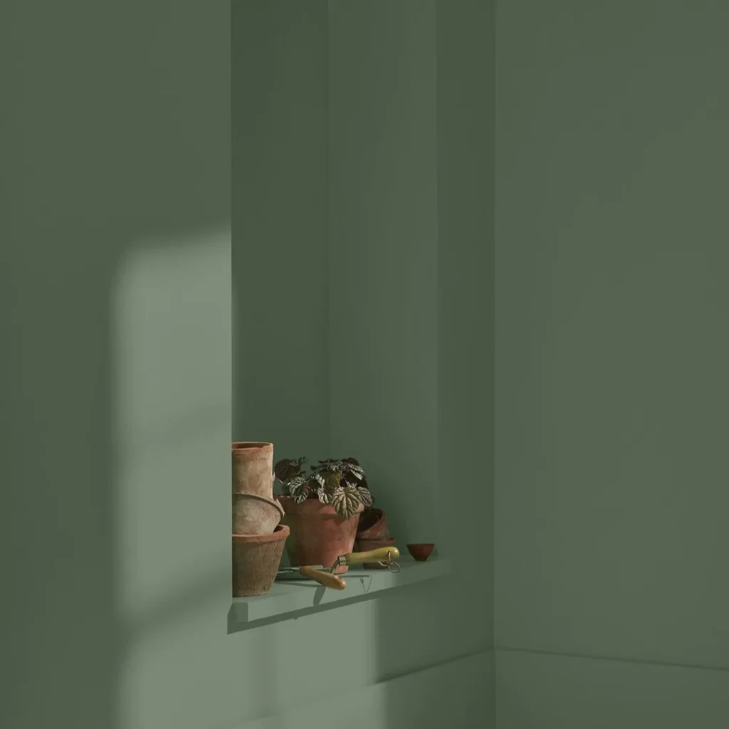
- Cool Colors (Blues, Greens, Purples): Known as passive colors, these hues promote relaxation, tranquility, and calmness. Cool colors have been shown to lower heart rates and body temperature, making them ideal for bedrooms, bathrooms, and quiet study areas.
Using historical color palettes can also evoke distinct feelings of timelessness and comfort. If you are interested in how classic color choices have shaped historic homes, explore the Newport Restoration Foundation’s work on Paint history and restoration.
Designing with Intention: Transforming Spaces and Brand Experiences
At The Color House, we believe your home should be a reflection of the life you want to cultivate. Understanding how colors interact is the first step to creating a balanced, beautiful home. By using a color wheel, you can easily plan cohesive color schemes:
- Monochromatic: Using different values (tints, tones, and shades) of a single color. This creates a clean, sophisticated, and highly peaceful look.
- Complementary: Pairing colors directly opposite each other on the color wheel (like blue and orange). This creates high contrast and vibrant energy.
- Triad: Using three colors spaced equally around the wheel (like red, yellow, and blue) for a playful, dynamic feel.
For practical advice on selecting these palettes for your walls, read our More info on choosing home paint colors and discover how to create beautiful flow with our guide on More info on room color combos.
Designing Harmonious Interiors: Choosing the Perfect Palette
To keep a room from feeling chaotic, interior designers rely on the 60-30-10 rule:
- 60% Dominant Color: Usually a neutral or soft tone on the walls, anchoring the space.
- 30% Secondary Color: A supportive hue used on furniture, large rugs, or window treatments to add depth.
- 10% Accent Color: A bold pop of color used sparingly on pillows, artwork, or decor accessories.
Beyond the color itself, the paint finish you choose will alter how the color looks and behaves in your space:
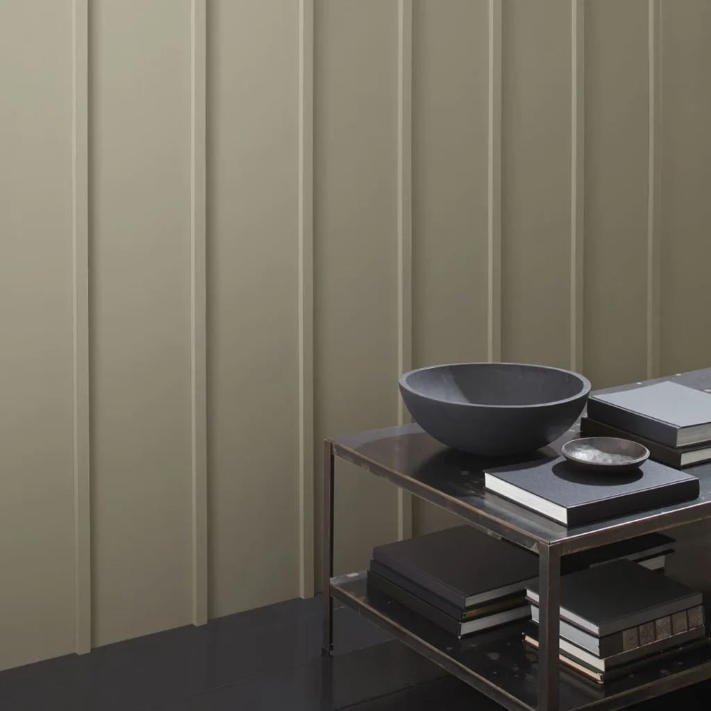
- Matte/Flat: Absorbs light, hiding wall imperfections beautifully. Colors appear soft and true to the swatch, making it ideal for low-traffic areas like ceilings and adult bedrooms.
- Eggshell & Satin: Offer a soft, low-sheen finish that is easy to clean, making them the gold standard for living rooms, foyers, and family spaces.
- Semi-Gloss & High-Gloss: Reflect light dramatically, making colors appear slightly darker and richer. They are highly durable and perfect for trim, doors, kitchens, and bathrooms.
If you are feeling overwhelmed by the endless options, we can help. Read about the benefits of working with a professional in our article on More info on expert color consulting, or book a personalized session directly by visiting our guide on More info on painting color consultations.
Selecting the Right Colors for Indoor Window Treatments, Blinds, and Draperies
Indoor window treatments are a vital design element that bridge the gap between your walls, your furniture, and the natural light entering your home. Whether you select custom indoor draperies, Roman shades, or wooden blinds, the color you choose will dictate how light filters into your room and how cohesive the space feels.
When selecting colors for indoor window treatments, consider these design strategies:
- Blending with the Walls: Choosing draperies or blinds in a similar shade to your wall color creates a seamless, minimalist look that makes small rooms feel much larger and more open.
- Creating a Focal Point: Selecting a bold, contrasting color or a rich pattern for your draperies turns your windows into a stunning architectural feature.
- Managing Light Filtration: Light-colored sheer draperies soften incoming sunlight while keeping the room bright and airy. Darker, heavier draperies or blackout linings block light completely, perfect for promoting deep, restful sleep in bedrooms.
To explore premium options and get hands-on design advice, keep in mind that our North Kingstown and Cranston stores are our only showrooms for window treatments. Stop by either location to browse our extensive collections of blinds, shades, and custom fabrics. For more inspiration before you visit, check out More info on window treatments.
Overcoming Design Challenges: Color Blindness and Lighting Variations
Designing a beautiful space also means designing an accessible and functional one. Approximately 8% of men and 0.5% of women worldwide live with some form of color blindness. When designing public, commercial, or even shared residential spaces, relying solely on color to convey important information can exclude these individuals. Pairing color with clear text labels, distinct patterns, or intuitive icons ensures your design is inclusive and WCAG compliant.
Furthermore, colors are chameleons—they change constantly depending on the light. A soft gray that looks warm and inviting in our showroom might look cold and blue under your home’s LED bulbs or in a north-facing room.
This is why we highly recommend testing paint colors in your actual space. We proudly stock premium Benjamin Moore paints because of their exceptional color depth, durability, and rich pigments that hold up beautifully under any lighting condition.
At The Color House, we have been serving the Rhode Island community for years, offering a personalized alternative to big-box retailers. If you want to make sure your next project is a success, let our local experts guide you. You can easily schedule an appointment through our More info on color consultation services or visit us at any of our convenient locations across the state:
- North Kingstown, RI
- Cranston, RI
- Wakefield, RI
- Middletown, RI
- Smithfield, RI
Stop by today, grab some Benjamin Moore samples, and let us help you bring your dream space to life!