Why Warm Paint Colors Transform Any Room Into a Cozy Retreat
Warm paint colors are shades that pull from the red, yellow, and orange families — and they’re one of the most reliable ways to make a room feel inviting, comfortable, and alive.
Here’s a quick look at the most popular warm paint colors homeowners choose:
| Color | Brand | Undertone | Best For |
|---|---|---|---|
| Accessible Beige | Benjamin Moore | Yellow-orange | Whole home |
| Ballet White | Benjamin Moore | Soft yellow | North-facing rooms |
| Navajo White | Benjamin Moore | Creamy orange | Open living areas |
| Swiss Coffee | Benjamin Moore | Warm cream | Any room |
| Chestertown Buff | Benjamin Moore | Golden yellow | Sunny rooms |
| Pomegranate | Benjamin Moore | Muted red-pink | Dining rooms, powder rooms |
Warm colors don’t have to be bold or dramatic. Even a soft beige or creamy white with the right undertone can make a space feel noticeably warmer and more welcoming than a cool gray or stark white ever could.
The key is understanding undertones — that hidden hue beneath the surface color. A gray with pink undertones reads warm. A white with yellow undertones feels cozy. A beige with green undertones? That can actually feel cold and flat.
Choosing the wrong undertone is one of the most common — and costly — mistakes homeowners make.
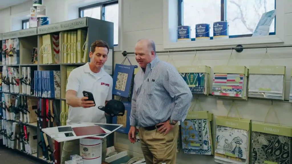
I’m Jean Hauser, owner of The Color House, Rhode Island’s premier Benjamin Moore retailer, and I’ve spent more than two decades helping homeowners navigate warm paint colors to create spaces they truly love. In this guide, I’ll walk you through everything you need to pick the right warm shade with confidence—especially when you’re coordinating paint with indoor window treatments, blinds, and draperies for a cohesive, finished look.

Essential Warm paint colors terms:
Choosing the Best Warm Paint Colors for Your Home
When we talk about Warm paint colors, we aren’t just talking about bright reds or sunny yellows. In interior design, warmth is often a subtle “glow” that comes from the undertones of your paint. A color is considered “warm” if it has a base of red, orange, or yellow. These hues are psychologically linked to comfort, energy, and the natural light of a sunset.
Selecting the right shade involves more than just picking a pretty swatch at our North Kingstown or Cranston stores. You have to consider how the color interacts with your specific architecture. For example, Pomegranate from Benjamin Moore is a stunning, muted pink-red that offers a sophisticated alternative to a “fire engine” red. It brings a sense of traditional elegance to a dining room without being overwhelming.
If you prefer something sunnier, Chestertown Buff by Benjamin Moore is a go-to golden yellow. It has a traditional appeal that avoids the “neon” trap many yellows fall into, thanks to its gentle orange undertone.
Understanding Undertones and Color Families
To choose the best palette, we first need to break down the main families of Warm paint colors:
- Warm Neutrals: These are your beiges, tans, and “greiges.” They provide a flexible backdrop for any decor style.
- Earthy Tones: Think terracotta, sage greens with yellow bases, and rich browns. These ground a room and feel very “nature-inspired.”
- Muted Jewels: Deep burgundies, ochres, and spiced oranges. These add drama and a “cocoon” effect.

Top Warm Paint Colors for North-Facing Rooms
North-facing rooms are notorious for being the “problem children” of interior design. Because they receive indirect, bluish light, they can often feel chilly or flat. If you put a cool gray in a north-facing room, it might end up looking like a concrete bunker.
To combat this, we recommend Warm paint colors with a Light Reflective Value (LRV) of 60 or higher. LRV measures how much light a color reflects; the higher the number, the brighter the room will feel.
- Ballet White: This is one of our all-time favorites for north-facing spaces. It has a soft yellow-cream base that catches what little light is available and warms it up. It’s a “passive” neutral, meaning it has mass appeal and works beautifully for resale.
- Navajo White: A classic for a reason! It has a slightly deeper orange-cream undertone that prevents it from looking dingy in low-light conditions.
- Swiss Coffee: Perhaps the most famous “warm white.” It provides a clean, crisp look while still offering that “swirl of warmth” that makes a bedroom feel like a sanctuary.
By choosing colors with these warm bases, you effectively “infuse” the room with the warmth it’s naturally lacking.
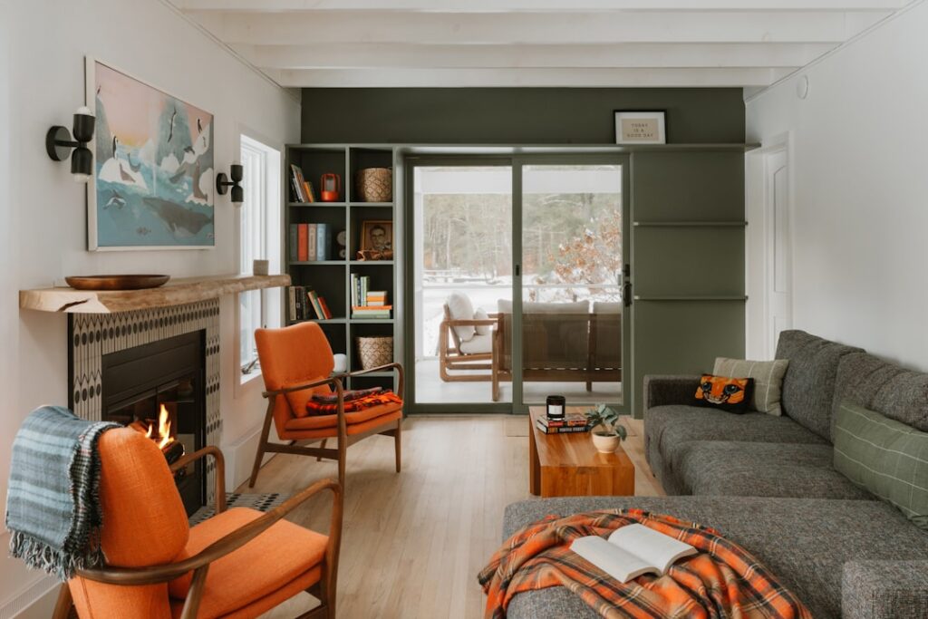
Bold Warm Paint Colors for Statement Spaces
Sometimes, you don’t want a neutral backdrop—you want a “wow” factor. Bold Warm paint colors can turn a small, uninspired room into a jewel box.
- Saturated Ochres: Colors like India Yellow are perfect for bathrooms or small studies. They exude character and look absolutely blissful when paired with dark wood trim.
- Cinnamon: This spice-inspired hue by Benjamin Moore is a lively alternative to brown. It has enough orange in its undertone to feel energetic rather than heavy, making it ideal for a cozy den or a reading nook.
- Muted Reds: If you’ve always wanted a red room but were afraid of the intensity, look for shades with a “drab” or “browned-down” quality. These feel lived-in and historic rather than aggressive.
Using these colors for “color drenching”—where you paint the walls, trim, and even the ceiling the same shade—can create an immersive, high-end feel that is incredibly cozy for evening lounging.
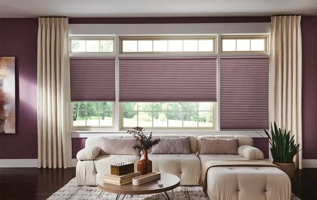
Coordinating Warm Tones with Blinds and Draperies
At The Color House, we don’t just stop at the walls. To truly make a living room glow, you need to consider your window treatments. Warm paint colors pair beautifully with natural textures.
- Linen Draperies: A soft, off-white linen drapery against a warm beige wall creates a tonal, sophisticated look. It allows light to filter through, enhancing the “glow” of the paint.
- Wood Blinds: For rooms with oak or walnut finishes, wood blinds are a natural choice. They echo the warm undertones in the paint and provide excellent privacy.
- Roman Shades: If you’ve chosen a bold color like a muted red or terracotta, a patterned Roman shade with hints of that same color can tie the whole room together.
The goal is to soften the edges of the room. Hard, cold surfaces can detract from the warmth of your paint, so adding fabric textures is essential for that “cozy” search intent you’re looking for.
The Role of LRV in Creating a Cozy Glow
We mentioned LRV earlier, but it’s worth a deeper dive. For a whole-home application, most of our Rhode Island clients prefer a “sweet spot” LRV between 60 and 75. This range is light enough to keep hallways from feeling like caves, but deep enough to provide contrast against white trim.
- LRV 50-60: These are “mid-toned” neutrals. They are great for brightening rooms like kitchens or bathrooms where you want a crisp, airy look without it being stark white.
- LRV 70+: These are your off-whites. They are perfect for south-facing rooms that are already flooded with golden light. If you use a color that’s too warm in a south-facing room, it might end up looking like a bowl of melted butter!
Understanding your room’s orientation is key. East-facing rooms get warm morning light and cool afternoon light, while west-facing rooms are the opposite. A versatile neutral like Winds Breath can flex between these shifts beautifully.
Pairing Warm Neutrals with Wood Finishes
One of the most common questions we get at our Smithfield and Wakefield locations is: “How do I match my paint to my orange oak cabinets?”
The secret is to lean into the warmth rather than trying to “cancel it out” with a cool blue-gray. Cool tones often make orange wood look more orange by contrast. Instead, try:
- Warm Greiges: Shades like Aesthetic White have a gray base to keep them modern, but enough beige to harmonize with wood floors and oak cabinetry.
- Earthy Neutrals: Colors with a subtle green or tan undertone, like Natural Tan, look fantastic next to granite countertops and natural stone.
- Tonal Harmony: If you have walnut furniture, look for “stony” mid-neutrals. These create a cohesive, high-end look that feels intentional and grounded.
Expert Guidance at The Color House
Selecting Warm paint colors shouldn’t be a stressful experience. While big-box stores might leave you staring at a wall of thousands of identical-looking chips, we take a different approach. We are a women-owned business that prides itself on individualized service.
When you visit us in Middletown or Cranston, you aren’t just getting a gallon of paint; you’re getting expert advice. We can help you avoid the “Pepto-Bismol pink” or “solar eclipse white” disasters.
How to Test and Sample Accurately
We always tell our customers: Never pick a color based on the swatch alone! Lighting in a store is nothing like the lighting in your home.
- Use Large Samples: We recommend peel-and-stick samples or painting large squares on your actual walls.
- Go Vertical: Don’t lay the sample on a table. Tape it to the wall. Light hits vertical and horizontal surfaces differently.
- Observe Over Time: Look at the sample in the morning, at noon, and at night under your artificial lights. A “perfect” beige might turn slightly pink or green depending on your LED bulbs.
- Check Your Finishes: Hold the sample next to your flooring, your window treatments, and your furniture.
Avoiding Common Mistakes
The biggest mistake? Ignoring the “fixed elements” of your home. Your paint needs to get along with your carpet, your tile, and your countertops. If your granite has warm gold flecks, a cool-toned gray will look disconnected.
Another common pitfall is going “too yellow.” In the quest for warmth, many people pick a cream that ends up looking like a highlighter pen once it’s on all four walls. This is why we often steer beginners toward “muted” or “grayed-down” warm tones. They provide the cozy feeling you want without the visual “noise.”
Whether you are looking for a whole house palette or just want to transform your home with Benjamin Moore paint in a single room, we are here to help.
Ready to find your perfect glow? Stop by one of our five Rhode Island locations today. From North Kingstown to Smithfield, our team of experts is ready to help you navigate the beautiful world of Warm paint colors and find the shade that makes you truly love coming home.