Why Sampling is Your Secret Weapon for a Perfect Living Room
Living room color samples are your best defense against costly paint mistakes. Before you commit to gallons of paint, samples let you see exactly how colors will look in your unique space. They help you visualize the true color on your walls, test it in your specific lighting, check for hidden undertones, and compare shades side-by-side with your furniture. This “try before you buy” approach saves money and builds confidence in your final decision.
As one homeowner shared, using samples is a great way to consider many different colors without the time and expense of buying a small pot of paint for every single one.
Paint changes drastically under different lighting. What looks like a warm beige in the store might appear pink on your wall at sunset. A crisp white could look dingy in morning light. This is why sampling in your actual living room is essential, not optional. Modern options like traditional paint chips, large sample boards, and liquid sample pots make this process easier than ever.
If you want to dive deeper into how light and color interact, the overview of color theory on Wikipedia is a useful primer alongside our in-store advice.
I’m Jean Hauser, owner of The Color House, and over the past two decades I’ve guided thousands of Rhode Island homeowners through the living room color samples selection process. The key is understanding how to use samples effectively to create the stunning space you’ve always imagined.
,\" \"South-facing wall (warmer, brighter),\" \"Morning light effect,\" and \"Afternoon light effect\" - living room color samples infographic")
The Benefits of Using Paint Samples
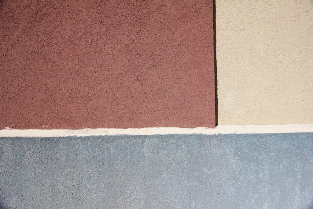
Choosing a paint color can feel overwhelming, but living room color samples are a critical step to ensure you love the final result. They allow you to see the color’s true depth and tone in your home, not just an idealized version on a tiny chip. Samples help you spot tricky undertones—like a gray that leans blue or a white with a yellow cast—that only appear on a large wall. By investing a small amount in samples, you avoid the costly mistake of repainting an entire room, saving you time, money, and frustration.
How Lighting Changes Everything
The impact of light on paint color cannot be overstated. It’s why testing living room color samples in your actual space is so important.
- Natural Light: North-facing rooms get cool, indirect light that can mute colors, while south-facing rooms get bright light that intensifies them. East-facing rooms get warm morning light, and west-facing rooms get intense evening light. Observe your samples throughout the day to see how the color shifts.
- Artificial Light: The bulbs you use also matter. Warm white bulbs bring out yellow and red undertones, while cool white bulbs can improve blues and greens. Test your samples under your home’s lighting at night to ensure you’re happy with the color 24/7.
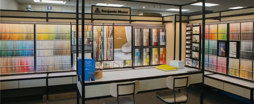
Decoding Your Options: Paint Chips vs. Sample Boards vs. Sample Pots
When starting your color journey, you’ll find several formats for living room color samples. Each has its advantages for different stages of the selection process.
| Sample Type | Cost | Size & Accuracy | Reusability | Mess-Level | Ideal Use |
|---|---|---|---|---|---|
| Paint Chips | Free | Small (2″x3″), low accuracy | No | None | Initial brainstorming, narrowing down choices |
| Sample Boards | Low | Larger (8″x8″ to 9″x15″), high accuracy | Yes | None | Comparing finalists, moving around the room |
| Sample Pots | Low-Mod | Half-pint, highest accuracy | No | Low | Direct wall application, final decision |
Paint Chips: The Starting Point
Paint chips are the small, free paper swatches from our store, perfect for initial brainstorming. They help you gather a wide range of hues and narrow your choices to a manageable handful. However, their small size and printed nature mean they offer low accuracy for how a color will look on a large wall. Use them as a first filter, not a final decision-maker.
Sample Boards: The Convenient Choice
Once you have a few favorites, move to sample boards. These are large, often peel-and-stick samples painted with real paint, which we carry from many top brands. Their beauty is in their mess-free, reusable application. You can easily move them around the room to see how the color looks on different walls, in different light, and next to your furniture. Homeowners love the convenience and flexibility of this hassle-free way to get a more accurate color representation.
Sample Pots: The Most Accurate Test
For the most authentic test, liquid sample pots are your best bet. These half-pint samples allow you to apply actual paint to your wall or a poster board, providing the truest representation of the color, finish, and texture. This method is best for catching subtle undertones that only real paint reveals. A sample pot provides ample coverage for you to get a clear idea before committing, making it the ideal final step in your decision.
The Ultimate Guide to Using Living Room Color Samples

Now that you know the types of living room color samples, let’s cover how to use them effectively. This is about thoughtful observation, not just slapping paint on a wall. For more general advice, check out our Painting Tips blog.
The Correct Way to Test Your Samples
Follow these crucial steps for testing living room color samples:
- Go big: Paint a large area (at least 2’x2′) on a white poster board or directly on the wall. If using a board, leave a white border to isolate the color from your current wall paint.
- Test on multiple walls: Place samples on at least two different walls to see how the color reacts to varying light.
- Observe over time: Look at the color in the morning, midday, and evening, and with your artificial lights on. This is non-negotiable.
- Avoid a stark white background: Testing a color directly on a white wall can make it appear darker than it is. Use a large enough swatch or a primed area to get a true read.
- View next to fixed elements: Hold your samples against your trim, flooring, and cabinetry to ensure a cohesive look.
Harmonizing with Your Existing Furniture and Decor
Your new paint color must complement your furniture, rugs, and artwork. Place your living room color samples directly against your sofa and tables to see how they interact. Consider your flooring and rug colors, as they cover a large surface area. Use dominant colors from artwork or textiles as inspiration. The goal is to weave all these elements into a beautiful, cohesive color story. For expert help, consider our Decorating Services.
Color Solutions for Small or Dimly Lit Spaces
The right paint can make a small or dark living room feel more spacious and inviting.
- Light colors expand space: Lighter colors like soft whites, pale blues, and light grays reflect more light, creating a sense of openness.
- Warm whites add coziness: In a dimly lit room, warm whites brighten the space without feeling cold.
- Dark colors create depth: Used strategically on an accent wall, a deep, rich hue can blur a room’s edges, creating an illusion of depth.
- Finish matters: Higher-sheen finishes (satin, semi-gloss) reflect more light, which can help in dark rooms, but they also highlight imperfections.
Inspiration Station: Finding Your Perfect Living Room Hue

Finding the perfect hue is an exciting journey of combining personal taste, color science, and current trends. For more ideas, explore our Living Room Inspiration and Paint Color Ideas.
Using Color Psychology to Set the Mood
Colors impact our emotions. Use living room color samples to choose a hue that creates your desired mood.
- Calm: Blues and greens promote tranquility and a connection to nature.
- Energy: Yellows create a vibrant, cheerful, and happy atmosphere.
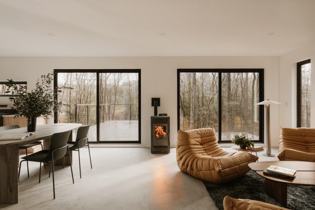
- Coziness: Earthy reds, terracottas, and deep brown neutrals feel warm and inviting.
- Sophistication: Grays, charcoals, and moody blues create a modern, dramatic, yet welcoming ambiance.
The Best Neutral Paint Colors for Living Rooms
Neutrals offer a timeless, versatile backdrop. Our Rhode Island customers love these Benjamin Moore options:
- Off-Whites: Chantilly Lace (crisp, clean), Simply White (warm), and White Dove (soft).
- Greiges: Revere Pewter (a classic that adapts to light) and Edgecomb Gray (balanced and warm).
- Warm Beiges: Swiss Coffee (creamy, inviting) and Pale Oak (light, sophisticated).
- Modern Grays: Classic Gray is a light, soft gray that works in almost any setting.
Current Color Trends: From Earthy Tones to Bold Hues
Understanding current trends can offer fresh inspiration. The 2025 design philosophy emphasizes balance and personal expression. Stay updated with insights from Pantone and our Color of the Year blog. Key trends include nature-inspired greens, warm earthy terracottas, and moody blues or deep charcoals for a sophisticated feel. The key is to test living room color samples to see how these trends work in your home.
Designer-Favorite Benjamin Moore Colors for Living Rooms
Designers consistently praise these Benjamin Moore shades for their versatility and appeal:
- Benjamin Moore White Dove OC-17: A soft, warm white that brightens a space while feeling cozy. Perfect for any style.
- Benjamin Moore Revere Pewter HC-172: A chameleon-like greige that adapts beautifully to different lighting, creating a sophisticated yet comfortable room.
- Benjamin Moore Edgecomb Gray HC-173: A slightly lighter, warmer greige that offers a soft, inviting feel.
- Benjamin Moore Hale Navy HC-154: A deep, rich navy for a bold, classic statement. It adds drama and elegance, especially on an accent wall.
Our team at The Color House can help you explore these and other Benjamin Moore collections.
Beyond Color: Why Paint Finish Matters
After choosing from your living room color samples, your next decision is the paint finish, or sheen. This choice is just as important as the color, affecting the final look, durability, and cleanability of your walls.
Choosing a Finish: Matte, Eggshell, Satin, or Semi-Gloss
Each finish has unique characteristics suitable for different effects in your living room:
- Matte: Has the least sheen and absorbs light, giving a velvety look that hides imperfections. It’s less durable and best for low-traffic areas.
- Eggshell: A popular choice for living rooms, offering a soft, low sheen with good durability and washability. It’s a great balance for most spaces.
- Satin: Has a noticeable sheen and is more durable and easier to clean than eggshell. It’s great for high-traffic areas but can show more wall imperfections.
- Semi-Gloss: Offers a distinct shine and is highly durable and easy to clean. It’s typically reserved for trim, doors, and molding to highlight architectural details.
How Finish Impacts Durability and Cleaning
A paint’s sheen level directly correlates with its durability. Higher sheens are more durable and washable but highlight surface imperfections. Lower sheens, like matte and eggshell, are better at hiding minor blemishes on walls. For busy households with children or pets, eggshell and satin finishes provide a practical balance of aesthetics and durability. While modern paints are more robust than ever, choosing the right finish is about balancing the look you want with the practical needs of your home.
Frequently Asked Questions about Living Room Paint Selection
Here are answers to common questions our Rhode Island customers ask about choosing living room paint.
How many living room color samples should I test?
We recommend a two-stage approach. First, gather 5-7 paint chips to narrow down your options. Then, select your top 2-3 shades and get larger format samples (boards or pots) to test in your space. This gives you a good comparison without being overwhelming.
Should I paint my living room a bold color or a neutral?
This depends on your personal style, lighting, and decor.
- Neutrals offer timeless versatility, create a calming atmosphere, and make a room feel larger. They provide a flexible backdrop for your furniture and art.
- Bold colors make a powerful statement and infuse a room with personality. They require careful consideration of light and decor to ensure harmony.
If you’re hesitant about a bold color, try it on an accent wall first. We always advise testing both bold and neutral living room color samples to see what feels right.
What are the most common mistakes to avoid when choosing a paint color?
We’ve helped homeowners across North Kingstown, Cranston, and our other locations avoid these common pitfalls:
- Choosing from a small chip: A tiny chip doesn’t accurately represent the color on a large wall. Always use larger samples.
- Ignoring lighting: A color can look completely different in morning light versus evening lamplight. Observe your samples at all times of day.
- Forgetting existing decor: Your paint must harmonize with your furniture, flooring, and textiles.
- Testing on a stark white wall: This can make the sample color appear darker than it is. Use a large poster board or prime the test area.
- Rushing the decision: Live with your samples for a few days before you commit.
Your Perfect Living Room Awaits
Choosing the perfect paint color for your living room is a journey, and living room color samples are your most trusted companions. From understanding how light transforms a hue to selecting the right finish for durability, every step brings you closer to a space that truly reflects your style and improves your daily life.
We encourage you to accept this creative process. Experiment with different shades, observe them thoughtfully, and have fun visualizing the possibilities. The journey from sample to stunning result is incredibly rewarding.
For expert advice, personalized service, and the largest selection of Benjamin Moore interior paints in Rhode Island, our team at The Color House is here to help you find the perfect color. Visit us in North Kingstown, Cranston, Wakefield, Middletown, or Smithfield, or explore more insights on our Color House Paint Blog. We can’t wait to help you transform your living room into the beautiful, inviting space you’ve always dreamed of!