
Why a Whole House Palette Creates Harmony and Simplifies Your Decorating Journey
A whole house palette is a curated collection of 5-7 paint colors that work together throughout your entire home to create visual harmony and flow. Here’s what you need to know:
- Dominant color: One neutral for main living areas (60% of your space)
- Secondary colors: 1-2 coordinating shues for bedrooms and bathrooms (30% of your space)
- Trim color: One consistent white or off-white for all doors, trim, and ceilings
- Accent colors: 1-2 bold or contrasting colors for decor and focal points (10% of your space)
Benefits: Simplifies decorating decisions, creates cohesive flow room-to-room, eliminates costly color mistakes, and increases home resale value.
Have you ever walked into a beautifully designed home and felt everything just worked together? That’s not luck—it’s the power of a whole house palette. Without one, homes can feel disjointed, like a bag of Skittles where each room competes for attention instead of complementing the next.
Creating a whole house palette means you’ll never second-guess whether that new sofa will clash with your dining room walls. You’ll shop with confidence, knowing exactly which colors belong in your home. You’ll save money by avoiding impulse purchases that don’t fit your scheme. And when it’s time to paint, you won’t stare paralyzed at thousands of paint chips wondering where to start.
The challenge? Most homeowners feel overwhelmed by color selection. With thousands of paint colors available and conflicting advice online, it’s easy to make expensive mistakes. You might choose a color that looks perfect in the store but completely wrong on your walls. Or you might paint rooms one at a time without a plan, ending up with a home that lacks flow.
The solution is simpler than you think. A well-planned whole house palette eliminates guesswork and creates a foundation for every decorating decision you’ll make. It ensures your living room flows naturally into your dining room, your hallway connects seamlessly to your bedrooms, and your entire home feels intentionally designed rather than randomly assembled.
I’m Jean Hauser, owner and president of The Color House in Rhode Island, and I’ve spent over two decades helping homeowners steer paint and design—including guiding hundreds of clients through the process of creating their perfect whole house palette. My background in fashion merchandising and interior design taught me that color is the foundation of any successful space, and choosing the right palette is the single most important decision you’ll make for your home.

The Building Blocks: Crafting Your Core Color Scheme
Creating a whole house palette is like composing a symphony for your home. Each color plays a role, contributing to a harmonious and cohesive environment. Typically, a whole house color palette consists of between five and seven colors. This usually includes a foundational color for your main living areas, a consistent trim color used throughout, secondary colors for individual rooms like bedrooms, and accent colors to add pops of personality. For smaller homes under 1,000 square feet, a palette of four or five colors can be perfectly effective, while larger homes might comfortably accommodate ten or more and still maintain a unified feel.

How to Choose a Dominant Color for Your Home
The journey to a cohesive whole house palette begins with selecting your dominant color. This color will typically grace your main living areas, such as living rooms, kitchens, and hallways, especially in open-concept layouts. These high-traffic zones benefit from a color that creates a serene and expansive backdrop, allowing other design elements to shine.
We often recommend starting with a neutral hue as your dominant color. Neutrals provide an excellent base for layering textures, furniture, and accent colors. The mood you want to evoke in your home should heavily influence this choice. Do you dream of a calming, spa-like sanctuary, or a space bursting with energy and contrast? Light and neutral colors often contribute to a sense of calm, while bolder choices can infuse vibrancy.
Popular neutral options that work beautifully in many Rhode Island homes include versatile greiges and off-whites. Greige, a blend of gray and beige, offers a sophisticated warmth that adapts well to various lighting conditions. Off-whites provide a clean, sophisticated canvas without the starkness of a pure white.
Selecting Secondary, Trim, and Accent Colors
Once your dominant color is established, we move to the supporting cast: secondary, trim, and accent colors.
Secondary colors are chosen for connecting rooms like bedrooms, bathrooms, and home offices. These colors should tie into your dominant color, perhaps sharing similar undertones or falling within an analogous or monochromatic scheme. For instance, if your dominant color is a warm greige, secondary colors could be a slightly deeper greige, a soft sage green, or a muted blue that shares a warm undertone. These “between” colors, like a gray-green or pink-beige, can add layers and complexity, making individual rooms feel distinct yet connected.
The trim color is crucial for establishing consistency and polish throughout your home. We strongly advocate for choosing one consistent white or off-white for all your trim, doors, and ceilings. Off-white paint colors are incredibly versatile and are a common choice for trim, seamlessly pairing with a wide range of wall colors. Crisp whites like Benjamin Moore Chantilly Lace OC-65 or warmer options like White Dove OC-17 and White Heron OC-57 are popular choices, offering endless adaptability. Using the same shade of white for both ceilings and trim creates a clean, unified look.
Finally, accent colors are where you infuse personality and intrigue into your whole house palette. These colors are typically used in smaller doses, representing the 10% in the 60-30-10 rule. Accent colors can appear on a single accent wall, in artwork, throw pillows, decorative objects, or even in dramatic window treatments. They should offer a thoughtful contrast to your dominant and secondary colors, adding visual interest without overwhelming the space. Unless you’re aiming for a maximalist style, use accent colors in moderation to maintain a balanced and sophisticated aesthetic.
A Crash Course in Color Theory for Your Whole House Palette
Understanding basic color theory is like having a secret weapon in your design arsenal. It helps us predict how colors will interact and ensures your whole house palette truly sings.

The color wheel is our foundational tool, illustrating the relationships between colors. It helps us understand primary (red, yellow, blue), secondary (orange, green, violet), and tertiary colors. Beyond this, we dive into the concepts of warm versus cool tones. Warm colors (reds, oranges, yellows, and their earthy relatives like browns and beiges) are active and stimulating. They tend to make a room feel cozier and can make elements pop. Cool colors (greens, blues, violets, and grays) are soothing and peaceful. They can make a room feel larger and more serene, as they tend to recede visually.
One of the most important aspects of color theory for a whole house palette is identifying undertones. Paint colors rarely exist in a pure form; they have subtle undertones that can be warm (yellow, red, orange) or cool (blue, green, purple). These undertones become particularly noticeable in different lighting conditions and when placed next to other colors. A “neutral” gray, for instance, can lean blue, green, or even purple depending on its undertone. Recognizing these undertones is critical to avoid clashes and ensure a harmonious flow throughout your home. Color psychology also plays a role, with certain hues naturally evoking specific moods—for example, greens for tranquility or blues for calmness.
Applying Color Schemes for Ultimate Cohesion
With the color wheel as our guide, we can apply various color schemes to achieve ultimate cohesion in your Rhode Island home:
- Monochromatic schemes use different shades, tints, and tones of a single color. This creates a sophisticated, calm, and harmonious feel, adding depth without introducing new hues.
- Analogous schemes combine colors that are next to each other on the color wheel, such as blues and greens. These palettes are naturally harmonious and flow beautifully, creating a sense of unity.
- Complementary schemes pair colors opposite each other on the color wheel, like blue and orange. This creates high contrast and vibrancy, often used for accent colors to make a statement.
Whether you aim for balance or a dramatic contrast, applying these principles will guide your choices. learn how to use the color wheel to open up its full potential.
The 60-30-10 Rule in Every Room
The 60-30-10 rule is a timeless design guideline that provides a simple yet effective framework for distributing colors within any space, ensuring balance and visual appeal. It suggests that:
- 60% of the room should be your dominant color, typically applied to the walls. This creates the main backdrop and sets the overall mood.
- 30% should be a secondary color, often found in larger elements like furniture, rugs, or even neat draperies. This color provides contrast and depth without overpowering the dominant shade.
- 10% is reserved for accent colors, used in smaller decorative items such as pillows, artwork, or small accessories. This is where you can add pops of bold color or unique textures to draw the eye and add personality.
Applying the 60-30-10 rule to each room in your home, even as a flexible guideline, helps maintain an intentional and harmonious look. It allows for individual expression within a cohesive framework, ensuring that each space feels complete and balanced.
Integrating Paint with Your Home’s Permanent Features
Before we even pick up a paint brush, we always consider the elements that are already fixed in your home. These “hard finishes” are significant investments and are expensive to change, so your paint choices should complement them rather than fight them. We’re talking about your flooring, countertops, cabinetry, and bathroom tiles.
For example, the undertones in your flooring (whether it’s warm hardwood, cool tile, or neutral carpet) will influence whether a warm or cool paint color will look best on your walls. Similarly, the colors and patterns in your countertops (granite, quartz, marble) and cabinetry are major players in your kitchen and bathroom palettes. Even the subtle nuances in your bathroom tile can dictate the perfect wall color.
Don’t forget metal finishes like faucets, cabinet hardware, and light fixtures. These also carry warm (brass, gold, copper) or cool (chrome, brushed nickel) undertones that should be considered to create a cohesive look. The goal is for your new paint colors to blend seamlessly with these existing elements, making your home feel intentionally designed from top to bottom.
Coordinating with Window Treatments, Blinds, and Draperies
Beyond paint, another crucial layer in your whole house palette is your window treatments. In our Rhode Island homes, the right indoor blinds, shades, or draperies not only control light and privacy but also significantly contribute to the overall aesthetic.
When selecting window treatments, consider their fabric colors and textures. If your walls are a neutral dominant color, your draperies can introduce a secondary color or subtle pattern. For instance, soft linen draperies in a muted blue can add a serene touch to a room with greige walls. We often recommend neutral blinds or shades as a versatile base, allowing you to layer more expressive patterned draperies over them. Wood shutters, a classic choice, can be stained or painted to match your trim color, creating a seamless, built-in look.
Layering different treatments, such as sheer curtains under heavier drapes or blinds behind valances, adds depth and sophistication. Our interior paints are designed to complement a wide range of fabric choices, ensuring that every element—from your walls to your windows—works together beautifully.
Your Step-by-Step Guide to a Perfect Whole House Palette
Creating your own whole house palette is an exciting journey. Here’s how we guide our clients in Rhode Island through the process:
- Gathering Inspiration: Start by collecting images of rooms, furniture, or even artwork that you love. Pinterest is an excellent resource for this; just remember, using Pinterest for ideas should be a starting point, not the final decision. Pay attention to colors you’re drawn to in your own closet or favorite objects.
- Creating a Mood Board: A physical or digital mood board helps you visualize how different elements—paint swatches, fabric samples, flooring, and furniture—will look together. This is where you start to define the overall mood you want for your home.
- Finalizing Your Palette: Based on your inspiration and mood board, you’ll select your dominant, secondary, trim, and accent colors. We recommend settling on 4-8 colors for a comprehensive palette that offers variety without chaos.
The Crucial Step: Sampling Colors in Your Space
This is perhaps the most critical advice we can offer: always sample your paint colors in your actual home. Paint colors appear differently on a small chip than they do on a large wall, and they can shift dramatically based on natural and artificial light conditions.
We encourage you to paint large swatches on your walls or, even better, use peel-and-stick samples. These innovative samples, made with real paint, can be easily moved around the room and observed at different times of the day, under varying light. Look at them in morning light, afternoon sun, and evening artificial light. This helps you understand a color’s true undertones and how it interacts with the unique lighting of your space. You can always buy paint samples from us at The Color House to ensure peace of mind.
Exploring Ready-Made Palettes and Design Styles
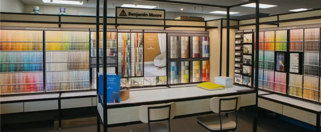
If starting from scratch feels overwhelming, we have good news! Many brands, including Benjamin Moore, offer expertly curated color palettes designed to work together seamlessly. These ready-made palettes are often categorized by popular design styles, making it easier to find a starting point that resonates with your aesthetic. At The Color House, we’re proud to offer a wide range of Benjamin Moore options.
Some popular design styles and the palettes they inspire include:
- Coastal: Inspired by our beautiful Rhode Island coastline, these palettes often feature sandy whites, watery blues, and glassy greens, creating a relaxed and sophisticated beach-casual feel.
- Modern Farmhouse: A blend of traditional and contemporary, often using warm neutrals, classic blues, and sometimes a touch of deep green.
- Scandinavian: Characterized by cozy neutrals, crisp whites, and muted grays, emphasizing simplicity and natural light.
- Classic/Timeless: Often features sophisticated neutrals, rich blues, and soft greens that transcend trends.
- Hygge: Emphasizes comfort and coziness with warm, inviting neutrals and soft, muted tones.
You can also explore palettes categorized by seasons or even the latest trends, like the 2025 Colors of the Year: A Fresh Palette. These can provide a fantastic foundation, which you can then customize to your taste.
Frequently Asked Questions about Whole House Palettes
Is it okay to paint my entire house one color?
Yes, it is absolutely okay to paint your entire house one color, with a few strategic variations! In fact, using a single dominant color throughout an open-concept home can create incredible cohesion and make the space feel larger and more unified. The trick to avoiding monotony is to introduce visual interest through different shades or tones of that same color. For example, you might use a slightly lighter tint for the ceiling, or a different sheen (like a satin on trim versus an eggshell on walls) to create subtle distinctions. This approach maintains a consistent backdrop while still offering visual depth.
How do I ensure color flow between rooms without being too “matchy-matchy”?
Achieving flow without a “matchy-matchy” feel is the art of a well-executed whole house palette. Here’s how we do it:
- Repeating Colors Subtly: Instead of painting every room the same, use your secondary and accent colors from one room as primary or secondary colors in another. For example, a deep blue accent wall in the living room could become the dominant color in a smaller den or a guest bedroom.
- Consistent Undertones: Ensure all the colors in your palette share a consistent warm, cool, or neutral undertone. This invisible thread ties everything together, even if the hues themselves are different.
- Architectural Breaks: Use doorways, archways, and other architectural features as natural break points for color transitions. This creates clear divisions between spaces, allowing for different colors without abruptness.
- Layering: Use an accent color from your palette in soft furnishings, artwork, or window treatments in various rooms. This repetition creates connection without being overt.
Can I mix and match different color palettes in my home?
While a core whole house palette is essential for main living areas, you absolutely can, and often should, “break the rules” in certain enclosed rooms. Spaces like powder rooms, kids’ bedrooms, or a cozy den offer opportunities for personal expression that might diverge from your main palette.
For example, a powder room, being a small and often separate space, is a fantastic place to experiment with a bolder color or even a dramatic wallpaper that wouldn’t work in your open-concept living area. Similarly, kids’ rooms are perfect for letting individual personalities shine, even if their chosen colors don’t strictly adhere to the overall house scheme. The key is to ensure these “fun chapters” are contained within their own spaces, maintaining the cohesive flow in the main areas of your home. It’s your home in Rhode Island, so ultimately, your personal preferences and unique style should guide your choices!
Bring Your Vision to Life with Expert Guidance
Embracing a whole house palette offers a multitude of benefits for your home. It provides a blueprint for decorating, allowing you to shop with confidence and make design decisions that truly make sense. You’ll avoid costly mistakes, save time and stress, and ultimately create a home that feels cohesive, intentional, and uniquely yours. Best of all, interior painting provides a hefty return on investment, and painting the entire house at once can even be more cost-effective as professional contractors often offer discounts for larger jobs.
At The Color House, we understand the unique character of Rhode Island homes. As a women-owned paint store, we specialize in premium paints like Benjamin Moore, offering competitive pricing, individualized service, and expert advice that you won’t find at big box stores. We pride ourselves on having the largest inventory in Rhode Island, ensuring you have access to the perfect hues for your project.
Ready to transform your home with a harmonious whole house palette? Let our team of experts guide you. From understanding undertones to selecting the perfect trim, we’re here to help you bring your vision to life. Get started with a professional Color Consultation with us today, and let’s create the home of your dreams.