Why 2026 Indoor Paint Colors and Window Treatments Are Redefining Home Design
2026 indoor paint colors and matching window treatments are shifting away from stark whites and cool grays toward warm, grounded tones that bring nature indoors. Here’s what’s defining the year ahead:
Top 2026 Design Trends:
- Silhouette AF-655 – Benjamin Moore’s Color of the Year paired with tonal draperies
- Warm Neutrals – Soft putties and off-whites complemented by natural woven blinds
- Nature-Inspired Greens – Herbal shades like Narragansett Green HC-157 accented by linen textures
- Bold Accents – Deep burgundies and plums for dramatic depth in window-heavy rooms
- Layered Harmony – The integration of paint, blinds, and drapes for a cohesive feel
The color psychology driving these choices reflects our growing desire for spaces that feel both grounded and sophisticated. As Benjamin Moore’s 2026 palette demonstrates, we’re moving toward warmth and depth paired with delicate accents and layered harmony—colors and fabrics that respond to evolving consumer tastes rather than chasing fleeting trends.
These aren’t just paint colors. They’re mood-setters that, when combined with the right indoor window treatments, help your home feel calm, lived-in, and authentically you. Whether you’re drawn to dusty pinks or rich greens, 2026 indoor paint colors and custom blinds prioritize longevity over trendiness.
I’m Jean Hauser, owner and president of The Color House, and over two decades of helping Rhode Island homeowners navigate 2026 indoor paint colors and window fashions has taught me that the best palette is one you’ll love for years, not just seasons. Let’s explore how these trending hues and window treatments can transform your space with confidence.

Quick 2026 indoor paint colors definitions:
Top 2026 Indoor Paint Colors and Design Movements
The shift we are seeing in 2026 is all about “Refined Elegance.” After years of minimalism, homeowners in Rhode Island are looking for colors and window treatments that tell a story. This movement is rooted in the idea of the “Heirloom” palette—colors and textures that feel familiar, stable, and reminiscent of historic brownstones. We are moving toward colors and custom draperies that age gracefully.
Leading this charge is the Benjamin Moore 2026 Color of the Year, Silhouette AF-655.

What makes Silhouette so special? It is a masterful blend of luxurious burnt umber and delicate charcoal. It provides a sophisticated backdrop for both modern furniture and elegant indoor blinds. When you see it on a wall, it feels like a warm hug—deep, mysterious, and incredibly chic, especially when paired with matching fabric window treatments.
For those looking to dive deeper into the full spectrum of upcoming trends, our Benjamin Moore 2026 Color Year Guide breaks down how this lead color anchors a larger movement toward craftsmanship and attention to detail in both paint and window design.
Earthy Neutrals and 2026 Indoor Paint Colors
If a deep shade like Silhouette feels a bit too daring for an entire room, don’t worry—the neutral world is getting a much-needed glow-up in 2026. We are officially saying goodbye to “Stark White” and welcoming “frothy” whites and “putty” tones that pair beautifully with natural wood blinds.
These neutral interior paint colors are designed to make a room “exhale.” One of the MVPs for 2026 is Swiss Coffee OC-45. It’s a classic for a reason, but in 2026, we’re seeing it used as the ultimate “all-over” shade because it carries just enough warmth to avoid looking like a gallery wall, providing the perfect canvas for textured draperies.
Other standouts in the neutral category include:
- Sherwood Tan 1054: A mid-tone tan that avoids the dreaded “yellow-green” undertones and looks stunning against linen window coverings.
- Pashmina AF-100: A sophisticated greige that designers love for its sun-warmed feel.
- Batik AF-610: A soft, muted neutral that bridges the gap between beige and gray perfectly.
If you are struggling to visualize these in your North Kingstown or Smithfield home, we always recommend starting with cream color paint samples and fabric swatches to see how the light affects these delicate undertones.
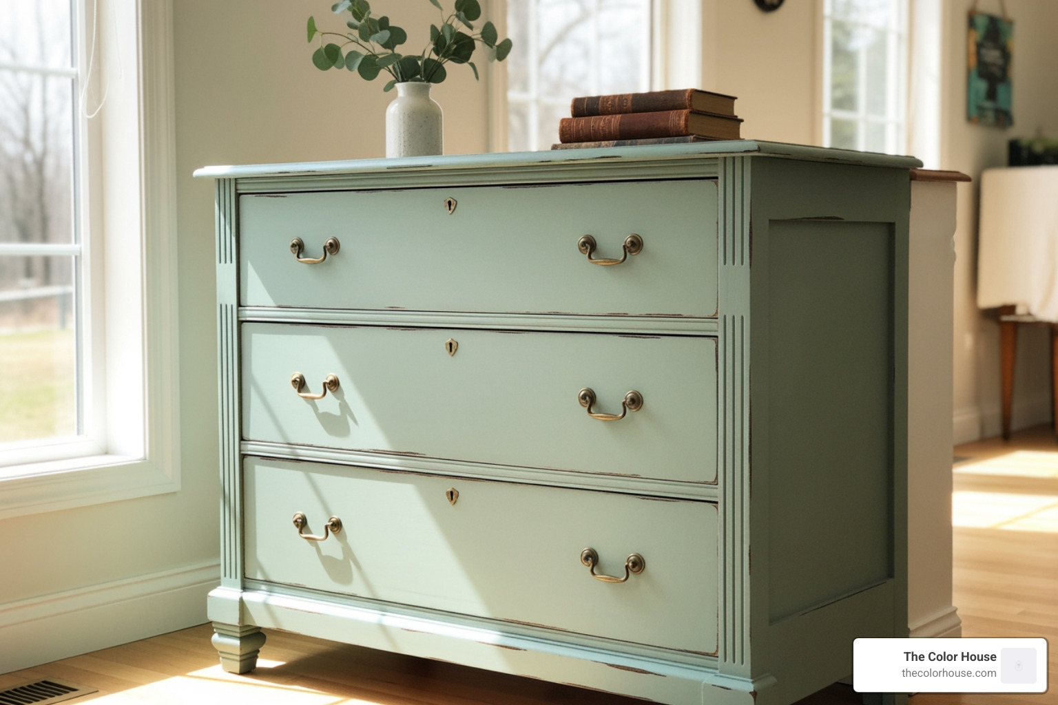
Nature-Inspired Greens and Herbal Shades
Green has become the new neutral. In 2026, the greens we are seeing are “herbal” and “organic,” often paired with woven wood shades to complete the look.
Narragansett Green HC-157 is a local favorite here in Rhode Island. It’s a deep, moody green that feels grounded and historic. It’s perfect for a library or home office, especially when framed by custom drapes. For a lighter, more spa-like feel, Raindance 1572 offers a beautiful balance of green and blue that complements light-filtering cellular blinds.
To help you find your perfect forest or field shade, check out our buyer’s guide to sage paint samples or explore a moodier olive green color sample to add instant character to a mudroom or entryway.
Bold Hues: Plums, Burgundies, and 2026 Indoor Paint Colors
While neutrals and greens provide the foundation, 2026 is also inviting us to be a little more “indulgent” with our color choices. Bolder hues are stepping into the spotlight, often used in tandem with dramatic window treatments to create a focal point.
Classic Burgundy HC-182 is a prime example. This isn’t the bright red of the 90s; it’s a deep, saturated wine color that looks exquisite with velvet draperies. We are also seeing a rise in “Plum” tones like Cinnamon Slate. It’s a purplish-brown that brings drama without being overpowering.
Even Benjamin Moore is leaning into these “midnight” shades. Deep blues like Encore or Nightfall are providing a grounding effect in bedrooms, fostering a sense of calm. These colors tell a story, making them perfect for “niches” like a cozy dining nook with custom-fitted blinds.
Pairing 2026 Trends with Window Treatments and Finishes
Choosing the right 2026 indoor paint colors is only half the battle. To truly pull a room together, you have to think about the “finishes” and how they interact with your indoor window treatments. In 2026, the trend of color drenching—painting the walls, trim, and even the ceiling the same color—is reaching its peak, often extending to the window hardware and fabrics.
Color drenching creates a seamless, luxurious look. To keep it from feeling “flat,” we recommend playing with sheens and textures. Use a matte or eggshell finish on the walls and a semi-gloss on the trim, then layer in soft fabric drapes to add a third dimension of texture.
Another technique gaining popularity is the use of limewash. This creates a “chalky,” textured appearance that diffuses light beautifully. While traditionally used with neutrals, in 2026, we are seeing homeowners use limewash with more saturated colors like dusty pinks (think Pink Ground) to create a “sultry” evening atmosphere, perfectly complemented by light-filtering blinds.
If you’re feeling overwhelmed by sheens, textures, or window styles, our color consultation service can help you map out exactly which finishes and treatments will work best for your Rhode Island home.
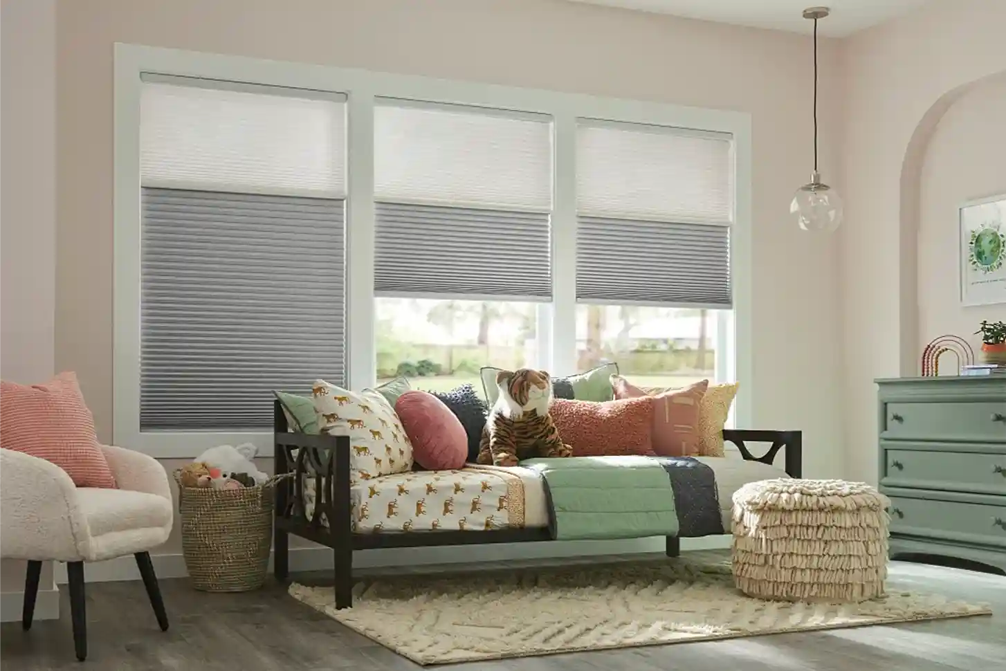
Coordinating Blinds and Draperies with Trending Hues
At The Color House, we know that a room isn’t finished until the windows are dressed. For 2026, the goal is layered harmony.
When you are using deep tones like Silhouette or Classic Burgundy, you want your window treatments to either blend in or provide a purposeful contrast.
- Custom Draperies: Consider matching your drapes exactly to your wall color for a high-end, monochromatic look. This is especially effective in bedrooms to create a “cocoon” effect.
- Interior Blinds: Natural wood blinds or woven textures are making a huge comeback. They pair beautifully with the “Heirloom” and “Earthy Neutral” palettes, adding a tactile element that paint alone can’t provide.
- Fabric Textures: Look for linens and wools. These natural fibers complement the organic feel of 2026 paint trends.
Our color specialist interior design team can help you select fabrics that won’t clash with your new wall colors, ensuring your blinds and drapes enhance the overall mood of the space.
Expert Tips for Testing and Selecting Your Palette
One of the biggest mistakes we see is choosing a color based on a tiny swatch in the store. Light is the most important factor in how a color looks! A “warm white” that looks creamy in our Cranston showroom might look slightly yellow in a north-facing room in Smithfield, which will also change how your window treatments appear.
Here are our expert tips for getting it right:
- Check the LRV: Light Reflectance Value (LRV) tells you how much light a color reflects. This is crucial when deciding between heavy drapes or light-filtering blinds.
- Sample, Sample, Sample: Use our peel & stick paint samples buying guide to find a mess-free way to test colors. Move the samples around the room at different times of the day and hold up fabric swatches next to them.
- Go Digital: Use technology to your advantage! You can download the Benjamin Moore Color Portfolio app for Android or get the app for iPhone to visualize how these 2026 shades will look on your actual walls.
Bringing the 2026 Vision to Life with The Color House
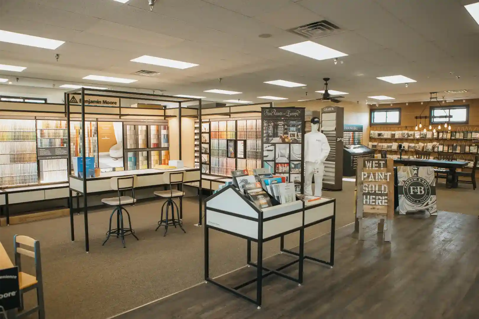
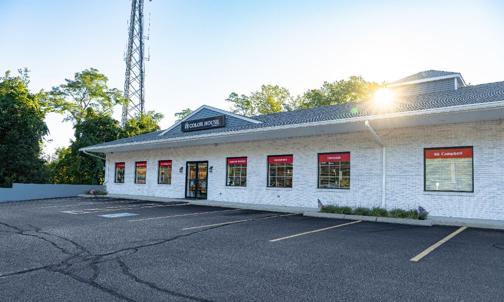
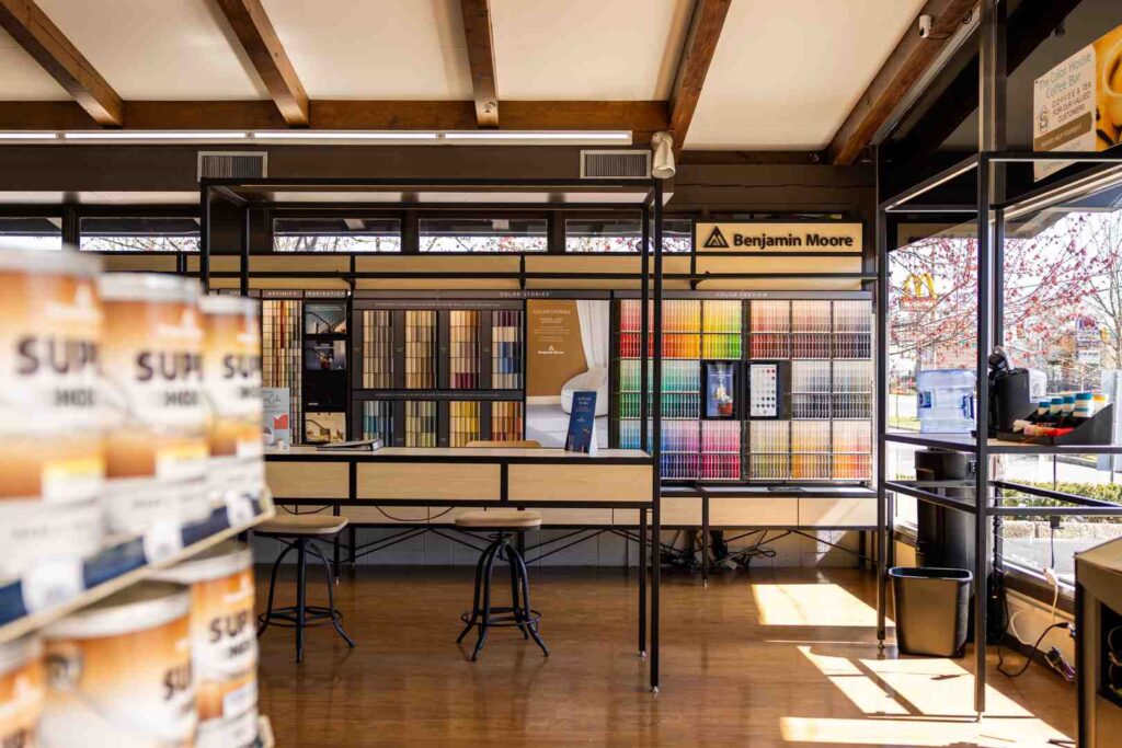
As a women-owned business with deep roots in Rhode Island, we pride ourselves on offering a personalized alternative to the big-box stores. Whether you are in Middletown, Wakefield, or Smithfield, we have the largest inventory in the state to ensure you get exactly what you need for your walls and windows.
Our color specialist team doesn’t just sell paint; we help you build a whole house palette that flows from room to room, including coordinated window fashions. We understand the local architecture and the unique New England light, making us your best resource for navigating the exciting world of 2026 indoor paint colors and window design.
Ready to transform your home? Visit us at one of our five locations or shop online to discover the Color of the Year 2026 and the full Trends Palette. We offer custom mixing, expert advice, and everything you need to paint your town—and your home—with confidence.