Why Sample Room Color Combinations Transform Your Home
Sample room color combinations are proven color palettes tested in real spaces that take the guesswork out of decorating, especially when coordinating walls with indoor window treatments. Here are the essential types you need to know:
Most Popular Sample Room Color Combinations:
- Neutral + Sage Green – Light taupe walls with sage green accents and darker taupe trim for calm, coordinated spaces
- Navy, Cream, and Yellow-Green – Deep navy grounding with cream fixtures and yellow-green furniture for vibrant balance
- Soft Grays + Natural Wood – Gray with gentle green undertones paired with natural wood tones for coastal serenity
- Pink, Peach, and Warm Hues – Peachy pink walls with matching cabinetry for cheerful, cohesive rooms
- Moody Blues – Deep peacock blue with navy and lighter blue accents for dramatic elegance
- Teal + Cobalt Blue – Bold jewel tones that create impactful statements in dining areas and entryways
Nothing transforms a room quite like color. As one 1930s Benjamin Moore brochure wisely noted, “The secret is color [which] will work wonders” when applied to walls, ceiling, and trim, especially when harmonized with indoor blinds and custom draperies.
But here’s the challenge: choosing colors feels overwhelming. You’re staring at hundreds of paint chips, wondering which combinations actually work together in real life—not just on a color wheel.
The good news? You don’t need to guess. Professional designers follow proven formulas like the 60-30-10 rule: 60% dominant color on walls, 30% secondary color on furniture and window treatments, and 10% accent color in accessories. This simple framework ensures balanced, cohesive rooms every time.
Color also sets the mood for how you want each space to feel. Calming greens and blues work beautifully in bedrooms and bathrooms. Bold teals, raspberry reds, and cobalt blues make powerful statements in entryways and living rooms. Warm neutrals with earthy undertones create timeless, welcoming kitchens and dining areas.
The key is understanding how colors flow from room to room, how lighting affects perception, and which undertones tie everything together. Testing samples in your actual space—with your specific lighting and window coverings—makes all the difference between a color that looks perfect on a chip and one that feels right on your walls.
As Jean Hauser, owner of The Color House, I’ve spent over two decades helping Rhode Island homeowners confidently select sample room color combinations that transform their spaces using expert color consultation and premium Benjamin Moore paints. My background in fashion merchandising and interior design has taught me that the right palette eliminates costly mistakes and creates homes people truly love living in.

Essential sample room color combinations terms:
Designer-Approved Sample Room Color Combinations for Every Space
When we look at 56 Living Room Color Schemes Interior Designers Actually Love, a common thread emerges: the most successful rooms aren’t just a collection of pretty colors; they are carefully curated stories. At The Color House, we often recommend starting with a color-consultation to help you find that narrative.
To achieve a professional look, we lean heavily on the 60-30-10 rule. Imagine a living room where 60% of the space (the walls) is a sophisticated Benjamin Moore neutral, 30% (the upholstery and window treatments) is a rich secondary hue like navy or forest green, and 10% (pillows, art, and vases) provides a “pop” of coral or gold. This balance prevents the room from feeling chaotic while ensuring it isn’t boring.
Serene Bedroom and Bathroom Sample Room Color Combinations
For the areas where you start and end your day, the goal is “restorative.” We love seeing homeowners experiment with sample-bedroom-paint-colors that lean into the cooler side of the spectrum.
One of our favorite sample room color combinations for a master suite involves a “color flow” strategy. Imagine a bedroom painted in a soft, misty sage green or Benjamin Moore’s French Gray. To create a seamless transition, you might use a slightly darker version of that same tonal family in the adjoining bathroom.
- The “Nature’s Hug” Palette: Mid-greens or sage greens like Benjamin Moore’s Saybrook Sage are ultimate calm-inducers. Pair these with crisp white trim to keep the space feeling fresh.
- The “Moody Sanctuary”: Deep peacock blue or navy can actually promote better sleep. When using dark colors, ensure your bedroom-paint-samples are tested against your evening lighting to make sure the room feels cozy, not cavernous.
- Cohesive Undertones: The secret to making a bedroom and bathroom feel like one suite is matching the undertones. If your bedroom gray has a blue base, your bathroom white should also have a cool, blue-ish undertone rather than a yellow one.
Impactful Living Room and Entryway Sample Room Color Combinations
Your entryway and living room are the “public” faces of your home. This is where you can afford to be a bit more daring. While choosing-your-perfect-gray-popular-paint-colors-reviewed is a great starting point for many, don’t be afraid of high-impact shades.
- The Bold Entryway: Consider a “joyful” greeting with Benjamin Moore’s Raspberry Glaze. It’s a daring red that makes white woodwork pop and sets a vibrant tone for the rest of the house.
- The Modern Craftsman: For a grounded, historic feel, an olive-green-color-sample works wonders. Pair it with warm wood tones and brass hardware for a look that feels both trendy and timeless.
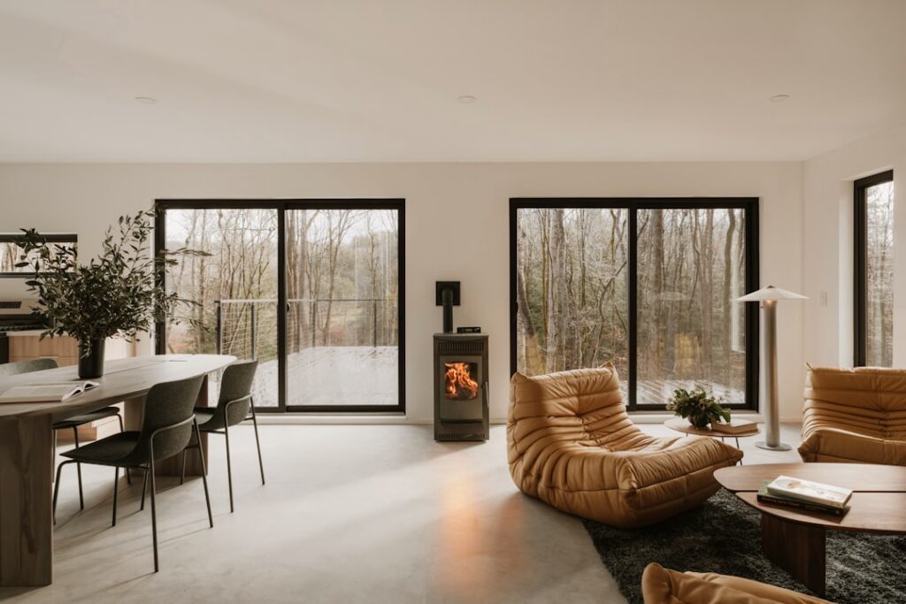
- Jewel Tone Statements: Deep teal or cobalt blue can make a small living room or dining nook feel incredibly high-end. In these spaces, “color drenching”—painting the walls, trim, and even the ceiling in the same shade—can create a moody, immersive environment.
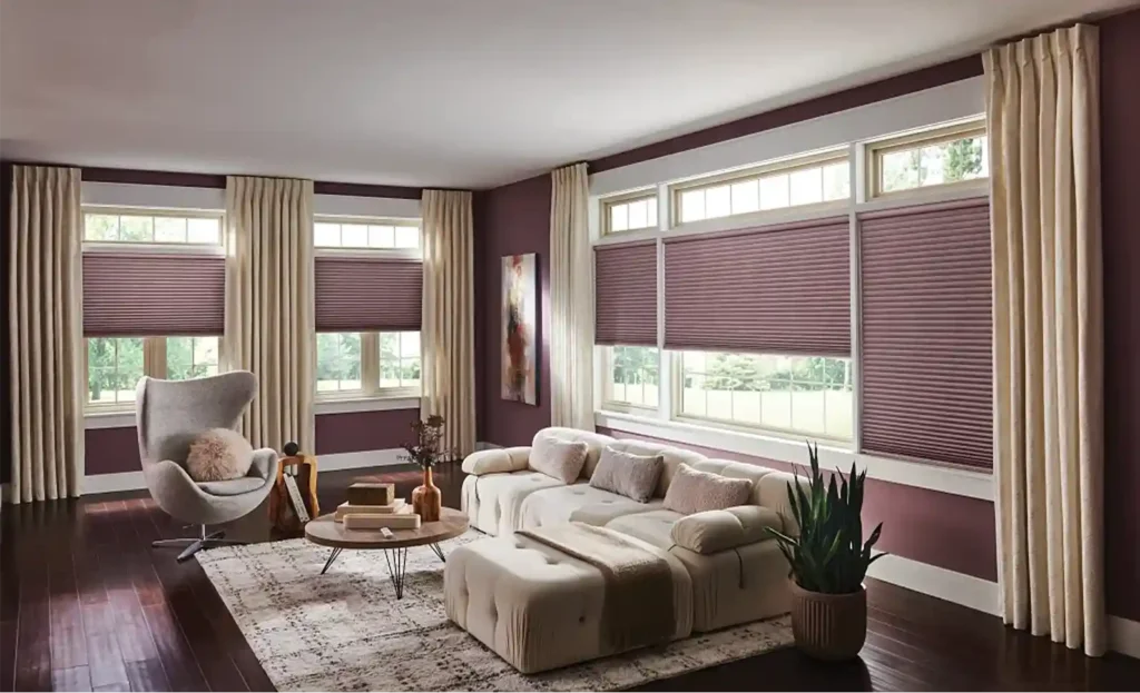
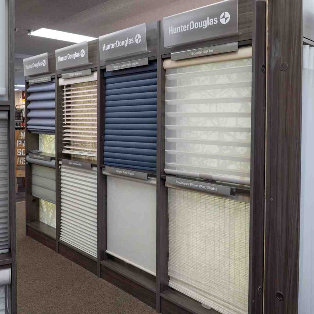
Coordinating Window Treatments with Your Palette
We cannot emphasize enough how much window-treatments influence your color palette. They are the “30%” in your 60-30-10 rule!

When selecting sample room color combinations, think of your blinds and draperies as the bridge between your wall color and your furniture.
- Texture and Light: Indoor window treatments like Roman shades or custom drapery add essential texture. A neutral wall comes to life when paired with a rich, textured fabric in a complementary shade.
- Matching Trim: For a clean, architectural look, match your interior shutters or blinds to the color of your window trim. This makes the windows feel larger and more integrated into the room’s design.
- Fabric Inspiration: Often, a patterned drapery fabric is the perfect “hero” element. You can pull your wall color from the smallest detail in the fabric to ensure a perfect match.
Mastering the Art of Color Selection and Flow
Creating a whole-house-palette is about more than just picking one color you like. As 12 Living Room Color Schemes That Will Make It Your Favorite Space in the House suggests, a cohesive home usually relies on a palette of 6-7 hues. This includes a dominant neutral, a few secondary colors for different rooms, a consistent trim color, and a couple of bold accent shades that tie in with your indoor window treatments.
Using Color Theory to Balance Your Home
If you’re feeling stuck, a color-specialist at one of our Rhode Island locations (like Cranston or North Kingstown) can walk you through the color wheel. Understanding these basic schemes can change the way you see your home:
- Complementary: Colors opposite each other (like blue and orange). These create high energy and “spatial tension” that feels exciting.
- Analogous: Colors next to each other (like blue and green). These are naturally harmonious and easy on the eyes.
- Monochromatic: Different shades and tints of the same color. This is the height of sophistication and makes rooms feel larger.
- Split-Complementary: A main color plus the two colors adjacent to its complement. This is for the “daring” decorator who wants a unique, professional look.
Testing Your Vision with Peel and Stick Samples
The biggest mistake we see is people choosing a color based on a tiny 2-inch square. Lighting changes everything! A north-facing room will make colors look cooler and grayer, while south-facing light brings out warm, yellow undertones.
This is where peel-stick samples become your best friend. If you’re wondering how-much-are-peel-and-stick-paint-samples, they are a small investment that saves you from a massive mistake. And yes, do-peel-and-stick-paint-samples-come-off easily—they leave no residue, allowing you to move them around the room to see how the color looks next to your sofa, your flooring, and your indoor blinds or draperies at different times of day.
Finalizing Your Design with The Color House
At The Color House, we pride ourselves on being a personalized alternative to the big box stores. Whether you visit us in Smithfield, Middletown, or Wakefield, you’ll find experts who actually know your name and your project.
When finalizing your sample room color combinations, consider how the finish interacts with the light filtered through your window treatments:
| Room Type | Recommended Finish | Why? |
|---|---|---|
| Living Room | Aura Matte | Deep, rich color without the glare; complements textured drapery. |
| Kitchen/Bath | Satin or Semi-Gloss | Easy to wipe down and moisture-resistant. |
| Bedroom | Matte or Eggshell | Soft, velvety appearance that pairs beautifully with Roman shades. |
| Trim/Doors | Advance Semi-Gloss | Durable, furniture-like finish for trim and matching wooden blinds. |
Ready to start your “Mix and Match Magic” journey? Whether you’re looking for cream-color-paint-samples to brighten a dark hallway or a bold mint-green-paint-samples-2 for a retro kitchen, we have the inventory and the expertise to help. Stop by one of our five Rhode Island locations today, and let’s find the perfect sample room color combinations for your home!