Why Cream Color Paint Samples Are Your Secret to Avoiding a Costly Mistake
Cream color paint samples are the essential first step in finding the perfect warm neutral for your home. Here’s what you need to know:
- Cream sits between white and beige – offering warmth without being too dark or too stark
- Undertones matter – cream paints can lean yellow, peach, gray, or even pink depending on the formula
- Light changes everything – the same cream sample will look different in north-facing vs. south-facing rooms
- Testing is non-negotiable – apply samples to your actual walls and observe them throughout the day
- Popular options include Benjamin Moore’s White Dove, Swiss Coffee, and Creamy White OC-7
Cream paint colors are neat and sophisticated, yet approachable. They reflect light beautifully while adding a timeless look to both traditional and modern spaces. As one designer puts it, cream is “the color to use when white seems too stark but beige seems too dark.”
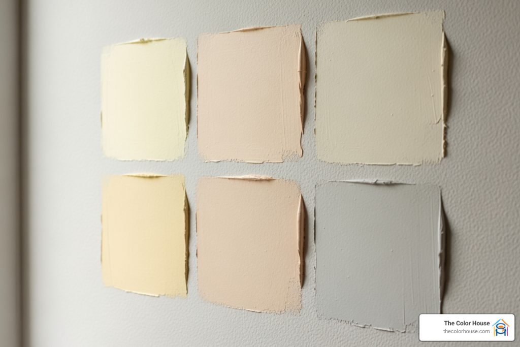
The challenge? Cream isn’t just one color. It’s a family of warm neutrals with different undertones that can make or break your design vision. What looks perfect on a paint chip can read too yellow, too gray, or too pink once it’s on your walls. That’s why sampling is crucial.

I’m Jean Hauser, owner of The Color House and Rhode Island’s leading expert in color consultation, and I’ve helped thousands of homeowners steer the overwhelming world of cream color paint samples over my two decades in the paint and design industry. In this guide, I’ll walk you through everything you need to know to confidently choose the perfect cream for your space.
Why Cream is the Dream Neutral
Cream paint colors are more than just a trend; they are a timeless choice that brings a unique blend of warmth, sophistication, and versatility to any space. When we talk about neutrals, white often feels too stark and cold, especially in our often-gray Rhode Island winters. Beige, on the other hand, can sometimes feel too heavy or dark, potentially making a room feel smaller or dated. This is precisely where cream steps in, offering that perfect “in-between” solution.
The inherent charm of cream lies in its ability to create a soft, inviting atmosphere without overwhelming the senses. It’s a sophisticated neutral that feels incredibly approachable, making any room feel more alive and welcoming. Our clients often tell us how cream transforms their spaces, giving them a cozy, lived-in feel that pure white simply can’t achieve.
Cream is also a master at reflecting light. While white can reflect light with a harsh glare, cream diffuses it softly, creating a gentle glow throughout the room. This makes it an excellent choice for rooms that might lack abundant natural light, as it can subtly brighten and expand the space without feeling cold. For those looking to Make Rooms Feel Bigger, cream is an unsung hero, providing an airy feel while maintaining warmth.
It truly is the perfect in-between neutral, offering a clean backdrop that still feels rich and comforting. It’s neat, yet unassuming, allowing other elements of your decor to shine while providing a harmonious foundation.

Cream vs. White and Beige
To truly appreciate cream, it helps to understand its unique position in the neutral spectrum, especially when compared to its close relatives: white and beige.
Imagine a room painted in a stark, pure white. While undeniably clean and modern, it can sometimes feel sterile, cold, or even institutional. This “too stark” quality can make a space feel uninviting, especially in homes where warmth and coziness are desired. White absorbs very little light, which can be great for brightness, but can also lead to a flat, one-dimensional look if not balanced with other textures and colors.
Now, consider a room painted in a darker beige. While beige offers warmth, it can sometimes lean towards being “too dark,” potentially absorbing too much light and making a room feel smaller or heavier. Some beige tones can also carry a yellowish or muddy undertone that might feel dated depending on the specific shade and the surrounding decor.
Cream, however, strikes a beautiful balance. It’s an off-white that has just enough warmth, typically from subtle yellow, peach, or even pink undertones, to soften the crispness of white without delving into the deeper, sometimes heavier territory of beige. This makes cream an excellent choice for creating an inviting atmosphere where comfort and elegance coexist. It has the refreshing quality of white but with an added layer of depth and softness that encourages relaxation and conversation.
Its versatility in decor is another major advantage. Cream can seamlessly complement both traditional interiors, providing a classic, sophisticated backdrop, and modern spaces, offering a soft contrast to clean lines and minimalist designs. It acts as a chameleon, adapting to the surrounding colors and textures, making it a truly adaptable and beloved neutral in our design toolkit.
Decoding Cream: Understanding Undertones and Light
The secret to mastering cream colors lies in understanding their undertones. Unlike pure white, which is often perceived as having no undertones (though it can pick them up from its surroundings), cream is inherently built upon subtle color bases. These undertones are what give each cream shade its unique personality and dictate how it will appear in your home.
Let’s explore the common undertones you’ll find in cream color paint samples:
- Yellow Undertones: Many classic cream paints lean into yellow. These shades evoke a cheerful, sunny feeling, bringing warmth and a gentle glow to a room. Think of a color akin to ‘Navajo White’ (which has a strong dose of yellow, giving it warmth and depth) or Benjamin Moore’s ‘Pale Almond’, a welcoming and warm backdrop often used with classic American and English brown furniture. Another example is Benjamin Moore’s ‘Featherbed’, which is heavy on the yellow, reminiscent of buttermilk – light, easy, and approachable. A color like Benjamin Moore’s ‘Calming Cream’ can even read as a very pale yellow for a cheerful glow.
- Peach Undertones: These creams have a subtle pinkish-orange hue, adding a soft, rosy warmth. Benjamin Moore’s ‘Putnam Ivory’, for instance, is a sophisticated neutral with peach and orange undertones that give it depth. Similarly, Benjamin Moore’s ‘Indian White’ has peach-beige tones but with a lighter, airier feel than some other warm creams.
- Gray Undertones: Some creams incorporate a touch of gray, creating a more muted, sophisticated, and often “greige” appearance. Benjamin Moore’s ‘Bruton White’, based on an 18th-century color, introduces a touch of gray for a chalkier take on cream. Benjamin Moore’s ‘Vanilla Milkshake’ also has a hint of gray, giving it a soft off-white appearance that works well in various lighting conditions. Benjamin Moore’s ‘Natural Cream’ OC-14 is another excellent example, described as a light greige that flatters both warm and cool color schemes.
- Pink and Orange Undertones: Less common but equally beautiful are creams with distinct pink or orange bases. Benjamin Moore’s ‘Maritime White’ is an off-white that features orange and pink rather than yellow undertones, resulting in a sophisticated beige that adds warmth to a living room or bedroom.
Understanding these undertones is paramount because natural light dramatically affects how they are perceived. What looks like a beautiful, soft cream on a swatch could turn into a glaring yellow or a muddy gray once applied to your walls. This is why we always emphasize the importance of our Color Consultation services, especially when dealing with such nuanced shades.
How Light Changes Everything
It’s no exaggeration to say that light is the single most influential factor in how your chosen cream paint color will appear. The same exact shade can look drastically different from one room to another, or even from morning to evening in the same room.
Natural Light Effects:
- North-facing rooms: These rooms typically receive cooler, indirect light. This cool light can emphasize any gray, green, or blue undertones in your cream paint, making it appear more muted or even slightly cooler than you might expect. A cream with a strong yellow undertone might be necessary here to counteract the coolness and maintain warmth.
- South-facing rooms: Bathed in abundant, warm, direct light throughout the day, south-facing rooms tend to intensify warm undertones. A cream with yellow or peach undertones will glow here, appearing even warmer and more vibrant. Conversely, a cream with subtle gray undertones might appear more neutral or even slightly warmer than it would in a north-facing room.
- East-facing rooms: These rooms get bright, warm morning light, which then transitions to cooler, indirect light in the afternoon. This means your cream could look quite different throughout the day.
- West-facing rooms: Enjoying warm, golden light in the afternoon and evening, these rooms will showcase the warm undertones of your cream paints beautifully as the day progresses.
Artificial Lighting Impact: Don’t forget about artificial light sources! Incandescent bulbs tend to cast a warm, yellowish glow, which will improve yellow undertones in your cream. LED lights, depending on their Kelvin temperature (warm white, neutral white, cool white), can either complement or clash with your paint’s undertones. It’s crucial to observe your cream color paint samples under both natural and artificial light conditions that mimic your everyday living.
Our best advice? Test, test, test!
- Testing on different walls: Apply your samples to at least two different walls in the room you intend to paint, especially walls that receive varying amounts of light.
- Morning vs. afternoon light: Observe the samples throughout the day, from morning to evening, to see how the color shifts.
- Choosing undertones based on room orientation: If you have a north-facing room that feels perpetually cold, a cream with a stronger yellow or peach undertone might be your best bet to inject warmth. For a south-facing room already brimming with sunlight, a cream with more neutral or even a hint of gray undertone could prevent it from becoming too yellow or intense.
Taking these steps will give you a true sense of how your chosen cream will live and breathe in your unique space, helping you choose the perfect shade with confidence.
A Curated List of Popular Cream Color Paint Samples
When exploring cream paints, certain shades consistently rise to the top as designer favorites and homeowner go-tos. These colors have earned their reputation for their beautiful balance, versatile undertones, and ability to create truly stunning spaces. We’ve gathered some of the most beloved cream color paint samples from Benjamin Moore and Farrow & Ball, two brands renowned for their exquisite palettes and uncompromising quality, which we proudly offer at The Color House.

Timeless Benjamin Moore Creams to Sample
Benjamin Moore is a powerhouse in the paint industry, celebrated for its vast and nuanced color selection, backed by proprietary Gennex Color Technology that ensures vibrant, long-lasting results. Their cream collection is particularly impressive, offering options for every taste and lighting condition.
- Benjamin Moore White Dove OC-17: This is a true classic among designers, used again and again throughout living spaces, kitchens, and bedrooms. As Eleanor Trepte, principal designer at Dekay & Tate, says, “We love this color because it’s an ‘easy’ white. It’s not too bright and overpowering. It picks up tones from the other colors in the room.” White Dove is beautifully creamy, a soft, warm off-white that provides an neat backdrop without ever feeling stark. It’s a color that gracefully adapts to its environment, reflecting the warmth of your furnishings and decor. You can explore more about this classic on the Benjamin Moore website.
- Benjamin Moore Swiss Coffee OC-45: Described as “yummy” by Morgan Martin Boyer, a design-focused Realtor, this color has “no glaring undertones, not a stark white. Just creamy goodness.” Swiss Coffee is an agreeable neutral that brings comfort and warmth to any room, from living rooms to bedrooms. It’s a soft, milky off-white that creates a serene and inviting atmosphere.
- Benjamin Moore Creamy White OC-7: A warm, gentle bisque hue that truly makes any space look relaxed and welcoming. With an LRV of 70.95, it’s light enough to feel airy but possesses a comforting depth. This is a fantastic option for those seeking a cream that leans into a very soft, inviting warmth without being overtly yellow. See more details on Benjamin Moore’s site.
- Benjamin Moore Natural Cream OC-14: This shade is a light greige, a sophisticated blend of gray and beige that flatters both warm and cool color schemes. With an LRV of 64.78, it offers a gentle, earthy warmth that feels incredibly organic and grounding. It’s a versatile choice for those who want a cream that isn’t too yellow or too stark, providing a subtle depth.
- Benjamin Moore Calming Cream OC-105: As its name suggests, this is a delicate white with a soft, sunbaked glow. It reads almost like a very pale yellow, offering a cheerful and subtle warmth without being overwhelming. It’s an excellent choice for brightening any room with a gentle, inviting radiance. You can find this delicate shade on Benjamin Moore’s product page.
Beyond these favorites, Benjamin Moore offers a wealth of other beautiful creams:
- Bruton White CW-710: Based on a classic 18th-century color, this cream introduces a touch of gray for a chalkier, more historic feel.
- Harwood Putty CW-5: A creamy off-white with a cool touch, resembling a lime wash, perfect for a subtle, aged look.
- Pale Almond OC-2: A yellow-toned neutral that is a welcoming and warm backdrop, especially for classic furniture.
- Putnam Ivory HC-39: A sophisticated neutral with peach and orange undertones, great for highlighting art.
- Mascarpone AF-20: A lightweight, airy cream with a hint of buttery yellow, lovely for cabinetry.
- Ivory White 925: A perfect choice for creaminess that’s warm without reading yellow, transitioning beautifully from day to night.
- Soft Chamois OC-13: A stately cream that leans towards beige, reading as a warm off-white.
- Gentle Cream OC-96: A bisque shade that adds depth and coziness, making a space feel inviting.
- Linen White 912: A relaxed off-white with a touch of butter, easygoing and casual.
- Acadia White OC-38: A warm cream that feels refreshing and crisp, bright and airy in natural light.
- Indian White OC-88: Peach-beige tones with a lighter, airier feel.
- Vanilla Milkshake 2141-70: A muted shade with a hint of gray, complementing both traditional and modern interiors.
- Maritime White OC-5: An off-white with orange and pink rather than yellow undertones, creating a sophisticated warmth.
At The Color House, we specialize in Benjamin Moore Paint and can guide you through their extensive collection to find your perfect cream.
Neat Farrow & Ball Creams
Farrow & Ball paints are renowned for their rich pigments, depth of color, and traditional craftsmanship. Their cream shades possess a unique chalky finish and incredible nuance that changes beautifully with the light.
- Farrow & Ball White Tie No. 2002: This clean, soft shade of white is aptly named for formal wear. It’s a beautifully soft, creamy color that feels luxurious and neat, bringing a gentle sophistication to any room. Its subtle warmth prevents it from feeling cold, making it a versatile choice for both classic and contemporary interiors.
- Farrow & Ball Slipper Satin No. 2004: A favorite cream paint color among designers like Becca Casey of Becca Interiors, Slipper Satin is a sophisticated neutral. Named for the color inside ballet slippers, it adds an exquisite elegance to classic decor. This cream has a remarkable ability to hold its own next to cooler tones and still feel warm and inviting, even in sun-soaked spaces.
- Farrow & Ball Pointing No. 2003: Pointing is a warm, versatile cream that feels at home across traditional and modern decor. It has a refreshing, crisp look that brightens any room, making it suitable for living rooms, kitchens, bedrooms, or anywhere you want a welcoming wash of color. Its ability to adapt makes it a highly popular choice.
Another notable Farrow & Ball cream is Tallow No. 2005, a glowy, clean neutral named for the material used to make candles. It’s beautiful in both dimly lit and bright spaces, thanks to its excellent light-reflecting properties.
Find the unique beauty of these shades and more in our Farrow & Ball Signature Palette Collection at The Color House.
The Smart Way to Sample: Tips for Testing Cream Paints
Choosing the perfect cream is not a decision to be made lightly, especially given the subtle differences in undertones and how they react to light. This is where cream color paint samples become your best friend. Gone are the days of guessing from a tiny chip or committing to a whole can of paint only to realize it’s all wrong. We’ve seen it countless times, and it’s why we champion smart sampling.
There are primarily two highly effective ways to sample paint colors today: brush-on samples and peel-and-stick samples. Each offers distinct advantages for helping you make an informed decision.
- Brush-on Samples: These are small pots (typically 8 oz.) of actual paint, designed for you to brush directly onto your walls or a large board. Benjamin Moore offers these, and we find them to be the “best visualizer” because they provide an authentic representation of the paint’s texture and finish. An 8 oz. sample typically covers about 2 ft. x 2 ft. with two coats. We always recommend applying two coats for the most accurate color representation.
- Peel-and-Stick Samples: These innovative samples have revolutionized the way homeowners test colors. They are large (often 9″x15″), pre-painted swatches that you simply peel off their backing and stick to your wall. The benefits are numerous:
- Mess-Free Application: No paint, no brushes, no cleanup. This is a huge time-saver and eliminates the hassle of traditional sampling.
- Repositionable Benefits: You can easily move these samples from one wall to another, or even from room to room, without losing adhesion or damaging your existing paint. This allows you to observe the color in different lighting conditions and against various elements of your decor.
- Better Visualization: The larger size of peel-and-stick samples provides a much better visual representation of the color than a small paint chip. Customers often appreciate seeing the color on a larger scale before committing. The clarity and size of these samples are highly praised.
- Speed and Convenience: Many services offer overnight delivery for these samples, meaning you can start testing colors almost immediately. This is incredibly valuable when you’re eager to make a decision.
Whether you opt for brush-on or peel-and-stick, the goal is the same: to see the color in your actual environment. This investment in sampling is a small price to pay for the larger investment of painting your entire home. It saves a ton of time and effort compared to buying small pots of paint for every color you’re considering.
Applying Your Cream Color Paint Samples for Best Results
Once you have your cream color paint samples in hand, the way you apply and observe them is just as important as the colors you’ve chosen. Don’t just slap them on and make a snap decision! Follow these best practices for truly accurate results:
- Preparation is Key (for Brush-On Samples): If using brush-on samples, ensure your wall is clean and dry. For the most accurate color, consider priming a small section, especially if your current wall color is very dark or very bright.
- Two-Coat Application: This is non-negotiable for brush-on samples. Paint manufacturers formulate their colors to be opaque and true-to-chip after two coats. A single coat can look streaky, uneven, and won’t accurately represent the final color. An 8 oz. sample is typically enough to cover a 2 ft. x 2 ft. area with two coats.
- Use a Foam Board (Optional but Recommended): Instead of painting directly on your wall, consider painting your brush-on samples onto large white foam boards (available at craft or office supply stores). This allows you to:
- Move the sample around the room, placing it on different walls.
- Hold it up against existing furniture, fabrics, and trim to see how the colors interact.
- Avoid painting multiple test patches directly on your wall, which can sometimes be difficult to cover later.
- Observe at Different Times of Day: As we discussed, light changes everything. Observe your samples (whether on the wall or foam board) in:
- Morning Light: Often cooler and brighter.
- Mid-day Light: Typically the brightest and most direct.
- Afternoon/Evening Light: Warmer and softer, or potentially darker depending on the room’s orientation.
- Artificial Light: Turn on your lamps and overhead fixtures to see how the color looks under the lighting you use most often.
- Check Against Furniture and Trim: Hold your samples directly against your couch, curtains, wood trim, and flooring. Does the cream complement or clash? A color like Benjamin Moore White Dove is beloved because it “picks up tones from the other colors in the room,” making it a harmonious choice. Similarly, Benjamin Moore Ivory White, when used for trim, “plays well with other colors.”
- Step Back and Take Notes: Don’t just look at the samples up close. Step back and view them from across the room. How does the color feel in the larger context? Take notes on what you like and dislike about each sample under different conditions.
By following these steps, you’ll gain a comprehensive understanding of how your chosen cream will perform in your unique space, helping you avoid common paint problems and ensure a beautiful, lasting result. For more advice on paint application and troubleshooting, check out our guide on Fixing Common Paint Problems.
Styling with Cream: Room by Room Inspiration
Cream paints are incredibly versatile, capable of changing any room into a haven of warmth and style. The key is to select the right cream for the specific function and desired ambiance of each space, considering its unique lighting and existing decor. Let’s explore some room-by-room inspiration, offering suggestions for both traditional and modern aesthetics.
| Room Type | Decor Style | Recommended Cream Characteristics periodically through the article with the keyword cream color paint samples.
- Do not mention any competitors of the company The Color House. This means avoiding any mention of Sherwin-Williams. I will rephrase any statistics or quotes that refer to Sherwin-Williams to describe the color or effect without naming the brand.
- Geography constraint: Only include information applicable to Rhode Island. This means I will focus on the general applicability of paint colors and sampling methods, and avoid specific regional promotions or details from external sources not tied to RI.
- Word count: Aim for ~2500 words. This will require thorough elaboration on each point.
- Tone: Simple, clear, warm, humorous where appropriate. First-person plural (we, us, our).
- Graphics: Use the exact syntax and sources provided.
Confidence Score: 5/5 – I am confident I can meet all requirements.
Strategizing complete. I will now proceed with generating the article.