

Prefer to listen to this? Click below to get an overview:
A New Era of Timeless Elegance
Benjamin Moore’s 2026 Color of the Year is Silhouette AF-655, a rich espresso brown with subtle notes of charcoal. Here’s what you need to know:
- Color: Silhouette AF-655
- Description: A distinctive blend of luxurious burnt umber with delicate charcoal undertones
- Style: Sophisticated, warm neutral that evokes classic custom suiting
- Mood: Grounded yet sophisticated, cozy yet bold, timeless yet contemporary
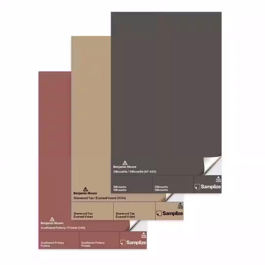
- Palette: Accompanied by seven complementary hues including Swiss Coffee OC-45, First Crush CSP-310, Raindance 1572, Batik AF-610, Narragansett Green HC-157, Southwest Pottery 048, and Sherwood Tan 1054
Every fall, the design world buzzes with anticipation. What will the next Color of the Year be?
Benjamin Moore’s choice for 2026 reflects a meaningful shift in how we think about our homes. After years of trending through happy blues and greens post-pandemic, then pivoting to quiet luxury beiges, we’re now embracing something deeper and more enduring. Silhouette AF-655 isn’t just another trendy shade—it’s a response to growing trend fatigue and a desire for spaces that feel both grounded and refined.
According to Andrea Magno, Benjamin Moore’s director of color marketing and design, this rich hue “embodies a renewed interest in suiting and classic silhouettes, the resurgence of timeless pieces, and the growing interest in the brown color family.” The inspiration draws directly from fashion’s return to custom, layered styles—think of a custom-custom suit that never goes out of style.
The Color Trends 2026 palette balances deep, commanding tones with delicate, ethereal accents. It signals a return to thoughtful attention to detail, craftsmanship, and colors that layer beautifully together. Whether you’re considering a dramatic color-drenched living room or subtle accents on trim and millwork, this palette offers sophisticated options for every space in your home.
As owner and president of The Color House and a longtime Benjamin Moore partner, I’ve spent over two decades helping Rhode Island homeowners steer color decisions with confidence. I’ve watched Benjamin Moore’s 2026 Color of the Year selection process evolve, and Silhouette AF-655 represents one of the most thoughtful, versatile choices yet—perfect for creating spaces that feel both current and enduring.
, Raindance 1572 (pale blue-green), Swiss Coffee OC-45 (warm off-white), First Crush CSP-310 (soft blush), Batik AF-610 (dusty mauve), Narragansett Green HC-157 (blackened teal), Southwest Pottery 048 (earthy clay), and Sherwood Tan 1054 (classic tan), each with color swatches and names clearly labeled - Benjamin Moore’s 2026 Color of the Year infographic brainstorm-6-items")
A Closer Look at Silhouette AF-655

At first glance, Silhouette AF-655 might appear to be a deep, dark brown, but its true beauty lies in its nuanced composition. Benjamin Moore describes it as a distinctive color that “weaves luxurious burnt umber with delicate notes of charcoal.” This isn’t a stark, flat brown; instead, it’s a dynamic hue with an alluring mix of rich espresso and subtle, smoky undertones that give it incredible depth and dimension. It’s a warm neutral, offering a softer, more inviting alternative to traditional black or even dark charcoal grays.
The characteristics of Silhouette AF-655 are truly captivating. It possesses an “enveloping quality and a softness to it,” making it feel both grand and intimate. It’s rich yet soft, intriguing yet familiar, and bold yet approachable—qualities that make it remarkably versatile in any space. Imagine the feeling of stepping into a room painted in this shade; it’s a sophisticated accept, a quiet confidence that instantly lifts the mood.
The overall mood that Silhouette AF-655 aims to evoke is one of refined elegance and cozy sophistication. It offers a sense of stability and grounding, without feeling heavy or overwhelming. It’s the color equivalent of a perfectly custom suit—classic, comfortable, and undeniably stylish. This timeless quality allows it to transcend fleeting trends, settling into a space with enduring grace.
The inspiration behind the selection of Silhouette AF-655 is deeply rooted in the connection between fashion and interior design. Andrea Magno highlights how the color reflects “a renewed interest in suiting and classic silhouettes, the resurgence of timeless pieces, and the growing interest in the brown color family.” Just as fashion has seen a return to well-crafted, enduring garments, our homes are seeking the same sense of lasting quality and sophisticated simplicity. This modern take on classical suiting translates into an interior color that is both commanding and comforting, a true statement neutral that anchors a room with quiet authority. We invite you to dive deeper into this captivating color and find its full potential. Learn more about Silhouette AF-655.
The Psychology Behind the Hue
The choice of Silhouette AF-655 for Benjamin Moore’s 2026 Color of the Year is no accident; it’s a thoughtful reflection of evolving color psychology and broader societal shifts. After years of navigating global uncertainties, our collective desire for comfort, stability, and authenticity has grown. This leads us to seek spaces that feel grounded, secure, and genuinely ours. Silhouette AF-655, with its deep, earthy tones, perfectly answers this call, creating a foundation of calm and sophistication in any room.
This color also speaks to the concept of “quiet luxury” that has permeated design trends. It’s a reaction against the fleeting, often loud, microtrends that social media constantly churns out. Instead of chasing the next viral aesthetic, homeowners are increasingly opting for enduring styles and high-quality finishes that offer a sense of understated opulence. Silhouette AF-655 embodies this perfectly—it’s luxurious without being ostentatious, making a statement through its depth and richness rather than its brightness.
When we compare Silhouette AF-655 to previous Benjamin Moore Colors of the Year, we can see a clear trend evolution. Benjamin Moore’s 2023 Color of the Year, Raspberry Blush, was a vivid, pink-inflected red—a burst of exuberance and optimism post-pandemic. This was followed by 2025’s Cinnamon Slate, a moody, brown-undertoned plum that hinted at a move towards more complex, sophisticated hues. Silhouette AF-655 continues this trajectory, solidifying the shift from bright, energetic colors to deep, luxurious, and ultimately more timeless tones. It represents a maturation of our aesthetic preferences, moving from celebratory brightness to comforting depth, and then to a quietly confident elegance. This gradual shift reflects our collective desire for spaces that not only look good but also feel good, offering a sanctuary from the outside world. For those interested in seeing how these trends have evolved, explore More on past Colors of the Year.
Meet the 2026 Color Trends Palette

Alongside the reigning Benjamin Moore’s 2026 Color of the Year, Silhouette AF-655, comes a carefully curated Color Trends 2026 palette. This collection of eight harmonious hues is designed to complement Silhouette, creating a comprehensive and versatile toolkit for interior design. The palette is described as perfectly “balanced between deep and delicate, traditional and poetic,” a testament to Benjamin Moore’s thoughtful approach to color forecasting.
What makes this palette truly special is its focus on craftsmanship and refinement. Each color has been chosen to work in concert, allowing for sophisticated layering and thoughtful attention to detail in design. It signals a powerful return to timeless classics, moving away from fleeting fads and towards enduring beauty. The palette includes a mix of “enchanting pales” and “handsome midtones,” providing a wide range of options that can transform any space. From creating a serene backdrop to making a bold statement, these colors are designed to empower homeowners and designers alike. We’re excited to see the beautiful, grounded spaces our Rhode Island clients will create with these selections. Explore the full palette.
The 8 Hues of the 2026 Palette
Let’s take a closer look at the stars of the Color Trends 2026 palette:
- Silhouette AF-655: The undisputed Benjamin Moore’s 2026 Color of the Year, a rich espresso brown with subtle charcoal notes. It serves as the grounding anchor of the entire collection, offering depth and sophistication.
- Raindance 1572: An easygoing, pale blue-green with a gray undertone. This adaptable shade works beautifully in rustic farmhouse or more traditional spaces, offering a calming presence that lets other design elements shine. It’s like a breath of fresh air on a misty morning.
- Swiss Coffee OC-45: An iconic, warm, and incredibly versatile off-white. This beloved hue is a designer favorite for a reason; it “sings so well with all the other colors” in the palette, providing a crisp brightness that brings out the custom structure of darker tones. It’s also a fantastic exterior choice, proving its best flexibility.
- First Crush CSP-310: A feel-good hue with a hint of blush. This delicate shade is perfect for creating a warm, inviting atmosphere in bedrooms, powder rooms, or primary baths. It subtly boosts a space’s details and brings textures to the forefront, creating a gentle, romantic effect.
- Batik AF-610: An ethereal, dusty mauve blending violet and rose with a gray undertone. This color is a “nice wink of color,” appearing neutral but capable of skewing purplish under certain lighting. It’s soft, subtle, and can personalize a space with its delicate charm, reminiscent of a vintage tea dress.
- Narragansett Green HC-157: A stately, blackened teal from Benjamin Moore’s Historical Color Collection. This striking blend of black and teal conveys a “strong sense of history and architectural relevance,” making it both dramatic and dignified. It’s a powerful choice for those looking to make a bold, sophisticated statement.
- Southwest Pottery 048: A versatile, earthy blend of brown, red, and orange, reminiscent of kiln-fired clay. This hue is remarkably adaptable; it can feel rustic or refined depending on its pairings, much like a favorite fashion piece that takes on different looks with various accessories.
- Sherwood Tan 1054: A classic, earthy tannish brown neutral. Sherwood Tan acts as a beautiful backdrop, allowing other elements to come to the forefront. It’s flexible enough for both traditional and modern spaces, creating a soft, layered look when paired with creamy whites like Swiss Coffee.
Designing with Benjamin Moore’s 2026 Color of the Year
Now that we’ve met Silhouette AF-655 and its stunning companions, the exciting part begins: bringing these colors into your Rhode Island home. The versatility of Benjamin Moore’s 2026 Color of the Year and its accompanying palette means there are countless ways to incorporate them, from subtle accents to dramatic changes.
For those looking to make a bold statement, consider color drenching a space with Silhouette. This technique involves painting walls, trim, and even ceilings in the same deep hue, creating a cozy, enveloping atmosphere. Imagine a living room, a home movie theater, or a dining room bathed entirely in Silhouette—it creates a sophisticated cocoon, perfect for intimate gatherings or quiet relaxation. If a full immersion feels too daring, Silhouette makes an exceptional accent wall, providing a commanding presence that can be softened by lighter tones elsewhere in the room.
Cabinetry is another fantastic canvas for Silhouette. Dark cabinets, especially in a rich espresso like this, can create a dramatic focal point in kitchens and bathrooms, pairing beautifully with lighter countertops and backsplashes for a stunning contrast. For trim and millwork, Silhouette can be used to create sharp, custom lines, especially when contrasted with crisp white walls or other lighter shades from the palette.
When choosing finishes, consider the mood you want to create:
- Matte or Flat finishes (like Aura Interior Matte or Regal Select Interior Matte) will give Silhouette a velvety, sophisticated depth, absorbing light to create a soft, enveloping feel.
- Eggshell (Aura Interior Eggshell, Regal Select Interior Eggshell) offers a low-sheen durability, perfect for walls in high-traffic areas, providing a balanced look.
- Satin (Aura Interior Satin) offers a slightly higher sheen, ideal for trim, doors, or cabinetry, providing a subtle gleam that highlights architectural details.
- Semi-Gloss (Regal Select Interior Semi-Gloss) is a classic choice for trim, doors, and furniture, offering excellent durability and a beautiful, luminous finish.
The right finish improves the color’s character and protects your surfaces. We can help you find the perfect Benjamin Moore paint for your project. Find the right Benjamin Moore paint.
Pairing Window Treatments with Benjamin Moore’s 2026 Color of the Year
The interplay between paint colors and window treatments is crucial for a cohesive and beautiful interior. With Benjamin Moore’s 2026 Color of the Year, Silhouette AF-655, the possibilities are truly neat.
For rooms featuring deep Silhouette AF-655 walls, you have a wonderful opportunity to balance the richness with thoughtfully chosen window treatments. Light, airy draperies in materials like sheer linen or soft cotton can provide a beautiful contrast, allowing natural light to filter gently while softening the deep wall color. Consider shades like Swiss Coffee OC-45 or First Crush CSP-310 for your drapes to echo the lighter tones in the palette. For a warmer, more natural feel, pair Silhouette with natural wood blinds or woven wood shades. These textures add an organic element that complements the earthy undertones of Silhouette, bringing an inviting warmth to the space. If you’re aiming for ultimate luxury and a more formal aesthetic, rich velvet drapes in a complementary deep hue like Narragansett Green HC-157 can create a dramatic and sophisticated layered look, perfect for a cozy living room or neat dining area.
When working with the lighter palette colors like Raindance 1572, First Crush CSP-310, or Batik AF-610, these soft hues create an enchanting backdrop. This allows you to introduce more dramatic or patterned blinds or draperies without overwhelming the room. Think bold geometric patterns on Roman shades, or intricate floral designs on custom drapes. The subtle wall color will let your window treatments become a stunning focal point.
Mid-tones such as Sherwood Tan 1054 or Southwest Pottery 048 offer a versatile foundation. Here, a layered look works beautifully. Textured Roman shades in a complementary solid or subtle pattern, combined with sheer or semi-sheer drapes, can add depth and flexibility, allowing you to control light and privacy while enhancing the color scheme. Our decorating services can help you expertly pair your paint choices with the perfect window treatments to complete your vision. Explore our decorating services.
Room-by-Room Inspiration for Benjamin Moore’s 2026 Color of the Year
Let’s imagine how Benjamin Moore’s 2026 Color of the Year and its palette can transform specific rooms in your Rhode Island home:
Living Room: Create a truly cozy, enveloping space by painting the walls in Silhouette AF-655. This deep, rich espresso brown with its charcoal undertones will make your living room feel like a luxurious retreat. Complement this with Swiss Coffee OC-45 on the trim and ceiling to provide a crisp contrast that highlights the architectural details. For window treatments, consider cream-colored linen drapes or custom Roman shades in a soft, textured fabric to add warmth and softness. The connection between fashion and interiors is evident here, as the custom elegance of Silhouette feels like wrapping your room in a bespoke garment.
Bedroom: For a serene and tranquil escape, look to the “enchanting pales” of the palette. Raindance 1572, a pale blue-green, or First Crush CSP-310, with its hint of blush, would create a wonderfully calming atmosphere. Pair these with soft, flowing draperies in a similar tone or a complementary neutral to improve the peaceful mood. Imagine blackout drapes in a muted gray or a light taupe, ensuring restful sleep while maintaining the room’s gentle aesthetic.
Kitchen: Make a bold yet sophisticated statement by applying Narragansett Green HC-157 to your kitchen cabinets. This blackened teal from Benjamin Moore’s Historical Collection offers a rich, deep hue that feels both classic and contemporary. Balance this intensity with Swiss Coffee OC-45 on the walls and ceiling, and perhaps a backsplash in natural stone. For window treatments, simple, functional blinds or valances in a neutral color would be ideal, keeping the focus on the stunning cabinetry.
No matter the room, the key is to consider the mood you want to evoke and how each element, from paint to window treatments, contributes to the overall design. Our expert color specialists are always ready to provide personalized advice and guide you through these exciting choices. Get expert advice from a color specialist.
Frequently Asked Questions about Silhouette AF-655
We know that choosing a new paint color can bring up a lot of questions. Here are some of the most common inquiries we receive about Benjamin Moore’s 2026 Color of the Year, Silhouette AF-655:
What kind of color is Silhouette AF-655?
Silhouette AF-655 is a rich espresso brown with delicate notes of charcoal and burnt umber. It’s truly a distinctive color that offers incredible depth and sophistication. While it’s a deep hue, it functions as a warm, sophisticated neutral. Think of it as a softer, more inviting alternative to stark black or cool charcoal gray. It brings warmth and grounding to a space without being overwhelming.
What colors go well with Silhouette AF-655?
The beauty of Silhouette AF-655 is its versatility, especially when paired with the Color Trends 2026 palette. It harmonizes beautifully with all seven complementary hues. For classic elegance, pair it with creamy whites like Swiss Coffee OC-45 on trim, ceilings, or adjacent walls. For a touch of softness, First Crush CSP-310 (a pale blush) creates a lovely, gentle contrast. Earthy tones like Sherwood Tan 1054 or Southwest Pottery 048 will create a rich, layered effect, enhancing Silhouette’s natural warmth. Even the cool notes of Raindance 1572 or the deep drama of Narragansett Green HC-157 can create stunning, balanced schemes with Silhouette as the anchor.
Is brown a trending color for interior design?
Absolutely, yes! There is a significant and growing interest in the brown color family within interior design. This trend reflects a broader shift towards warmer, classic, and more grounded interior spaces. After years of cooler grays and bright, high-energy colors, homeowners are seeking comfort, authenticity, and timelessness. Brown hues, like Silhouette AF-655, offer that sense of stability, sophistication, and comforting familiarity. They are versatile, pair well with many other colors, and create spaces that feel both current and enduring. It’s a wonderful time to accept the richness that brown can bring to your home.
Bring the 2026 Color Trends to Your Rhode Island Home
Bringing the sophisticated elegance of Benjamin Moore’s 2026 Color of the Year, Silhouette AF-655, and its stunning Color Trends 2026 palette into your Rhode Island home is an exciting journey. We at The Color House are here to guide you every step of the way.
One of the most crucial steps in selecting paint colors is testing colors in your actual space. Colors can look dramatically different depending on your home’s lighting, existing furnishings, and even the time of day. We always recommend picking up bedroom paint samples (or samples for any room!) and painting small swatches on your walls. You can also download the Color Trends 2026 Brochure for larger swatches. Even better, use the Benjamin Moore Color Portfolio® app to visualize colors in your space before you commit. Download it on Google Play or the App Store.
At The Color House, we pride ourselves on offering expert guidance and individualized service that you won’t find at big box stores. As a women-owned business with the largest inventory in Rhode Island, we provide a personalized alternative. Our team is passionate about color and interior design, ready to offer color consultation and help you select the perfect hues and finishes for your project. We can discuss everything from color psychology to the best Benjamin Moore Fresh Start primers to ensure your project looks professional and lasts for years.
Ready to transform your space with the timeless elegance of Silhouette AF-655 and the 2026 Color Trends palette? Visit one of our convenient Rhode Island locations in North Kingstown, Cranston, Wakefield, Middletown, or Smithfield to get started. We look forward to helping you create a home you’ll love!


