Color coding can help students start school feeling calm, focused, and in control. At The Color House, we believe the right palette not only organizes but also enhances the joy of learning. By pairing purposeful Benjamin Moore colors with thoughtful design, you can reduce stress, speed up homework time, and make your student’s study space feel both fun and functional.
Why Color Coding Boosts Productivity and Focus
Color coding simplifies school life—it turns “find my math book” into “find the green binder.” At The Color House, our color experts know that when kids instantly recognize a subject by its hue, they save time and mental energy. A consistent system helps kids stay on task and build confidence over the school year. Parents often comment how their children “finish homework faster with less fuss,” thanks to this visual organization.

Selecting the Right Color Palette for Study Zones
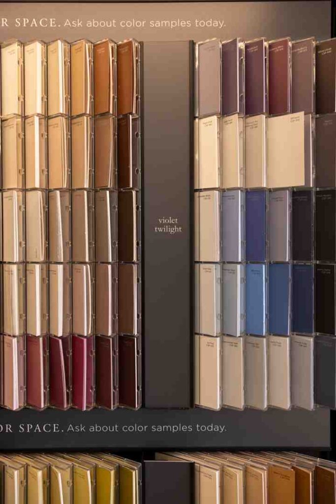
Choosing colors wisely makes a big difference in how a study area feels. Our team at The Color House helps families strike a balance: energetic tones for creativity, calming shades for concentration. Bold colors like orange and yellow energize younger students, while soft blues and greens offer a soothing backdrop for middle and high school learners. Plus, picking just three main colors—walls, containers, and labels—keeps the space harmonious and clutter-free.
Color and Mood: Choosing Colors that Calm or Energize
Colors have feelings too—and we craft spaces with that in mind. At The Color House, we know that tranquil blues or greens dial down stress, perfect for reading or test prep. Fun, warm hues like yellow or peach spark energy during creative tasks. By mixing calming and vibrant tones, we tailor study areas that adapt to different moods—keeping kids engaged, focused, or relaxed as needed.

Space Design Tips: Lighting, Storage, and Color Harmony
A good study zone combines smart colors with smart design. The Color House advises maximizing natural light—bright hues come alive in daylight, aiding alertness. Use neutral wall paint so colorful bins, labels, and organizers pop without overwhelming the eye. Consistency is key: three main colors create visual harmony and make tidying up intuitive. Want to explore how subtle finish choices or complementary accents enhance the learning vibe? Our color consultations in Rhode Island stores offer personalized guidance.
(See our post on “Child-Friendly Paint Options” for safe, durable choices that suit study spaces especially well.)
Conclusion
Color coding turns study spaces into organized, joyful zones where kids can focus and thrive. At The Color House, we combine thoughtful design, expert palettes, and product know‑how to create spaces that work beautifully for learning. From the paint on the walls to the labels on folders, each hue plays a role. Ready to make studying smoother and more colorful? Let The Color House guide your back‑to‑school transformation.