Why Choosing the Right Wall Color Transforms Your Home
The best indoor paint colors for walls can completely transform your space—but with thousands of shades available, the decision often feels overwhelming. Here’s what you need to know:
Top Indoor Paint Color Categories:
- Timeless Neutrals – Alabaster, Agreeable Gray, Swiss Coffee, White Dove
- Calming Blues & Greens – Aegean Teal, Sage Green, Palladian Blue
- Warm Earthy Tones – Softer Tan, Natural Linen, Fairview Taupe
- Moody Dramatic Shades – Hale Navy, Black Jack, Urbane Bronze
- Crisp Whites – Chantilly Lace, Pure White, Snowbound
Gray, beige, white, and earth tones dominate bestseller lists because they work with nearly any decor style. Neutrals like Agreeable Gray and Alabaster remain consistent customer favorites for their ageless versatility. But don’t overlook bolder choices—designers are increasingly favoring deep blues, rich greens, and even moody purples, even in smaller spaces.
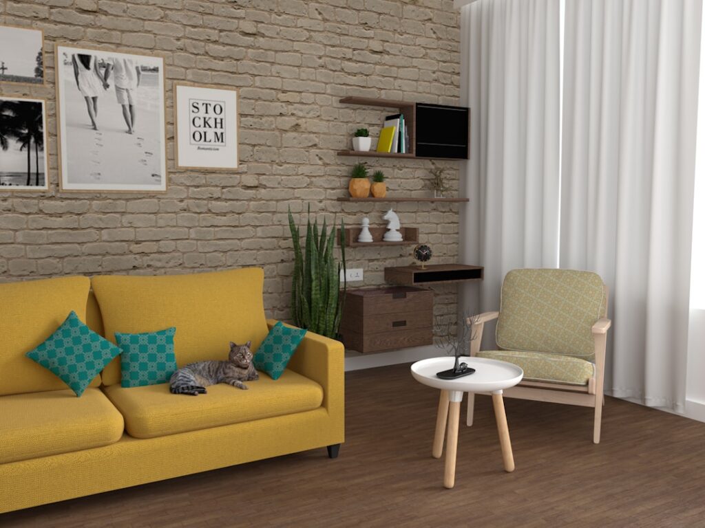
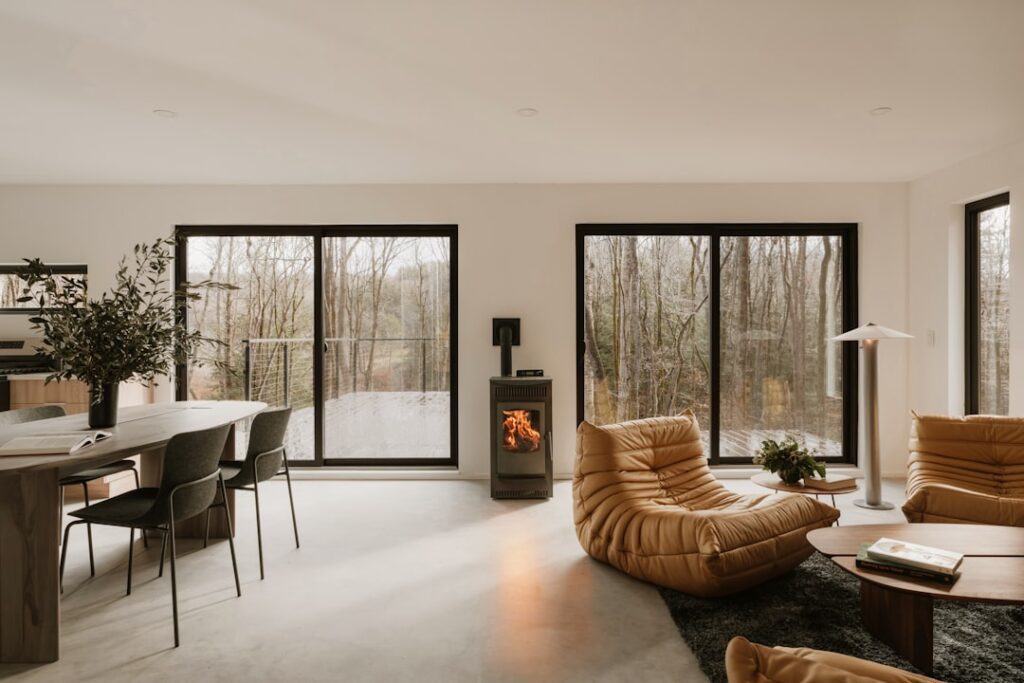
The color of your walls sets the tone for everything else in the room. It affects how natural light moves through your space, how large or intimate a room feels, and even your mood when you walk through the door. The right shade can make a small room feel airy and open, while a deep, saturated hue can create the cozy embrace you crave in a bedroom or den.
The challenge isn’t just picking a pretty color—it’s understanding undertones, how lighting changes throughout the day, and which shades complement your existing furniture, flooring, and window treatments. A color that looks perfect on a paint chip can read completely different on your walls, especially when paired with Rhode Island’s varying natural light conditions.
As Jean Hauser, owner of The Color House with over two decades of experience in interior design and color consultation, I’ve guided countless Rhode Island homeowners through selecting the best indoor paint colors for walls that perfectly match their vision and lifestyle. Whether you’re refreshing a single room or planning a whole-house transformation, the right guidance makes all the difference.

Simple guide to best indoor paint colors for walls:
Best Indoor Paint Colors for Walls: Designer Favorites and Trends
When we look at the current landscape of interior design, there is a clear shift toward colors that feel “lived-in” and organic. While the “all-gray” trend of the last decade is fading, it has been replaced by warmer, more nuanced shades.

One of the most requested Benjamin Moore colors in our Smithfield and Cranston stores is Swiss Coffee OC-45. This off-white is a designer darling because it has just enough warmth to feel cozy without leaning too yellow. It’s often paired with White Dove, another classic that provides a clean, soft contrast on trim and ceilings.
Current trends are also leaning heavily into nature-inspired hues. Sage green has become the new neutral for many Rhode Island homeowners. It provides a subtle pop of color that remains incredibly calming. According to 12 Calming Colors to Paint Your Walls, According to Interior Designers, shades that remind us of nature—like clear skies or gentle meadows—have a measurable soothing effect on our nervous systems.
Timeless Neutrals and the Best Indoor Paint Colors for Walls for Small Spaces
A common myth in home design is that you must use stark white to make a small room feel larger. While light colors certainly help with light reflectance, the best indoor paint colors for walls in small spaces are often those with a bit of depth.
For a neutral interior paint colors approach that works in tight quarters, we often recommend Classic Gray. It’s a sophisticated “whisper” of a color that changes beautifully with the light. To truly make rooms feel bigger, we suggest painting the walls, trim, and even the ceiling in the same color—a technique known as “color drenching” or monochromatic design. This removes the visual boundaries of the room, tricking the eye into seeing a more expansive space.
If you want to add a high-end, tactile feel to your small rooms, consider textured options like Roman Clay. This finish adds movement and depth, making even the simplest neutral feel like a work of art.
Understanding Neutral Undertones
| Color Name | Undertone | Vibe |
|---|---|---|
| Alabaster | Warm Yellow | Cozy & Traditional |
| Agreeable Gray | Warm Beige (Greige) | Versatile & Modern |
| Chantilly Lace | True Neutral/Cool | Crisp & Clean |
| Classic Gray | Cool Violet/Blue | Sophisticated & Airy |
Calming Blues and Greens for a Relaxing Atmosphere
If your goal is to create a sanctuary, look no further than the blue and green families. These colors are scientifically linked to lower stress levels.
Aegean Teal remains a powerhouse in this category. It’s a rich, mid-tone blend of blue, green, and gray that feels grounded and serene. For those who prefer something lighter, an olive green color sample or a soft sage can provide that “forest bathing” feel right in your bedroom.
As noted by experts like Barry Bordelon and Jordan Slocum, colors that recall nature—think of a misty morning or a mossy path—are the ultimate tools for creating a peaceful home. If you’re ready to explore these shades, our guide to sage paint samples can help you find the perfect balance between green and gray.
Moody Tones and 2026 Color Trends
While neutrals are safe, moody tones are making a massive comeback for 2025 and 2026. We are seeing a surge in “earthy drama”—colors that are dark but rooted in natural pigments.
Hale Navy is perhaps the most famous “moody” neutral. It is deep enough to feel bold but classic enough to never go out of style. Another favorite for a sophisticated, dusty look is Black Jack, which is a soft, charcoal-leaning black that feels more like a warm hug than a cold void.
Looking ahead, the Benjamin Moore 2026 Color of the Year discussions are already pointing toward deeply pigmented, restorative tones. Think rich burgundies, deep forest greens, and spiced browns. You can stay ahead of the curve by checking out our Benjamin Moore 2026 Color Year Guide to see how these earthy tones are evolving.
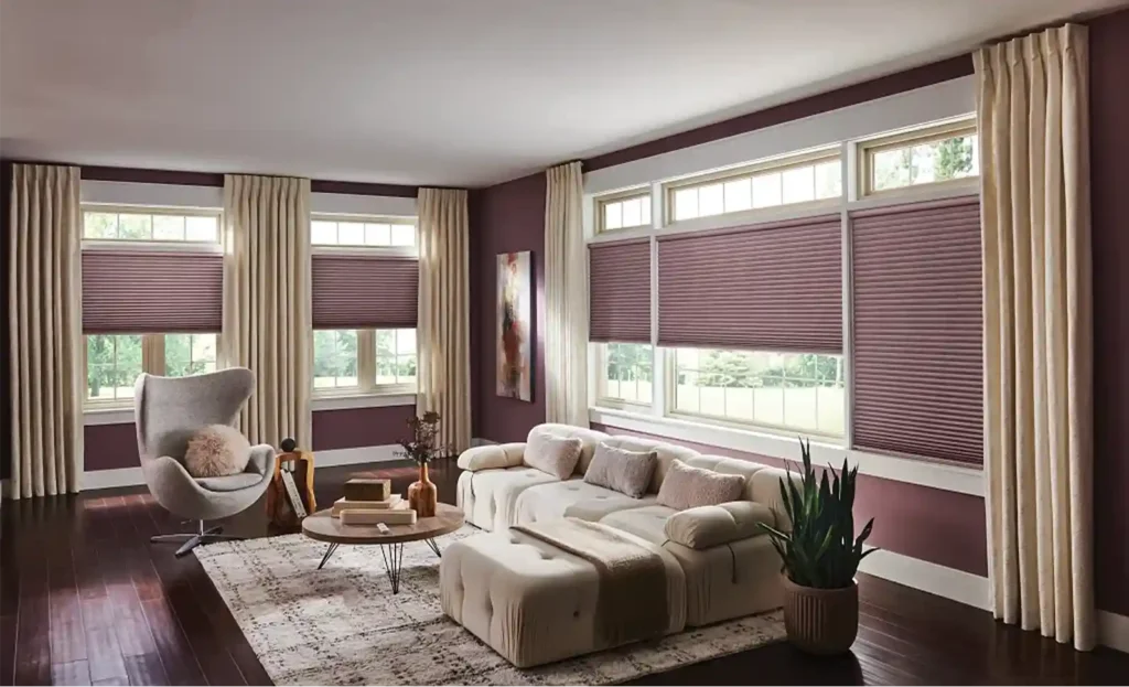
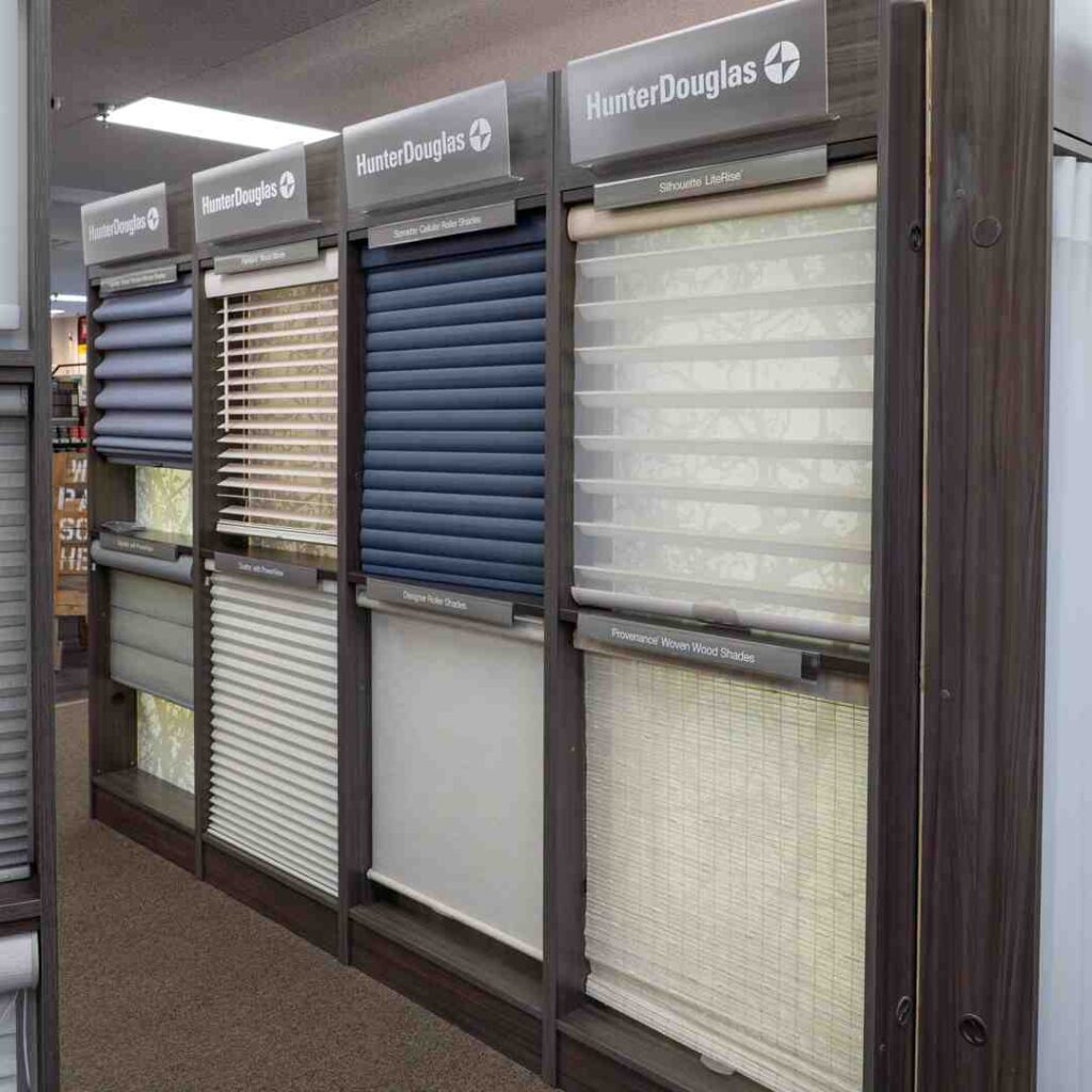
Coordinating Wall Colors with Indoor Window Treatments
Choosing the best indoor paint colors for walls is only half the battle. To create a truly cohesive room, you must consider your window treatments. In Rhode Island, where we deal with everything from bright coastal sun in Middletown to the wooded shadows of North Kingstown, how you control light is vital.
Window treatments serve two purposes: they are functional (privacy and light filtering) and they are the “jewelry” of the room. When your wall color and your blinds or draperies work together, the room feels intentional. If you choose a warm neutral like Swiss Coffee, pairing it with cool-toned, stark white plastic blinds can make the walls look “dirty.” Instead, we recommend layering textures—perhaps a natural wood blind or a cream-colored fabric shade—to transform your home with Benjamin Moore paint and high-quality finishes.
Pairing the Best Indoor Paint Colors for Walls with Custom Draperies
Custom draperies offer an opportunity to add softness and vertical height to a room. When pairing them with your wall color, you have two main design paths:
- The Monochromatic Look: Choose a fabric that is 1-2 shades darker or lighter than your wall color. This creates a seamless, high-end hotel feel that is incredibly relaxing. This works beautifully with a whole house palette.
- The High-Contrast Look: If your walls are a light neutral like Classic Gray, consider a bold navy or forest green drape. This anchors the room and draws the eye to the windows, making the space feel more architectural.
For bedrooms, we often suggest looking at sample bedroom paint colors first, then selecting blackout draperies that complement the undertones. A soft blue wall paired with a silvery-gray drape is a timeless combination that promotes deep sleep.
Testing Your Palette with Samples and Swatches
One of the biggest mistakes homeowners make is choosing a color under the fluorescent lights of a store and then buying five gallons immediately. Don’t do it!
Lighting is the most significant factor in how paint looks. A color that looks beige in our Smithfield store might look pink in your west-facing living room at 4:00 PM. This is why we are huge proponents of peel & stick samples. These are made with real paint and can be moved from wall to wall.
Our peel & stick paint samples buying guide explains how to use these effectively. We recommend placing them near your trim and your furniture to see how the colors interact. For more tips on this process, read From Samples to Stunning: Choosing Your Living Room’s Next Great Color.
Expert Advice for a Cohesive Home Design
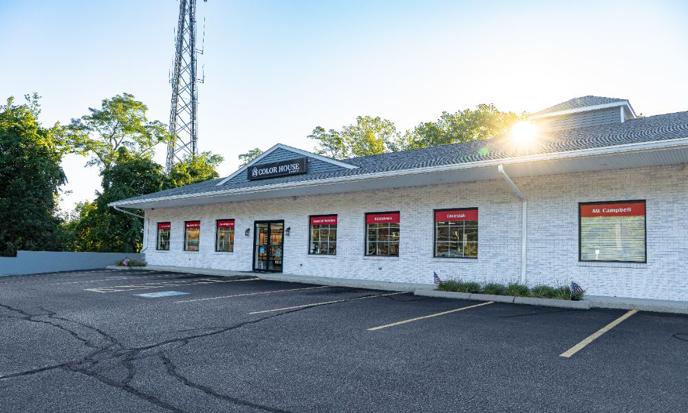
At The Color House, we know that your home is your most significant investment. Choosing the best indoor paint colors for walls shouldn’t be a stressful chore—it should be an exciting part of making your house a home.
If you’re feeling stuck between five different shades of “white” (we’ve all been there!), our color consultation services are designed to help. Hiring a color specialist can save you time, money, and the heartache of a “wrong” color choice.
Our experts understand the nuances of undertones and how to avoid common mistakes, like picking a gray that accidentally turns purple once it’s on all four walls. Whether you need help with a single room or a whole house palette, we are here to provide the expert advice that big-box stores simply can’t match.
Ready to start your project? Book a Color Consultation today!
By focusing on quality, understanding the impact of light, and coordinating your walls with beautiful window treatments, you can create a space that reflects your personality and stands the test of time. Visit us at any of our Rhode Island locations—from North Kingstown to Middletown—and let’s find your perfect color together.