
The Power of Expert Colorconsulting for Your Home
Are you wondering what colorconsulting is and how it can help you? Here’s a quick overview:
- What it is: Expert guidance to choose the perfect colors for your home, aligning with psychology, design, and your personal style.
- Improves Mood: Strategic color choices can create specific atmospheres, from calm and soothing to energetic and vibrant.
- Increases Home Value: Thoughtfully selected colors boost curb appeal and interior attractiveness, making your home more desirable.
- Avoids Costly Mistakes: Professional advice prevents common errors like picking the wrong undertones or colors that clash with existing elements.
- Personalized Solutions: Consultants tailor palettes to your unique preferences, lighting, and home architecture.
When it comes to changing your home, few things have as profound an impact as color. Colorconsulting helps you steer the overwhelming world of hues and shades. It’s not just about picking a pretty paint chip. Marketing research shows that over 80% of visual information is related to color. This means the colors in your home deeply influence how you feel and how others perceive your space.
A professional color consultant guides you. They help choose colors that improve your mood and reflect your unique style. The right colors can also significantly increase your home’s value and curb appeal.
As the owner and president of The Color House, I’ve spent over two decades bringing strategic vision and creative expertise in colorconsulting to Rhode Island homeowners. My background in fashion merchandising and interior design allows me to help clients confidently transform their spaces. Now, let’s explore how expert color guidance can lift your home.

Simple colorconsulting glossary:
The Science and Psychology of Color
Color is more than just a visual treat; it’s a powerful tool that influences our emotions, perceptions, and even our behavior. Understanding the science and psychology behind color is the first step in mastering its use in your home.
At the heart of color theory is the color wheel. This fundamental tool organizes colors into a logical sequence, showing their relationships. Primary colors (red, blue, yellow) are the building blocks, from which all other colors are derived. Mix two primary colors, and you get secondary colors (green, orange, violet). Beyond that, tertiary colors are created by mixing a primary and a secondary color. Warm colors—like reds, oranges, and yellows—tend to evoke feelings of energy, excitement, and comfort. On the other hand, cool colors—such as greens, blues, and violets—often bring a sense of calm, serenity, and relaxation.
The emotional impact of colors, often referred to as color psychology, is a key aspect of colorconsulting. For instance:
- Red is known to stimulate energy and can even increase appetite, making it a popular choice for dining rooms or accent pieces where vibrancy is desired.
- Blue typically promotes feelings of peace and trust, making it ideal for bedrooms or other spaces meant for relaxation.
- Green is associated with nature, renewal, and balance, creating a refreshing and harmonious atmosphere.
If you want to dig deeper into how specific hues affect mood and behavior, resources like the overview of color psychology can provide helpful background that complements professional guidance.
Understanding these psychological effects allows us to select colors that align with the desired mood and function of each room.

Understanding Color Schemes
Once you grasp individual color psychology, the next step in colorconsulting is to understand how colors work together in schemes. Choosing the right color scheme can create harmony, add excitement, or establish a specific aesthetic.
- Monochromatic schemes use different tints, tones, and shades of a single color. This approach creates a sophisticated and cohesive look that is subtle and calming. Imagine a bedroom adorned in various shades of blue, from deep navy to soft sky blue – it’s a tranquil oasis.
- Analogous schemes use colors that are adjacent to each other on the color wheel, such as blue, blue-green, and green. These schemes are inherently harmonious and create a smooth visual transition, often found in nature.
- Complementary schemes involve two colors directly opposite each other on the color wheel, like blue and orange, or red and green. These pairings offer high contrast and can create a vibrant, energetic feel. When using complementary colors, it’s often best to let one color dominate and use the other as an accent to avoid overwhelming the space.
For those who prefer a subtler backdrop, Neutral Interior Paint Colors provide a versatile foundation that allows other elements of your decor to shine. Neutrals are easy to blend and can create stylish drama when paired with the right accents.
Key Color Terminology
To speak the language of color, it helps to understand a few key terms that our colorconsulting experts use regularly:
- Hue: This is simply the pure color itself, like red, blue, or yellow. When we talk about a “color,” we’re usually referring to its hue.
- Value: Value describes how light or dark a color is. Adding white increases a color’s value (making it lighter, or a tint), while adding black decreases its value (making it darker, or a shade). Think of a light pink versus a deep burgundy – same hue (red), different values.
- Saturation: Also known as intensity or chroma, saturation refers to the purity or vividness of a color. A highly saturated color is bright and bold, while a desaturated color is duller and closer to gray.
- Tone: A tone is created by adding gray (a mix of white and black) to a pure hue. This softens the color, making it less intense and often more sophisticated. Many of the beautiful, muted colors we love in home design are tones.
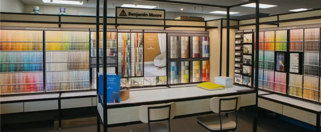
These terms are crucial for paint selection. For example, understanding the value of a paint color helps us predict how light or dark a room will feel, while knowing its saturation can tell us how vibrant or subtle the overall effect will be. At The Color House, we proudly offer premium paints, including those from Benjamin Moore, which are renowned for their extensive range of hues, values, and saturations, ensuring we find the perfect match for your vision.
The Art of the Palette: Key Considerations for Your Home
Choosing the right color for your home is an art form, deeply influenced by practical considerations beyond just aesthetics. Our colorconsulting approach takes into account unique elements of your space to ensure the perfect palette.
The role of light is paramount in how we perceive color. A color can look entirely different depending on whether it’s bathed in natural sunlight or artificial lamplight. Natural light changes throughout the day, affecting how colors appear. A pale hue that looks soft and subtle in the morning sun might appear washed out under bright midday light or take on a warmer glow in the evening. Similarly, artificial light sources – whether warm incandescent or cool LED – can dramatically alter a color’s perception. This is why testing colors in your actual space, at different times of day, is non-negotiable.
Another critical factor is paint sheen and finish. The sheen refers to the paint’s level of glossiness, and it plays a significant role in how light reflects off the surface and how durable the paint is.
- Flat paint has the lowest sheen and offers a soft, non-reflective finish, making it excellent for camouflaging imperfections. It’s often used on ceilings and low-traffic areas.
- Matte/Eggshell paint provides a slightly higher sheen than flat, offering more durability and easier cleaning, making it a versatile choice for most rooms.
- Semi-Gloss paint has a luminous finish that highlights architectural details and is highly durable, perfect for trim, doors, and high-traffic areas like kitchens and bathrooms.
While durability is key for certain areas, the appearance and how the sheen affects the color are equally important. For instance, painting walls in a gloss can add dimension and levity to a space, while a semi-gloss on a low ceiling can reflect light and create the illusion of height. Our team can guide you in choosing the right sheen for each surface, ensuring both beauty and longevity. If you’re dealing with existing paint issues, our guide on Fixing Common Paint Problems can offer some initial insights.

Creating Visual Illusions with Color
Color is a magician when it comes to manipulating perception, and our colorconsulting experts are adept at using it to create visual illusions that improve your home.
One of the most common desires is making rooms feel bigger. We achieve this by using light colors on walls, floors, and ceilings, which reflect more light and create a sense of openness. For more tips on this, check out our insights on how to Make Rooms Feel Bigger. Conversely, if you have a vast, impersonal room, using dark neutrals or warm, rich colors on the walls and floors can visually scale down the space, creating a cozier, more intimate atmosphere.
Ceiling height can also be played with. To make a ceiling seem higher, we recommend painting it a color lighter than the walls. This draws the eye upward and expands the sense of vertical space. If a room feels too tall or cavernous, painting the ceiling a darker color than the walls can visually lower it, bringing a sense of comfort and enclosure. These simple tricks, when applied correctly, can transform the entire feel of a room.
The Importance of Testing
We’ve all been there: falling in love with a tiny paint chip, only to be horrified when that “perfect” shade turns into a “bubblegum” nightmare on an entire wall. This is precisely why our colorconsulting process emphasizes thorough testing.
Paint chips are a great starting point for inspiration, but they are simply not enough. Most colors on paint chips appear a shade darker when applied to a real room, and the subtle undertones that are hard to discern on a small sample can become glaringly obvious on a large surface. Experts agree that the average person often misjudges paint colors from small samples. Whites and neutrals, in particular, have elusive undertones that can make a wall look dirty or yellow to the untrained eye.
The value of paint samples cannot be overstated. We encourage clients to use pint-sized samples to paint large swatches (at least 2×2 feet) on foam core boards or directly on the wall. This allows you to truly see how the color interacts with your room’s unique lighting, existing furnishings, and architectural features. It’s crucial to observe these swatches at different times of the day – morning, afternoon, and evening – to understand how the color shifts under varying light conditions. Living with the samples for a few days can save you from a costly mistake and ensure you’ll love the final result for years to come. For convenience, consider using Peel Stick paint samples, which make testing even easier.
The Professional Edge: Why Expert Colorconsulting Makes a Difference
While the allure of DIY can be strong, the nuanced world of color often benefits from a seasoned guide. This is where professional colorconsulting truly shines, offering an expertise that goes far beyond simply choosing a favorite hue.
The role of a color consultant is multifaceted. We don’t just suggest colors; we interpret your vision, analyze your space, and apply a deep understanding of color theory, psychology, and practical application. A key aspect of this is understanding undertones – those subtle hints of other colors within a primary shade that can make a seemingly perfect neutral clash with your flooring or furniture. Our consultants are trained to see these nuances, helping you avoid selections that might appear “dirty” or “off” once applied. We then work to create a holistic plan that considers every element of your home, from walls and trim to furnishings and lighting. Navigating the vast array of paint brands and types, each with its unique formulations and color offerings, can be overwhelming. We streamline this process, recommending the best products for your specific needs and desired finish. Our team at The Color House includes dedicated Color Specialists who are passionate about bringing your vision to life.
The Value of Professional Colorconsulting
Investing in professional colorconsulting isn’t an expense; it’s an investment that yields significant returns.
- Saving time and money: We prevent costly mistakes that come from repainting or choosing colors that don’t quite work. The time saved agonizing over choices and the money saved on wasted paint and labor are invaluable.
- Avoiding costly mistakes: The wrong color can detract from your home’s aesthetic and even its market value. Our expertise ensures you make confident choices that improve your space.
- Resolving decision conflicts: If you and your partner have differing opinions on color, our consultants act as objective mediators, using data and design principles to find a winning solution that satisfies everyone. We can clarify issues and work towards the best color solution for your goals.
- Achieving a professional, cohesive look: We ensure that every color choice contributes to a harmonious and intentional design, creating a polished look that flows seamlessly throughout your home. This level of expertise is central to our broader Decorating Services.
Common Challenges Solved by Colorconsulting
Many homeowners encounter similar problems when selecting colors, and these are precisely the challenges our colorconsulting services are designed to overcome:
- Choice paralysis: The sheer number of paint colors available can be overwhelming. We help narrow down the options, focusing on what truly works for your space and style.
- Matching existing furniture and flooring: Integrating new paint colors with existing elements like hardwood floors, upholstery, or artwork requires a keen eye for undertones and balance. We ensure your new colors complement, rather than clash with, what you already own.
- Creating flow between rooms: Especially in open-concept homes or spaces with visible sightlines between rooms, creating a cohesive color flow is crucial. We develop palettes that transition smoothly, making your home feel integrated and spacious.
- Choosing the right white or neutral: This might seem simple, but selecting the perfect white or neutral can be surprisingly difficult due to their complex undertones. Our consultants are experts at identifying the subtle differences that make all the difference, ensuring your walls look clean and intentional, not dingy or yellow. As a leading colorconsulting firm, we specialize in resolving the complex effects of color.
Beyond Paint: Coordinating Colors with Decor
While paint sets the stage, true interior design magic happens when colors are coordinated across all elements of your decor. Our colorconsulting extends beyond just wall colors to help you create a truly cohesive and inviting home.
Creating a cohesive look involves harmonizing paint with fabrics, furniture, and decorative accents. A popular guideline we often use is the 60-30-10 rule:
- 60% Dominant Color: This is typically your wall color, providing the main backdrop for the room.
- 30% Secondary Color: This color is used for larger elements like upholstery, indoor window treatments, or area rugs, adding depth and contrast.
- 10% Accent Color: This small but impactful percentage is reserved for decorative items such as throw pillows, artwork, or accessories, providing pops of interest and personality.
By following such a rule, or adapting it to your unique space, we ensure that every piece contributes to a unified aesthetic. Using accent colors strategically can pull a room together, creating visual interest without overwhelming the senses.
The Role of Window Treatments in Your Color Scheme
Often overlooked, indoor window treatments are key color elements that significantly impact a room’s overall aesthetic and functionality. They contribute to the 30% or 10% of your color scheme, adding texture, pattern, and depth.
When considering your color scheme, think about how your blinds, shades, and draperies will integrate. Do you want them to blend seamlessly with your wall color for a serene look, or stand out as a bold accent? We help you coordinate these elements, ensuring they complement your paint choices and overall design vision. Patterns and textures in your window treatments can introduce another layer of visual interest, softening harsh lines or adding a touch of elegance. For a comprehensive selection of options that perfectly align with your colorconsulting plan, explore our offerings in Window Treatments, including premium brands like Hunter Douglas and Graber Window Treatments.
Frequently Asked Questions about Color Consulting
We understand you might have questions about how colorconsulting works. Here are some of the most common inquiries we receive:
How much does a color consultation cost?
The cost of a colorconsulting service can vary depending on the scope and complexity of your project. Typically, fees might be structured in a few ways:
- Hourly rates: For smaller projects or specific dilemmas, an hourly rate allows you to pay only for the time you need.
- Flat-fee packages: Many consultants offer packages for a set number of rooms or a specific service, providing a clear upfront cost.
- Included with a larger project: At The Color House, we sometimes offer complimentary or reduced-cost colorconsulting when you book a larger painting or design project with us. We believe in providing the best balanced “price – quality – terms” propositions to our clients in Rhode Island. We encourage you to reach out to discuss your specific needs for a custom quote.
Can a color consultation be done remotely?
Absolutely! Remote colorconsulting is a highly effective and convenient option. We leverage technology to bring our expertise directly to you, no matter where you are in Rhode Island.
- Virtual consultations: Through video calls, we can virtually tour your space, discuss your preferences, and present options.
- Using photos and video calls: You can send us photos and videos of your rooms, existing furnishings, and inspiration images.
- Digital tools and mockups: We use advanced digital tools to create mockups of your space with different color palettes, allowing you to visualize the changes before committing.
Remote services are designed to be just as thorough and personalized as in-person consultations, making professional guidance accessible and flexible for your schedule.
What should I prepare for my consultation?
To make the most of your colorconsulting session, a little preparation goes a long way. We recommend gathering the following:
- Inspiration photos: Collect images from magazines, Pinterest, or Houzz that showcase colors, styles, or moods you love. This helps us understand your aesthetic preferences.
- Samples of flooring, fabrics, or furniture: If you have existing elements you want to coordinate with, bring physical samples (swatches, wood chips, etc.) so we can accurately match or complement them. This is especially helpful for items like upholstery, draperies, and blinds.
- An idea of the mood you want to create: Think about how you want each room to feel – calm, vibrant, cozy, sophisticated? Describing the desired emotion helps us select colors that evoke that feeling.
- Questions for the consultant: Don’t hesitate to write down any specific questions or concerns you have about color, lighting, durability, or anything else related to your project. No question is too small!
The more information you provide, the better we can tailor our recommendations to your unique home and lifestyle.
Conclusion
As we’ve explored, colorconsulting is far more than just picking a paint color; it’s a strategic process that blends art, science, and psychology to transform your living spaces. From understanding the emotional impact of hues to mastering color schemes and leveraging visual illusions, expert guidance ensures every color choice is intentional and impactful. We’ve seen how professional colorconsulting saves you time and money, prevents costly mistakes, and resolves common design dilemmas, ultimately leading to a more cohesive and personalized home.
At The Color House, our women-owned business is dedicated to providing Rhode Island homeowners with unparalleled service and expertise. Our team, with its deep understanding of premium paints and interior design, is here to guide you every step of the way. We believe that your home should be a reflection of your personality and a source of comfort and joy. With our expert colorconsulting, you gain the confidence to make informed decisions, resulting in a beautiful home that truly feels like yours.
Ready to find the perfect palette that improves your mood, increases your home’s value, and reflects your unique style? Let us help you Transform Your Space with Decorating Services.
Book your professional Color Consultation today and let’s open up the power of color in your Rhode Island home!