Why Gray Paint Colors Are a Timeless Choice for Your Home
Gray paint colors are the ultimate neutral foundation for modern and traditional homes alike. Whether you’re drawn to warm greige tones that feel cozy and inviting, or cool blue-grays that create a serene, contemporary atmosphere, choosing the right shade depends on understanding undertones, lighting, and your personal style.
Quick Guide to Choosing Gray Paint:
| Gray Type | Undertone | Best For | Mood |
|---|---|---|---|
| Greige | Warm (beige/taupe) | North-facing rooms, cozy spaces | Enveloping, welcoming |
| Blue-Gray | Cool (blue) | Bedrooms, modern spaces | Calm, sophisticated |
| Green-Gray | Cool (green) | Bathrooms, spa-like retreats | Tranquil, fresh |
| Charcoal | Neutral to cool | Accent walls, cabinetry | Dramatic, neat |
Gray has become a design favorite because it offers balance—it’s neither stark white nor heavy beige. It works beautifully with almost any color palette, from crisp whites and natural woods to bold jewel tones. Light grays with silvery tones create airy sophistication, while darker shades like charcoal and slate add depth and refined elegance.
But here’s the challenge: not all grays are created equal. The same gray can look completely different in your north-facing bedroom versus your south-facing kitchen. Some grays lean warm (with beige, red, or yellow undertones), while others feel cool (with blue, green, or purple undertones). Understanding these subtle differences is the key to finding a gray you’ll love.
I’m Jean Hauser, owner of The Color House and a Benjamin Moore expert with over two decades of experience helping Rhode Island homeowners steer gray paint colors and find their perfect shade. Our team provides personalized color consultations to ensure you choose a gray that works beautifully with your home’s unique lighting and style.

Similar topics to Gray paint colors:
The Foundation of Gray: Understanding Undertones and Temperature
The magic of gray paint colors lies in their incredible versatility, largely due to their undertones. Gray isn’t just gray; it’s a complex blend that can subtly shift its appearance based on the colors mixed within it. These hidden hues—whether blue, green, violet, beige, red, or yellow—are what we call undertones, and they profoundly affect the overall look and feel of a room.
Understanding these undertones is crucial because they dictate whether a gray will feel warm and inviting or cool and crisp. It’s the difference between a cozy, enveloping space and a modern, airy one. For instance, a gray with blue undertones will feel vastly different from one with a subtle hint of green, or a gray with a warm, sandy beige base. When selecting gray paint colors, identifying these undertones is the first step to creating a cohesive and harmonious design in your Rhode Island home.

Warm Grays (Greige & Taupe)
Warm grays, often referred to as “greige” or “taupe,” are the ultimate chameleons of the gray family. Greige, a delightful mix of gray and beige, offers the sophistication of gray with the undeniable warmth of beige. This blend creates a rich, welcoming color that feels incredibly balanced. Taupe takes this a step further, with prominent brown undertones that bring an extra layer of softness and earthiness into a space.
These warm gray paint colors are characterized by red or yellow undertones, which infuse a room with an enveloping and cozy atmosphere. They are particularly wonderful for north-facing rooms, which often receive cooler, indirect light. In such spaces, a warm gray can counteract the chill and make the room feel much more inviting. We love how they pair effortlessly with warm wood tones, rustic textures, and natural fibers, helping to create a classic rustic appearance or a serene, welcoming retreat.
Cool Grays (Blue, Green, Violet)
On the other side of the spectrum are cool grays, which embody elegance and modernity. These gray paint colors carry blue, green, or even subtle violet undertones, giving them a crisp and refreshing quality. A blue-gray, for example, is a blue-dominant color that has just enough gray to temper its intensity, creating a sophisticated blue hue. Conversely, a gray-blue is primarily gray, with a blue undertone that adds interest without overwhelming the space.
Cool grays are exceptional at creating a serene, airy, and calming feel. They are often sought after for bedrooms and bathrooms, changing these spaces into spa-like sanctuaries. A green-gray can offer a tranquil blend, while a blue-gray can lend a sophisticated, slightly moody vibe. These shades pair beautifully with modern decor, sleek metals like chrome or brushed nickel, and crisp whites, making them a popular choice for contemporary interiors.
Understanding these foundational differences in gray paint colors is where we come in. Our color specialists can help you steer these nuances and find the perfect shade for your home. More info about color theory.
8 Timeless Gray Paint Colors to Consider
Choosing the perfect gray can feel like searching for a needle in a haystack, especially with the sheer number of options available. But fear not! We’ve curated a list of our top Benjamin Moore gray paint colors that stand out for their versatility, timeless appeal, and ability to create a variety of moods and aesthetics. From light and airy to dark and dramatic, these shades are consistently celebrated by designers and homeowners alike.

A Versatile Light Greige
Benjamin Moore Revere Pewter HC-172: This beloved greige is often hailed as the “perfect warm gray.” Its balanced blend of gray and beige makes it incredibly versatile, adapting beautifully to different lighting conditions and decor styles. It’s warm enough to feel inviting, yet neutral enough to complement almost any color palette. With an LRV around 55.5, it’s a light-medium depth that works well in any room, from living areas to bedrooms, creating an enveloping and welcoming atmosphere.
A Crisp & Modern Light Gray
Benjamin Moore Gray Owl OC-52: If you’re looking for a light, crisp gray with a modern edge, Gray Owl is an excellent choice. It features subtle cool undertones, often revealing hints of green or blue depending on the light. This makes it fantastic for brightening spaces and creating an airy, sophisticated feel. It’s a popular choice for open-plan homes, where it can provide a clean backdrop without feeling cold. A popular choice for open-plan homes. Its LRV is approximately 65.7.
A Steadfast Medium Gray
Benjamin Moore Coventry Gray HC-169: A true classic, Coventry Gray is a steadfast medium gray that offers a sophisticated and balanced look. It has a slight cool undertone, making it feel grounded and refined without being overly dark. This color is a go-to neutral for many of our Rhode Island clients, providing a reliable and neat backdrop in living rooms, dining rooms, or home offices. Its LRV is around 48.
A Moody & Sophisticated Charcoal
Benjamin Moore Kendall Charcoal HC-166: For those ready to accept drama and depth, Kendall Charcoal is a rich, deep gray that exudes sophistication. This moody hue is fantastic for creating a focal point, whether on an accent wall, kitchen cabinetry, or even an entire room for a cozy, cocoon-like effect. It brings refined elegance and pairs beautifully with lighter grays or crisp whites for striking contrast. Its LRV is approximately 14.6.
A Calming Blue-Gray
Benjamin Moore Smoke 2122-40: This neat and serene blue-gray is a sophisticated blend of blue with significant gray depth. It’s perfect for creating a calming and relaxing atmosphere, making it an ideal choice for bedrooms and bathrooms. Smoke has an LRV of 56.39, putting it in the light-medium range, which allows it to offer color without feeling overwhelming. It avoids feeling too childish and instead provides a mature, tranquil vibe. Smoke 2122-40.
A Soft Green-Gray
Benjamin Moore Quiet Moments 1563: If you dream of a spa-like retreat, Quiet Moments is your color. This beautiful blend of blue, green, and gray creates an incredibly tranquil and soothing atmosphere. It’s soft and ethereal, perfect for bedrooms, bathrooms, or any space where you want to promote relaxation and calm. With an LRV of 60.73, it’s a moderately light color that feels serene and inviting. Quiet Moments 1563.
A Chic Dark Greige
Benjamin Moore Chelsea Gray HC-168: A darker take on greige, Chelsea Gray offers a rich, warm, and highly sophisticated feel. It’s a deep, luxurious gray with subtle warm undertones that prevent it from feeling cold. This color is excellent for creating a chic and comfortable environment in living rooms, dining rooms, or home offices, especially when paired with lighter trim or accents. Its LRV is approximately 22.1.
A Luminous Off-White Gray
Benjamin Moore Wickham Gray HC-171: For those who prefer a very light gray that almost reads as an off-white, Wickham Gray is a luminous choice. This cool gray has subtle green-blue undertones that become more apparent in certain lighting conditions, making it a dynamic color that shifts throughout the day. It’s perfect for creating an airy, sophisticated space that feels fresh and clean. Its LRV is around 68.9.
Decorating with Gray: Pairings, Accents, and Window Treatments
The true beauty of gray paint colors lies in their ability to serve as a versatile backdrop for almost any decorating scheme. Whether you’re aiming for a minimalist aesthetic or a vibrant, eclectic look, gray provides the perfect canvas. The key is understanding how to pair it with other colors and elements to create a cohesive and inviting space.
Color Palettes that Work with Gray
Gray’s neutrality makes it incredibly forgiving when it comes to color pairings. Here are some of our favorite combinations:
- Crisp Whites: For a traditional and impeccably clean look, pairing gray paint colors with crisp off-whites is a timeless choice. Benjamin Moore Simply White OC-117 or Distant Gray OC-68 are excellent options for trim, ceilings, or even adjacent walls. This creates a serene, calm, and sophisticated atmosphere.
- Warm Wood Tones: To add warmth and organic texture, integrate natural wood elements. Whether it’s hardwood floors, wooden furniture, or decorative accents, the richness of wood tones beautifully complements both warm and cool grays, preventing a room from feeling too stark or cold.
- Bold Accent Colors: Don’t be afraid to introduce vibrant hues! Gray provides the perfect grounding for bold accents. Consider:
- Blues: Deep navy, teal, or even lighter blues like Benjamin Moore Mysterious AF-565 or Santorini Blue 1634 create a compelling, sophisticated look.
- Pinks: Soft pinks, such as Benjamin Moore Tissue Pink 1163 or Head Over Heels AF-250, offer a complementary aesthetic, especially when paired with darker charcoal grays, adding a touch of softness and romance.
- Greens: Emerald green or earthy sage can bring a refreshing, natural element to a gray room.
- Yellows/Oranges: A pop of mustard yellow or burnt orange can infuse a gray space with energy and warmth.
If you’re feeling overwhelmed by the possibilities, our expert team is here to help you achieve your vision. Get help from a color specialist.
The Finishing Touch: Gray Walls and Window Treatments
Once your walls are painted in your chosen shade of gray, the next step is to select decor that improves the overall aesthetic. Window treatments play a significant role here, influencing light, privacy, and the room’s style. For gray paint colors, the right window treatment can either reinforce the mood or introduce a contrasting element that adds visual interest.
- Draperies: Fabric choices for draperies can dramatically alter the feel of a gray room. Sheer white drapes can improve the airy quality of a light gray, while rich velvet drapes in jewel tones can add luxury and depth to a darker gray. Patterned fabrics can introduce texture and personality.
- Woven Wood Shades: For those seeking to add warmth and a natural touch, woven wood shades are an excellent complement to most gray paint colors, particularly greiges and warmer grays. They bring organic texture and a relaxed, earthy feel.
- Blinds and Shades: If you prefer clean lines and a minimalist approach, blinds and shades offer a sleek solution. Available in a wide array of colors and opacities, they can seamlessly blend with your gray walls or provide a subtle contrast.
We offer a full range of interior window treatment options, including custom draperies, blinds, and shades from Hunter Douglas and Graber, to perfectly complement your chosen gray paint colors and interior design. Explore Hunter Douglas & Graber options or browse Our full range of window treatments.
How to Choose the Right Shade of Gray Paint Colors
Selecting the perfect gray paint colors for your home is an art and a science. It’s not just about picking a shade you like from a chip; it’s about understanding how that color will interact with its environment. Two critical factors are lighting and the specific room you’re painting.
The Impact of Light on Gray Paint Colors
Lighting is the single most influential factor in how any paint color, especially gray, will appear in your home. Gray is particularly susceptible to shifts because its subtle undertones are easily amplified or muted by different light sources.
-
Natural Light:
- North-facing rooms receive cooler, indirect light, which tends to improve blue and green undertones in grays, making them appear cooler. In these rooms, a warmer gray or greige might be preferred to prevent the space from feeling too cold.
- South-facing rooms are bathed in warm, bright light throughout the day. This light is generally more forgiving and allows for a wider range of gray choices, as it can warm up cooler grays and highlight the richness of warmer ones.
- East-facing rooms get bright, warm light in the morning, which then turns cooler in the afternoon. A balanced gray might work well here, or one that you enjoy seeing in its morning glow.
- West-facing rooms receive warm, intense light in the afternoon and evening. This can make grays appear warmer and more saturated at certain times of the day.
-
Artificial Light: The Kelvin temperature of your light bulbs also plays a crucial role. Warmer light bulbs (around 2700K) can soften cool gray tones, making a blue-gray feel more inviting. Cooler light bulbs (4000K+) will emphasize the cool undertones, making a gray appear even crisper or bluer. Observing how your chosen gray shifts throughout the day under both natural and artificial light is indispensable.
Room-by-Room Recommendations for Gray Paint Colors
The function and mood of each room should guide your choice of gray paint colors.
- Living Rooms: These are often high-traffic, communal spaces where you want comfort and versatility. Versatile greiges like Benjamin Moore Revere Pewter HC-172 or a balanced medium gray like Benjamin Moore Coventry Gray HC-169 are excellent choices. They provide a sophisticated backdrop that can adapt to various decor changes and offer a welcoming feel.
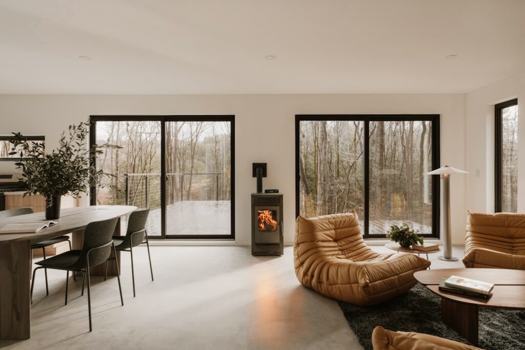
- Bedrooms: For a sanctuary of rest, calming blue-grays like Benjamin Moore Smoke 2122-40 or soft green-grays like Benjamin Moore Quiet Moments 1563 are ideal. Their serene qualities promote relaxation and tranquility, creating a peaceful escape.
- Kitchens: Durability and cleanliness are key here. A clean, mid-tone gray that hides everyday splatters while still looking fresh is perfect. Many grays work well, but consider those with a slight cool undertone for a crisp, modern kitchen or a warm greige for a more inviting, traditional space.
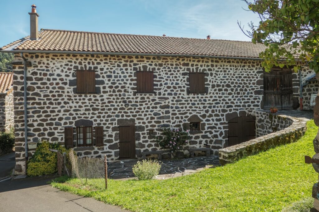
- Home Exteriors: Gray paint colors offer timeless appeal for home exteriors, complementing classic roof colors, brick, and stone beautifully. A light gray can look fresh and inviting, while a darker charcoal can provide a striking, modern look. Exterior colors often appear lighter in direct sunlight, so a slightly darker shade than you initially think might be appropriate. For tips on enhancing your home’s curb appeal with paint, see our guide on Choosing Exterior Paint Colors with Lasting Curb Appeal.
The best way to ensure you choose the right shade is to test it in your own home. We highly recommend using peel-and-stick samples, which allow you to see the color accurately without committing to a full can. How to use peel-and-stick samples.
Frequently Asked Questions About Gray Paint
We often hear similar questions from our clients throughout Rhode Island when they start on their gray paint journey. Let’s address some of the most common concerns to help you feel more confident in your choices.
How do I make a gray room feel warm and not cold?
This is a common concern, especially with cool grays. The trick is to balance the cool tones with an abundance of warmth through other elements in the room:
- Warm Textures: Introduce soft textiles like wool rugs, velvet cushions, chunky knit throws, or linen curtains.
- Wood Furniture: Incorporate furniture with warm wood tones (e.g., oak, walnut, cherry). These natural elements instantly add coziness.
- Warm Accent Colors: Bring in accent colors with warm undertones, such as muted terracotta, mustard yellow, blush pink, or deep rust.
- Warm-Toned Lighting: Opt for light bulbs with a lower Kelvin temperature (around 2700K-3000K) to cast a softer, warmer glow.
- Metallic Accents: Gold, brass, or copper finishes can add a touch of warmth and luxury.
Even a cool blue-gray can feel incredibly inviting when surrounded by the right warm elements.
What’s the best paint finish for gray walls?
The best paint finish depends on the room’s function, desired aesthetic, and traffic levels.
- Matte/Flat: Offers a velvety, sophisticated, and modern look. It hides imperfections well and provides a rich depth of color. Ideal for low-traffic areas like formal living rooms or master bedrooms.
- Eggshell: A popular choice for its soft sheen and good durability. It’s more washable than flat finishes, making it suitable for living rooms, dining rooms, and bedrooms where a bit more resilience is needed.
- Satin: Provides a subtle, pearl-like sheen and excellent durability, making it easy to clean. This finish is perfect for high-traffic areas like hallways, kids’ rooms, kitchens, and bathrooms, where moisture and frequent cleaning are concerns.
- Semi-Gloss/High Gloss: These higher sheen levels are typically reserved for trim, doors, and cabinetry, as they are highly durable and very easy to clean. A high-gloss silvery-gray on trim or a feature piece can evoke a luxurious vibe.
For walls, eggshell is often the sweet spot, offering a beautiful balance of appearance and practicality.
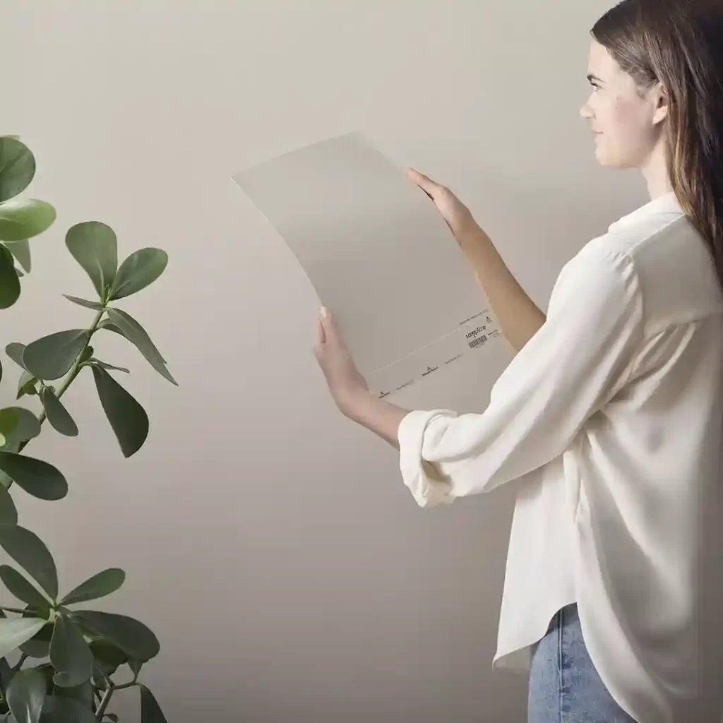
What’s the best way to test a gray paint color?
Testing is non-negotiable when it comes to gray paint colors! Their appearance changes so dramatically with light and surrounding colors.
- Never test on the existing wall color: The old color will bias your perception.
- Use large peel-and-stick samples: These are a game-changer! They are true to color, mess-free, and allow you to see a substantial area of the color.
- Move samples around the room: Place them on different walls, near windows, and next to existing furniture or flooring.
- Observe in different lighting: Crucially, watch the samples from morning to evening, and under both natural and artificial light. This will reveal the undertones and how the color shifts throughout the day.
- Compare with your furnishings: See how the gray interacts with your existing decor, fabrics, and wood tones.
We offer convenient peel-and-stick samples that can be delivered right to your door in Rhode Island, making your decision process much easier. Learn about our sample options.
Find Your Perfect Gray in Rhode Island
Choosing the right gray paint colors for your home is more than just picking a shade; it’s about crafting an atmosphere, reflecting your personal style, and creating a space you’ll love for years to come. While gray offers unparalleled versatility, its subtle nuances and shifting undertones can make the selection process complex.
That’s where our expert advice makes all the difference. At The Color House, we understand the unique lighting and architectural styles found throughout Rhode Island, from the coastal homes of Narragansett to the historic charm of Cranston. Our team is dedicated to providing individualized service and expert guidance, helping you steer through undertones, lighting conditions, and your existing decor to find your absolute perfect gray.
As a women-owned paint store specializing in premium Benjamin Moore paints, we pride ourselves on offering competitive pricing, expert advice, and the largest inventory in Rhode Island. We’re a personalized alternative to big box stores, committed to ensuring your painting project is a success, from color selection to the final brushstroke.
Ready to transform your home with the timeless elegance of gray? Don’t let the nuances of undertones and lighting intimidate you. Schedule your professional color consultation today with The Color House. We’re here to help you bring your vision to life!