Why an Olive Green Color Sample Matters for Your Next Project
An olive green color sample is essential before committing to this sophisticated shade. Here’s what you need to know:
Key Considerations for Olive Green Samples:
- Undertones vary widely – from warm yellow to cool gray to earthy brown
- Light Reflectance Value (LRV) ranges from 6 (very dark) to 27 (lighter) across popular shades
- Lighting dramatically changes appearance – test samples in natural and artificial light
- Popular options include Benjamin Moore Vintage Vogue (LRV 12), Tate Olive (LRV 27), and Mediterranean Olive (LRV 11)
- Always test multiple samples on your actual walls before purchasing gallons
Olive green has emerged as one of the most versatile paint colors for Rhode Island homeowners seeking a timeless, nature-inspired palette. Unlike bright or cool greens, olive green offers a comfortable, grounding presence that works beautifully in both modern and traditional spaces.
This sophisticated shade carries rich history – originally named for the unripe olive fruit and famously used in military camouflage since World War II. Today, it’s shed its utilitarian past to become a sophisticated neutral that pairs beautifully with everything from warm woods to cool metallics.
What makes olive green particularly appealing is its complexity. The color sits at the intersection of green, yellow, and sometimes brown or gray, creating depth and interest without overwhelming a space. It can read as a true olive in bright light, shift to a warm sage in softer conditions, or appear nearly brown in dimly lit rooms.
The challenge? With hundreds of olive green options available from Benjamin Moore and other premium brands, choosing the right shade for your specific space can feel overwhelming. That’s where sampling becomes critical.
I’m Jean Hauser, owner of The Color House, and over two decades of helping Rhode Island homeowners steer paint selections has taught me that testing an olive green color sample in your actual space is the only way to avoid costly mistakes. Whether you’re painting kitchen cabinets, creating an accent wall, or refreshing your entire home, I’ll guide you through selecting and testing the perfect olive green shade.

The Anatomy of Olive Green: Undertones, LRV, and More
When we talk about an olive green color sample, we’re diving into a world of subtle nuances. Unlike a primary color, olive green is a complex blend, primarily green with significant yellow, brown, or gray undertones. These underlying hues are what give each olive green its unique character and dictate how it will appear in your home. Understanding these factors is key to making an informed choice for your Rhode Island space, and can even help you to Make Rooms Feel Bigger.
Defining Undertones: Yellow, Brown, and Gray
Undertones are the subtle colors that peek through a paint color, especially under different lighting conditions. For olive green, these are typically:
- Yellow undertones: These are the most common and give olive green its signature warmth and earthy feel. A true olive green has a fair amount of yellow. This can make the color feel vibrant without being overly saturated.
- Brown undertones: When brown is present, the olive green becomes deeper, muddier, and often more sophisticated. These shades can read almost like a greenish-brown, adding a grounding, organic feel to a room.
- Gray undertones: A touch of gray can neutralize the yellow, making the olive green appear more muted, subtle, and sophisticated. These greens often lean towards a more contemporary or Scandinavian aesthetic.
The interplay of these undertones means that no two olive greens are exactly alike. Lighting, both natural and artificial, dramatically impacts how these undertones are perceived. A color that looks perfectly yellow-based in natural daylight might appear more gray or brown under artificial light at night. This complexity is why testing an olive green color sample directly in your home is non-negotiable.
Olive vs. Sage: What’s the Difference?
It’s easy to confuse olive green with sage green, as both are muted, earthy greens. However, a key distinction lies in their primary undertones:
- Olive Green: Our research shows that olive green is typically warmer due to its pronounced yellow undertones. This gives it a richer, more vibrant character that can still feel calm and comfortable on the eye. It’s often described as a true green with a yellowish tint.
- Sage Green: In contrast, sage green tends to be cooler, often featuring blue or gray undertones. This gives sage a softer, more muted appearance, making it excellent for creating tranquil, spa-like environments.
While some olive greens can lean towards sage depending on their gray content, the core difference is that warm yellow base in olive versus the cool gray/blue base in sage. When you’re comparing an olive green color sample with a sage green sample, you’ll notice olive’s inherent warmth and depth.
Understanding LRV (Light Reflectance Value)
LRV, or Light Reflectance Value, is a crucial metric that tells us how much light a paint color reflects. It’s measured on a scale from 0 (absolute black, reflecting no light) to 100 (pure white, reflecting all light).
- Low LRV (e.g., 0-20): These colors are darker and will absorb more light, creating a moody, cozy, or dramatic atmosphere. For example, Benjamin Moore Southern Vine has an LRV of 8, while Vintage Vogue has an LRV of 12. These are excellent choices for spaces where you want to create depth and intimacy.
- Higher LRV (e.g., 20-40): These colors reflect more light, making a room feel brighter and more open. Benjamin Moore Tate Olive, with an LRV of 27, and Crownsville Gray, with an LRV of 22, fall into this category, offering a lighter yet still earthy green presence.
Understanding LRV helps you predict how light or dark a color will appear on your walls, especially when online photos can be deceiving. Our team at The Color House uses LRV values to help our Rhode Island customers accurately compare paint chips and select the right depth of color for their desired outcome.
A Curated Olive Green Color Sample Palette
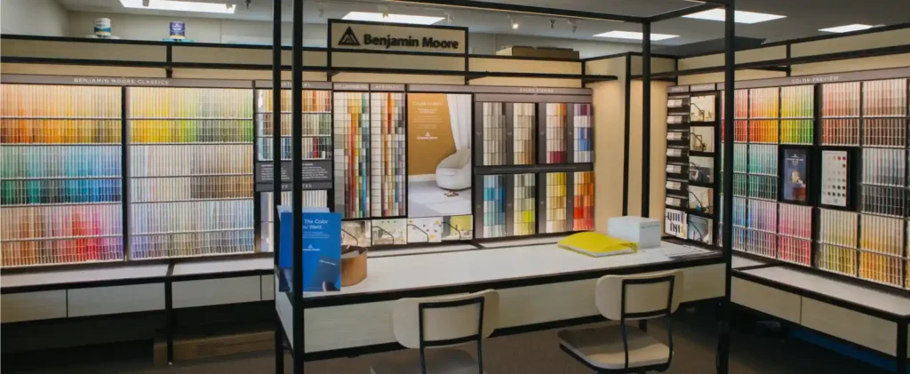
At The Color House, we pride ourselves on offering a nuanced selection of premium greens, particularly from Benjamin Moore, that cater to every design vision. Our experts have seen how these colors transform homes across North Kingstown, Cranston, and beyond. We’ve gathered some designer favorites that exemplify the beauty and versatility of olive green. For more insights into our paint brands and products, explore our offerings at The Color House Benjamin Moore.
Dark & Moody Olives
These deep, rich olive greens are perfect for creating sophisticated, moody spaces that feel grounded and luxurious. They work wonderfully in studies, dining rooms, or even cozy bedrooms where you want to evoke a sense of calm and intimacy.
- Benjamin Moore Vintage Vogue 462 (LRV: 12): This is one of Benjamin Moore’s most loved dark greens, an ultra-dark, smoky green that can read almost black in certain lights, or even forest or emerald green. It’s a favorite of designers like Studio McGee for its sophisticated depth.
- Benjamin Moore Southern Vine 2138-10 (LRV: 8): A profoundly dark and rich olive, Southern Vine offers a sophisticated and earthy vibe. Our research indicates it’s been used in traditional homes, showcasing its timeless appeal.
- Benjamin Moore Mediterranean Olive 2142-10 (LRV: 11): Despite its relatively low LRV, Mediterranean Olive reads lighter in real life with a fair amount of gray. This makes it a wonderful choice if you’re looking for a subtle yet sophisticated green.

These deep shades can bring incredible character to a room. You can see this color in a traditional home for inspiration on how to incorporate these rich tones.
Mid-Tone & Earthy Olives
For those seeking a balanced, earthy green that isn’t too dark but still offers a natural, grounding presence, these mid-tone olives are excellent choices. They provide warmth and sophistication without overwhelming a space.
- Benjamin Moore Tate Olive 390F-6 (LRV: 27): A fan favorite and part of Benjamin Moore’s Historical Collection, Tate Olive is a mid-tone green with just enough warmth to firmly place it in the olive category. It’s known for its versatility.
- Benjamin Moore Crownsville Gray HC-106 (LRV: 22): Described as a “deep, dignified greenish-brown,” Crownsville Gray is another complex olive that reads predominantly as a warm olive green. It’s a favorite of designer Tiffany Leigh, known for its sophisticated feel.
- Benjamin Moore Pine Grove 511: While its LRV isn’t explicitly listed in our provided stats, Pine Grove is a noteworthy mid-tone green. One designer chose it for bunk beds after testing 17 samples, highlighting its balance between olive, brown, and gray for a muted green tone.

These mid-tone olives are incredibly adaptable and can bring a touch of nature indoors, whether on an accent wall, kitchen cabinets, or as a full room color.
How to Perfectly Test Paint Samples in Your Home
Choosing the perfect olive green color sample for your home is an exciting step, but it’s also where many homeowners make critical mistakes. We always emphasize the importance of thorough sampling before you commit to gallons of paint. After all, a little extra effort now can save you a lot of headache (and money!) later.
Why an Olive Green Color Sample is Crucial
We’ve all seen it: a paint color looks perfect online or on a small chip, but completely different on our walls. This isn’t magic; it’s science! The way light interacts with paint, and how surrounding elements influence our perception, can drastically alter a color’s appearance.
- Natural Light Changes: The quality of natural light varies throughout the day and with the seasons. A sunny morning might make your olive green color sample appear brighter and more yellow, while an overcast afternoon could bring out its gray or brown undertones.
- Artificial Light Influence: Different light bulbs (warm LED, cool fluorescent, incandescent) emit different color temperatures, which will directly impact how your olive green looks. Test your samples with the lights you’ll actually be using in the room.
- Sheen Differences: The finish of the paint (matte, eggshell, satin, semi-gloss) affects how much light it reflects. A matte finish will absorb more light and appear richer, while a satin or semi-gloss will reflect more light, making the color seem slightly brighter and more vibrant.
- How Surrounding Decor Affects Perception: Your existing furniture, flooring, artwork, and even the view outside your window can influence how you perceive a paint color. An olive green color sample might look different next to warm wood tones than it does beside cool gray upholstery.
The Best Way to Test Colors
Forget painting small squares directly on your wall – that often leads to inaccurate results. We recommend a more effective approach:
- Peel-and-Stick Samples: Without a doubt, the best way to sample paint colors is with reusable peel and stick samples. These are made with real paint, can be ordered online, and cost about the same or less than traditional sample pots. They’re faster to apply, require no cleanup, and can be easily moved around your room.
- Sample Boards: If peel-and-stick isn’t an option, paint large swatches (at least 12×12 inches) on white poster board. This provides a neutral background and allows you to move the sample around.
- Move Samples to Different Walls: Place your olive green color sample on each wall of the room you’re considering. Observe it at various times of day and night, with both natural and artificial lights on and off.
- Check Against Trim and Flooring: Hold your sample next to your existing trim, flooring, and any dominant furniture pieces to ensure harmony.
Pro Sampling Tips
Our decades of experience helping homeowners in Rhode Island select paint have taught us a few tricks:
- Gather Inspiration: A Google or Pinterest search is a great place to start for color inspiration. Paint decks from Benjamin Moore are also incredibly helpful for narrowing down options.
- Order Multiple Shades: Don’t just pick one! We recommend ordering at least 6-10 different olive green color sample options. They always look different in person than online, and having several to compare side-by-side helps you see the subtle differences in undertones and LRV.
- View Against White: When comparing samples, temporarily tape them to a large piece of white paper or poster board. This helps isolate the color and prevents your existing wall color from influencing your perception.
- Get Expert Advice: If you’re feeling overwhelmed, a professional color consultation can be invaluable. Our team at The Color House offers personalized guidance to help you find the perfect shade for your home. Learn more about our Color Consultation services.
Designing with Olive Green: Pairings & Room Ideas
Olive green, once primarily associated with military uniforms, has truly come into its own as a sophisticated, versatile neutral in interior design. Its ability to create different moods, from calming and serene to rich and dramatic, makes it a fantastic choice for any room in your Rhode Island home. The key is understanding what colors pair best with your chosen olive green color sample to achieve your desired aesthetic.
What Colors Pair Best with an Olive Green Color Sample?
Olive green’s earthy nature makes it incredibly adaptable, pairing beautifully with a wide range of colors. Our research and experience show it can be both harmonious and strikingly contrasted.
- Warm Neutrals (Creams, Beiges): For a soft, inviting, and timeless look, pair olive green with warm neutrals like creamy whites (e.g., Benjamin Moore Swiss Coffee) and cozy beiges (e.g., Benjamin Moore Grant Beige). These combinations create a harmonious and comfortable environment.
- Earthy Tones (Terracotta, Wood): Accept olive green’s organic roots by pairing it with other natural elements. Terracotta, rust, and various wood tones (from light oak to dark walnut) improve its warmth and create a grounded, nature-inspired palette.
- Contrasting Colors (Dusty Pink, Deep Navy): To add a touch of vibrancy or drama, consider complementary shades. Soft pinks or dusty rose tones offer a subtle contrast that feels fresh and inviting. For a bolder statement, deep blues (like Benjamin Moore Hale Navy) or even deep violet and dark turquoise can create a striking and sophisticated contrast.
- Metallics (Brass, Bronze): Warm metallics like brass, bronze, and antique gold beautifully complement the richness of olive green, adding a touch of elegance and sophistication.
Olive green is comfortable on the eye and can be incredibly vibrant without sacrificing calmness. It has a significant weight with warmer colors, drawing attention, but can appear louder with pale colors.
Olive Green in Every Room
The versatility of an olive green color sample means it can shine in almost any space, bringing a unique character to each.
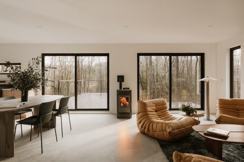
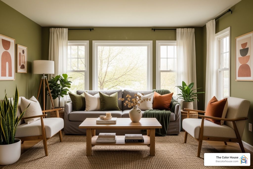
- Living Rooms: An olive green accent wall can provide a beautiful focal point, especially when paired with natural textures and warm wood furniture. For a truly immersive experience, painting the entire living room in a mid-tone olive can create a cozy, sophisticated, and grounding retreat.
- Kitchens: Olive green cabinets are a rising trend, offering a fresh alternative to traditional whites or grays. A lighter olive green can brighten a kitchen, while a darker shade provides a rich, neat backdrop, especially when combined with brass hardware or butcher block countertops. It can also be used for a kitchen island to add a pop of color.
- Bedrooms: Given its calming and stress-relieving properties, olive green is an ideal choice for bedrooms. A soft, muted olive can create a serene and restful sanctuary. Pair it with crisp white linens and natural wood furniture for a truly tranquil space.
- Bathrooms: For a spa-like feel, consider a lighter, more muted olive green in the bathroom. It evokes nature and tranquility, especially when combined with white fixtures and natural stone elements.
Whether you’re looking to refresh a single room or redesign your entire home, olive green offers endless possibilities. Don’t forget to explore our Wallpaper & Decor options to complement your chosen olive green palette.
Frequently Asked Questions about Olive Green
As experts in helping Rhode Island homeowners choose the perfect colors, we often hear similar questions about popular shades like olive green. Here are some of the most common inquiries we receive:
Is olive green a warm or cool color?
Typically, olive green is considered a warm color. This is primarily due to its inherent yellow undertones, which give it an earthy, organic warmth. However, as we discussed, olive green is a complex color. Depending on the specific shade, it can sometimes have hints of gray or brown, which can temper its warmth or even give it a slightly cooler edge. A more muted olive green color sample with significant gray undertones might feel more neutral than overtly warm. Always test your chosen sample to see how its warmth or coolness manifests in your unique lighting conditions.
Is olive green going out of style?
Absolutely not! Olive green is far from a fleeting trend; it’s a timeless classic. Its enduring appeal lies in its strong connection to nature and its versatility as a neutral. Unlike some brighter or more saturated greens that can feel very “of the moment,” olive green’s muted, earthy quality allows it to blend seamlessly with various design styles, from traditional to modern, rustic to minimalist.
Our research indicates that while historically used for practical purposes like military camouflage, olive green is now considered a sophisticated neutral suitable for almost any space. It’s a color that evokes comfort and grounding, qualities that homeowners consistently seek. As such, we consider it a classic choice that transcends temporary fads. To stay updated on enduring styles and fresh palettes, check out the latest Paint Trends from So Rhode Island – April 2025.
What finish is best for olive green paint?
The best paint finish for your olive green color sample depends entirely on the surface you’re painting and the desired durability and aesthetic. Each finish has its own characteristics:
- Matte/Flat: This finish absorbs the most light, providing a rich, velvety look that can make deep olive greens feel incredibly sophisticated and moody. It’s excellent for walls in low-traffic areas like bedrooms or dining rooms, as it hides imperfections well.
- Eggshell: Slightly more durable than matte, eggshell offers a subtle sheen, making it a popular choice for living room and bedroom walls. It’s easier to clean than matte and still provides a soft, inviting look for olive green.
- Satin: With a noticeable sheen, satin is more durable and easier to clean than eggshell. It’s a fantastic choice for kitchen walls, bathrooms, and high-traffic areas, and it works wonderfully on cabinetry, bringing out the depth of olive green.
- Semi-Gloss: This finish offers a higher sheen and maximum durability, making it ideal for trim, doors, and furniture. It can make an olive green pop, providing a crisp contrast or highlighting architectural details.
- Gloss: The highest sheen, gloss finishes are very durable and reflective. While less common for entire walls, they can create a dramatic, modern statement when used strategically on specific elements like a front door or a piece of furniture in olive green.
For walls, we often recommend matte or eggshell for a softer, more traditional feel, while satin or semi-gloss are excellent for cabinetry, trim, and doors due to their increased durability and ease of cleaning.
Find Your Perfect Olive Green
We hope this extensive guide has illuminated the nuanced world of olive green and empowered you to confidently choose your perfect olive green color sample. From its rich history to its incredible versatility, olive green offers a timeless appeal that can transform any space in your Rhode Island home. Its ability to create grounding, sophisticated, and calming environments makes it a truly special color.
The importance of testing cannot be overstated. A carefully chosen and properly sampled olive green color sample will ensure that the color you love in the can is the color you love on your walls.
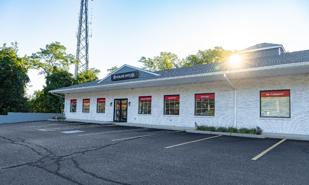
At The Color House, we’re more than just a paint store; we’re your partners in changing your home. As a women-owned business, we pride ourselves on providing individualized service, expert advice, and the largest inventory of premium Benjamin Moore paints in Rhode Island. We offer a personalized alternative to big box stores, ensuring you get competitive pricing and the right products for your project.
Whether you’re starting on a full home renovation in Wakefield, updating a kitchen in Middletown, or simply adding an accent wall in Smithfield, our team is here to guide you every step of the way. Come visit us, and let us help you find the perfect olive green color sample to bring your vision to life. Explore our wide selection of Interior/Exterior Paints and start your color journey with The Color House today.